Provide column width in cellInfo object for JavaScript render function
Thanks for creating the powerful package.
I am exploring the strategy to use reactable with plotly. One limitation is the efficiency to use plotly R package as each row is creating a htmlwidgets. reactable package already illustrated the performance issue in the custom-rendering.
So, I start to explore react Plotly.js in javascript following #5. One challenge of using Plotly.js is to set responsive width for the figure generated by javascript.
I am wondering if the cellInfo and other object for JavaScript render function can provide the column width information.
Below is a simplified code example. (I hope the figure width change while resizing the column.)
I am also wondering if there is a simpler way to only render a htmlwidgets one time and use it as template for each row. Any hint would be appreciate. (I tried to convert plotly htmlwidgets to JSON using plotly:::to_JSON, but not sure how to transfer the JSON object to a proper javascript function with JS() function to be used in reactable.
library(plotly)
library(reactR)
library(reactable)
library(htmltools)
j <- '
function(cell) {
const Plot = createPlotlyComponent(Plotly);
var x = [cell.value];
return React.createElement(Plot, {
data: [
{
"x": x,
"y": 1,
"text": x,
"hoverinfo": "text",
"mode": "markers",
"alpha_stroke": 1,
"sizes": [10, 100],
"spans": [1, 20],
"type": "scatter"
}
],
layout: {
"width": 200,
"height": 30,
"xaxis": {
"title": "",
"range": [4, 8],
"zeroline": false,
"fixedrange": true,
"showline": true,
"ticks": "outside"
},
"yaxis": {
"title": "",
"showgrid": false,
"zeroline": false,
"showticklabels": false,
"fixedrange": true
},
"margin": {
"l": 0,
"r": 0,
"b": 0,
"t": 0,
"pad": 0
},
"plot_bgcolor": "rgba(0, 0, 0, 0)",
"paper_bgcolor": "rgba(0, 0, 0, 0)",
"hoverlabel": {
"bgcolor": "lightgray"
},
"showlegend": false
},
"config": {
"showSendToCloud": false,
"displayModeBar": false
},
})
}
'
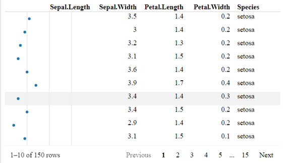
p <- reactable(data = iris,
theme = reactableTheme(cellPadding = "0px 8px"),
borderless = TRUE,
highlight = TRUE,
resizable = TRUE,
columns = list( Sepal.Length = colDef(html = TRUE,
cell = JS(j),
style="font-size: 0px; padding: 0px; margin: 0px;",
width = 200)))
browsable(tagList(
reactR::html_dependency_react(),
htmltools::tags$script(src="https://cdn.plot.ly/plotly-latest.min.js"),
htmltools::tags$script(src="https://unpkg.com/[email protected]/dist/create-plotly-component.js"),
p
))
Hi, it is possible to get the column widths in cellInfo, but it's not documented or exposed publicly. However, only the initial column widths and column-resized widths are available, so I don't think this would help in the case where the browser window resizes. For example, the width of a column with minWidth = 100 would always be reported as 100px, even if the actual column width was 300px when stretched to fill the browser window.
I don't know much about Plotly, but it seems possible to create responsive plots that automatically adapt to resize changes: https://plotly.com/javascript/responsive-fluid-layout/. I'd recommend trying to figure out how to make a Plotly graph responsive to width changes by itself, and then inserting that into a table.
As for converting htmlwidgets to JS code that can be used in reactable - I have no idea, it probably depends on the htmlwidget. From some quick googling, how about plotly::plotly_json()? https://rdrr.io/cran/plotly/man/plotly_json.html. At least you can get the plotly JSON, which could be substituted into a JavaScript string template (e.g., using sprintf or glue).
> library(plotly)
> p <- plot_ly(x = mtcars$mpg, type = "histogram")
> plotly_json(p = p, jsonedit = FALSE)
{
  "visdat": {
    "705c291e3b04": ["function () ", "plotlyVisDat"]
  },
  "cur_data": "705c291e3b04",
  "attrs": {
    "705c291e3b04": {
      "x": [21, 21, 22.8, 21.4, 18.7, 18.1, 14.3, 24.4, 22.8, 19.2, 17.8, 16.4, 17.3, 15.2, 10.4, 10.4, 14.7, 32.4, 30.4, 33.9, 21.5, 15.5, 15.2, 13.3, 19.2, 27.3, 26, 30.4, 15.8, 19.7, 15, 21.4],
      "alpha_stroke": 1,
      "sizes": [10, 100],
      "spans": [1, 20],
      "type": "histogram"
    }
  },
  "layout": {
    "margin": {
      "b": 40,
      "l": 60,
      "t": 25,
      "r": 10
    },
    "xaxis": {
      "domain": [0, 1],
      "automargin": true,
      "title": []
    },
    "yaxis": {
      "domain": [0, 1],
      "automargin": true
    },
    "hovermode": "closest",
    "showlegend": false
  },
  "source": "A",
  "config": {
    "showSendToCloud": false
  },
  "data": [
    {
      "x": [21, 21, 22.8, 21.4, 18.7, 18.1, 14.3, 24.4, 22.8, 19.2, 17.8, 16.4, 17.3, 15.2, 10.4, 10.4, 14.7, 32.4, 30.4, 33.9, 21.5, 15.5, 15.2, 13.3, 19.2, 27.3, 26, 30.4, 15.8, 19.7, 15, 21.4],
      "type": "histogram",
      "marker": {
        "color": "rgba(31,119,180,1)",
        "line": {
          "color": "rgba(31,119,180,1)"
        }
      },
      "error_y": {
        "color": "rgba(31,119,180,1)"
      },
      "error_x": {
        "color": "rgba(31,119,180,1)"
      },
      "xaxis": "x",
      "yaxis": "y",
      "frame": null
    }
  ],
  "highlight": {
    "on": "plotly_click",
    "persistent": false,
    "dynamic": false,
    "selectize": false,
    "opacityDim": 0.2,
    "selected": {
      "opacity": 1
    },
    "debounce": 0
  },
  "shinyEvents": ["plotly_hover", "plotly_click", "plotly_selected", "plotly_relayout", "plotly_brushed", "plotly_brushing", "plotly_clickannotation", "plotly_doubleclick", "plotly_deselect", "plotly_afterplot", "plotly_sunburstclick"],
  "base_url": "https://plot.ly"
}
You might also get some ideas from the Kent's dataui package, which does something similar to what you're trying to achieve: https://timelyportfolio.github.io/dataui/articles/dataui_reactable.html