 freenowtech
Enable size control on Logo component
Describe the feature you'd like
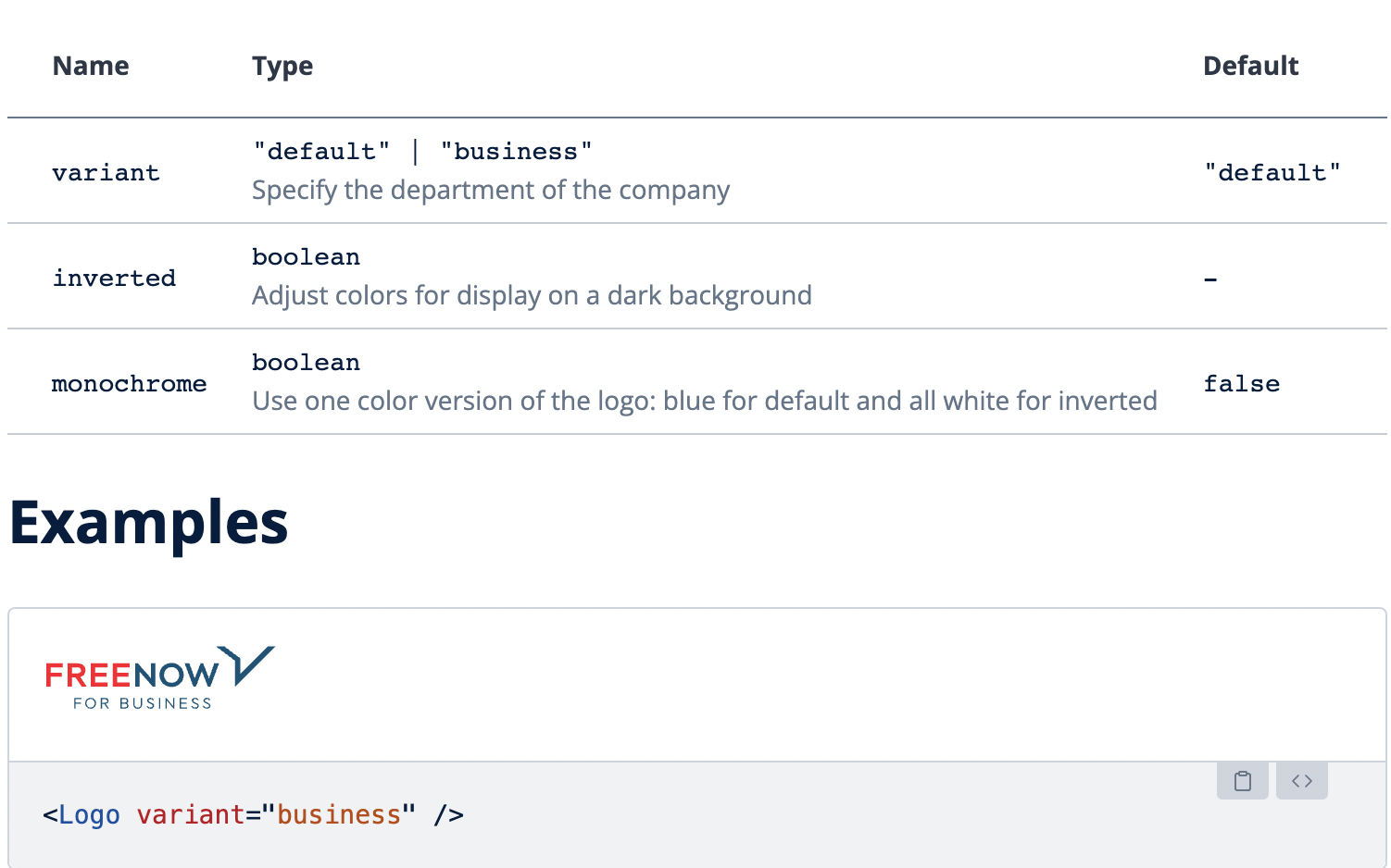
In our current implementation of Logo component, we only have props for changing the variant of logo (default and business), using an inverted or monochrome version.
All of our props are related to the styling of the logo, however, we do not have a prop for dynamically changing the size of the logo, which is quite important ability, but right now we are limited to only a single size (124px X 22px).
This is needed for example on BOMT now, as we are refactoring UI to stop using deprecated @mytaxi/internal-components library, however, we need logo with height of 25px and using the Wave component it doesn't currently allow us to do that.

Docs: https://wave.free-now.com/essentials/Logo
As the logo is created as an SVG, I would suggest to add both width & height optional props to the logo component and allow to manage the size via these props.
Optionally, another strategy could be to create a couple of fixed size variants for the logo (small / medium / big), if we want to fully prevent users of the component from breaking the aspect ratio, in case they don't calculate the ratio between width and height properly.
We need to ask design what are the specs for the logo on their end, should it always have the same size (22px height)? If there are multiple sizes in their Figma we need to adapt our code for them...