Redesign DevTools Settings
It needs visual polish and perhaps some rethinking, reorganizing. Would be great if it could look like a mini version of about:preferences!
Been thinking about this, and here are some ideas:
-
It might be useful to pull one or two essential settings from the Settings page and into the “three dots” menu (or duplicate them). I’ve suggested doing that with the theme choice since we only have light/dark now. It could be a “Dark Theme” checkbox or toggle.
-
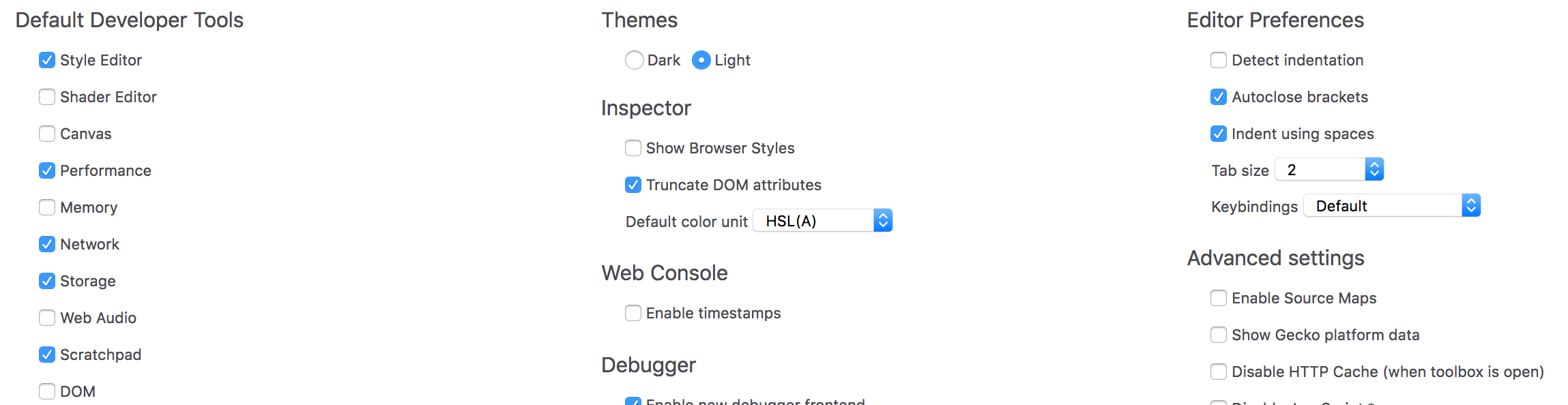
I would merge the “Default Developer Tools”, “Developer Tools installed by add-ons” and “Available Toolbox Buttons”. It should probably be one big list, but easier to navigate thanks to:
- Alphabetical sorting
- Showing each tool’s icon, not just its label
- Maybe “Inspector”, “Debugger” and “Console” should be added to the list, with a way to show that are always on and cannot be disabled
Just a detail, but “Inspector > Show browser styles” should be moved to the Inspector’s Rules panel. There is already a “Show browser styles” checkbox in the Inspector’s Computed panel. Having a similar solution for both, maybe with an icon if we’re short on space, would allow us to remove it from the Settings page.
I also suggested turning “Disable JavaScript” into a toolbox button in bug 1484981 and on Slack, where it was mostly met with approval. ^^
I'd like to provide a little bit more context to this issue.
The current design offers quite a few options that are grouped by some kind of category. However, I do see a few issues with the current approach:
- It's hard to scan
- It's hard to quickly get context for single items, except for when you hover each of them individually
- It's not easy to discover if something has changed or is new
- There is no easy way to narrow down the options e.g. by filtering/searching which makes looking for specific options slow
- It doesn't scale
One approach could be to get closer to about:preferences. Top-level categories could serve as pages, settings be presented as a list per category with optional additional grouping. This would allow us to make better use of the available space, provide more context per setting (also, for example, previews for themes), and scale out towards new sections in the future.
Especially the scaling aspect is important to me. We are thinking about new features that could potentially live in the settings panel (of course we need to check if there are better places individually). Some ideas we have in the backlog are a what's new section, an extra panel to enable experimental features or features that are behind flags (instead of going to about:config), or a section for recommended design & development oriented Firefox extensions.
With the new concept, I'd like us to address these points and really rethink what we have today.
Thanks Florens and Martin, these are all great suggestions. More bonus background info: Here's a redesign created by Helen 3 years ago, made to match the pre-Photon Preferences.
Extra commentary:
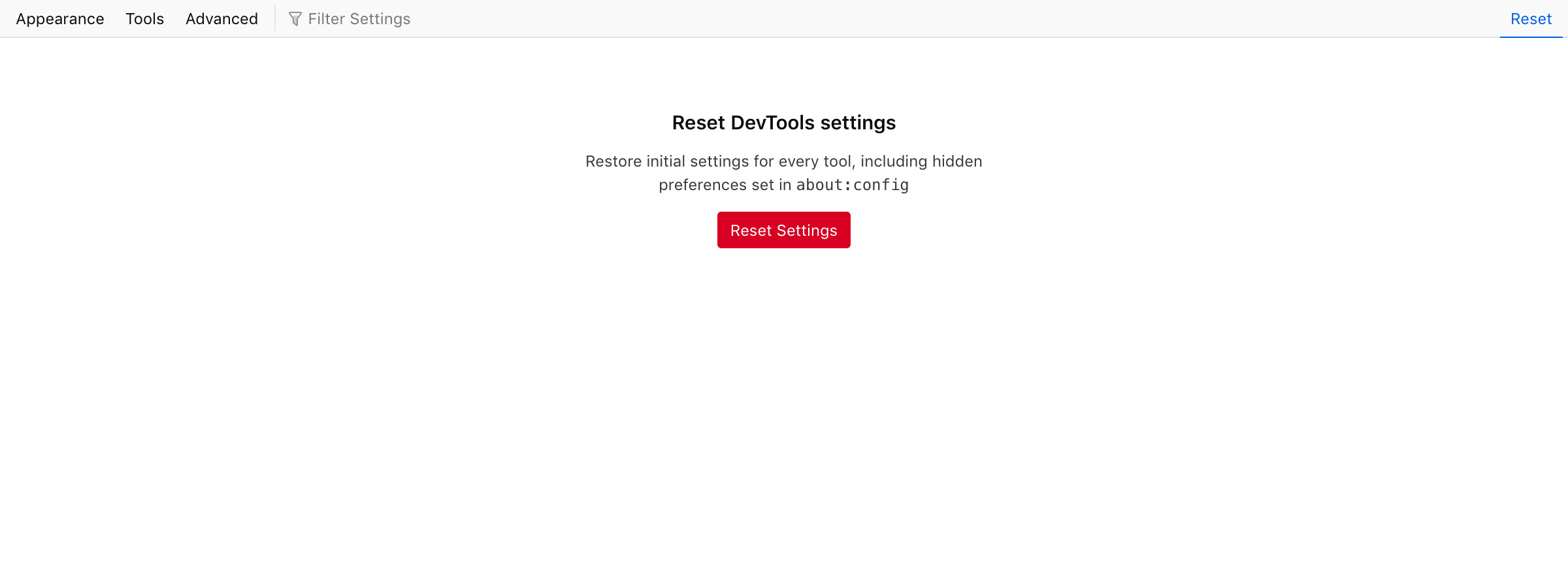
Some people have requested a button to "reset settings to default." Maybe we should do this, but I bring it up primarily to point out the fear people have in changing the DevTools settings and messing something up.
Doing some organizing of settings into a more prominent "most people want to change these" settings and a less prominent (with more explainer text) for "really weird, you gotta know what you're doing before you click this" settings could help
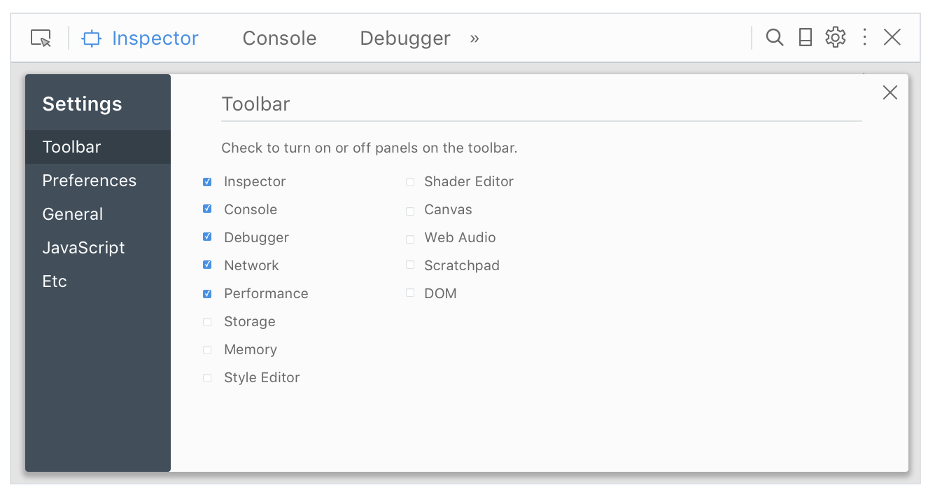
(Also the panel-specific ones really need to be moved into their panels but that's a broader problem for later :). This is what I designed for Console: https://mozilla.invisionapp.com/share/2XEEY0RYA#/screens/263400464)
Hi Florens, were you still interested in working on this? If not, I could try to find another person to give this a try :)
So, I kinda neglected this project, but I definitely want to take a stab at it. I'm going to try to come up with notes / questions / UI drafts in the next two weeks, to get the ball rolling.
Hello @violasong is this issue still available? i would like to take this up. Let me know, thanks!
Hi @ruchikabgosain, we've been discussing it for a bit and I've started a HTML mockup. You can find some info on the #ux channel on Slack but I'll post an update here soon. Any feedback will be greatly appreciated. :)
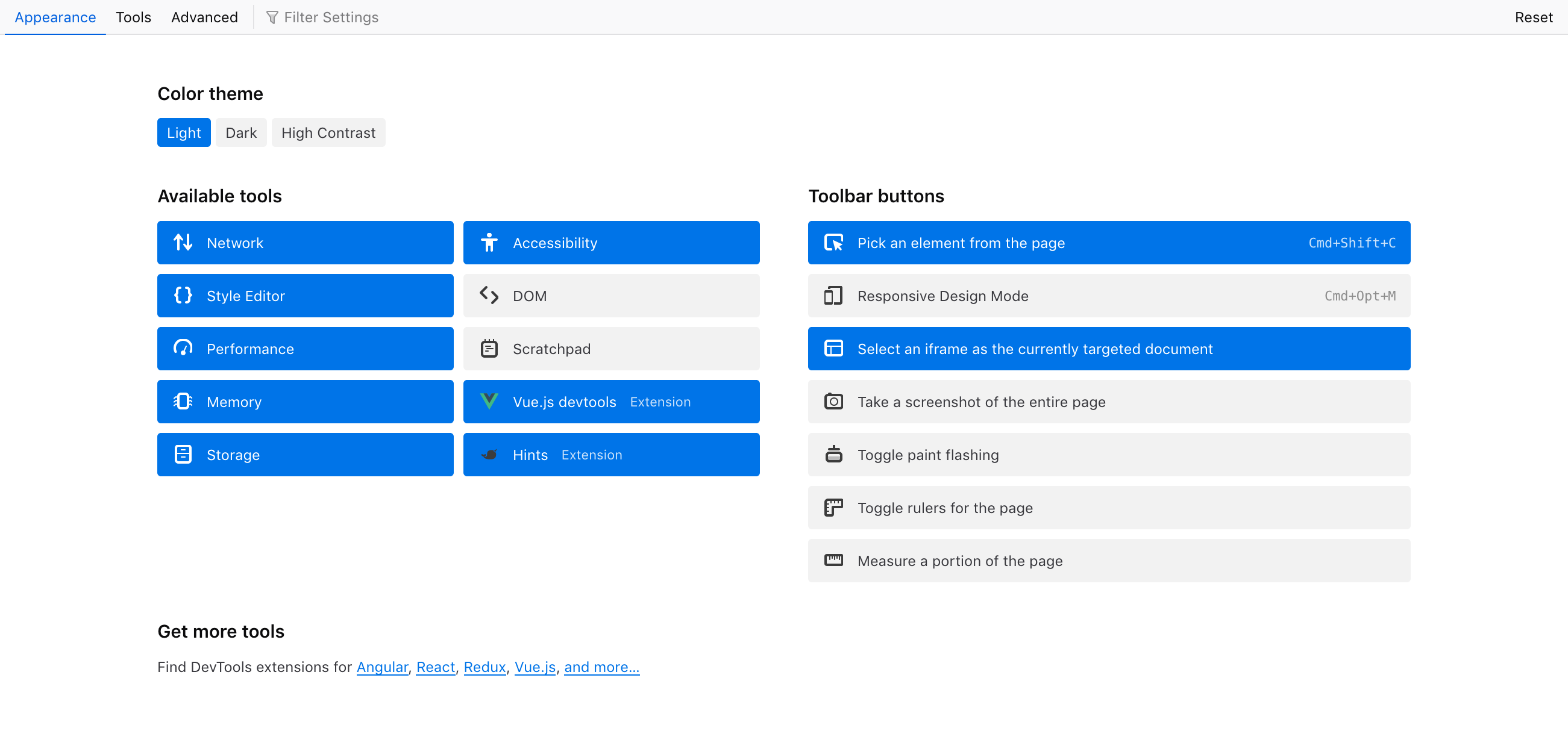
So here are screenshots of what I have right now (it's online as a HTML mockup but Netlify is having a certificate downtime right now, so I'll post it later).
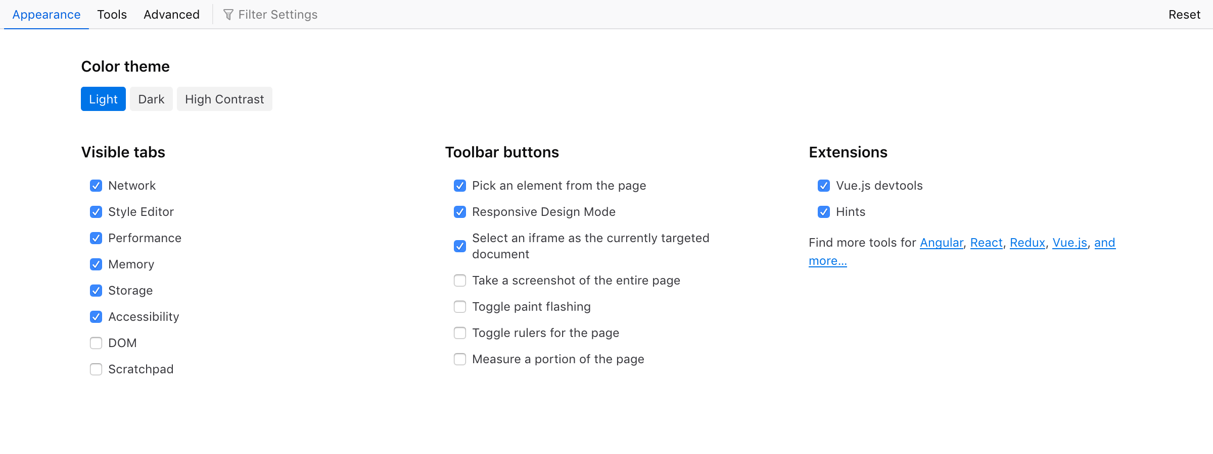
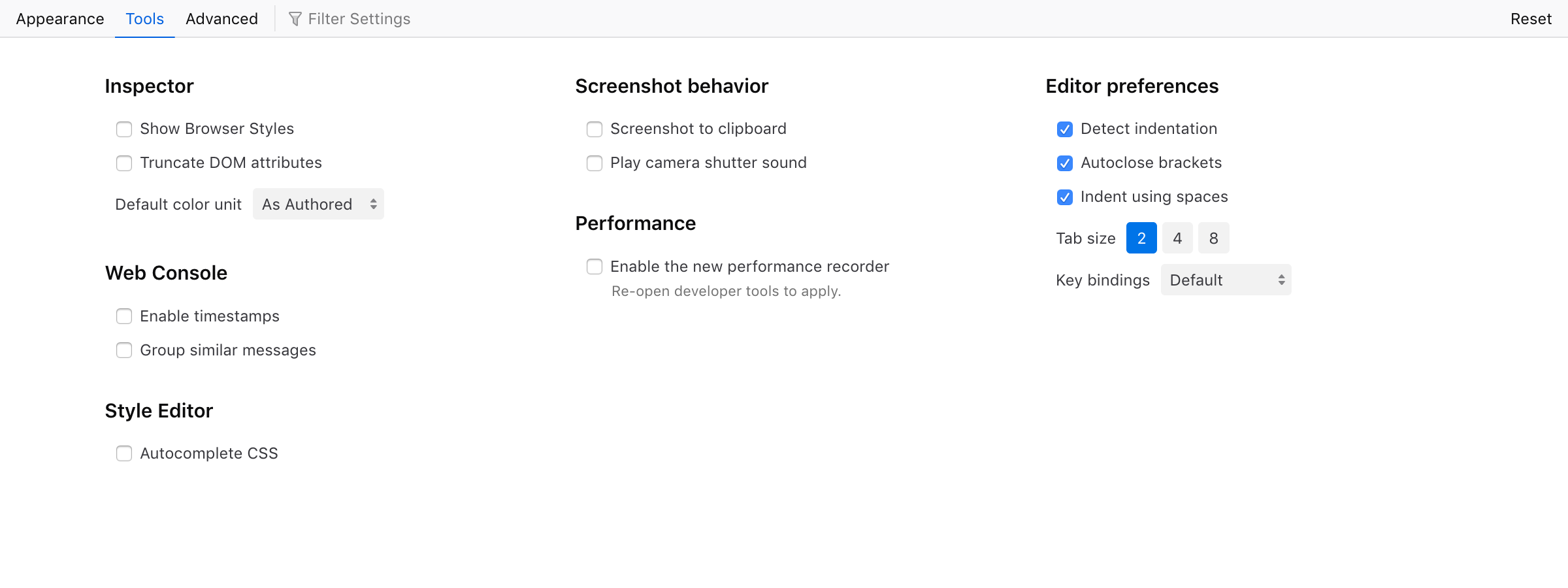
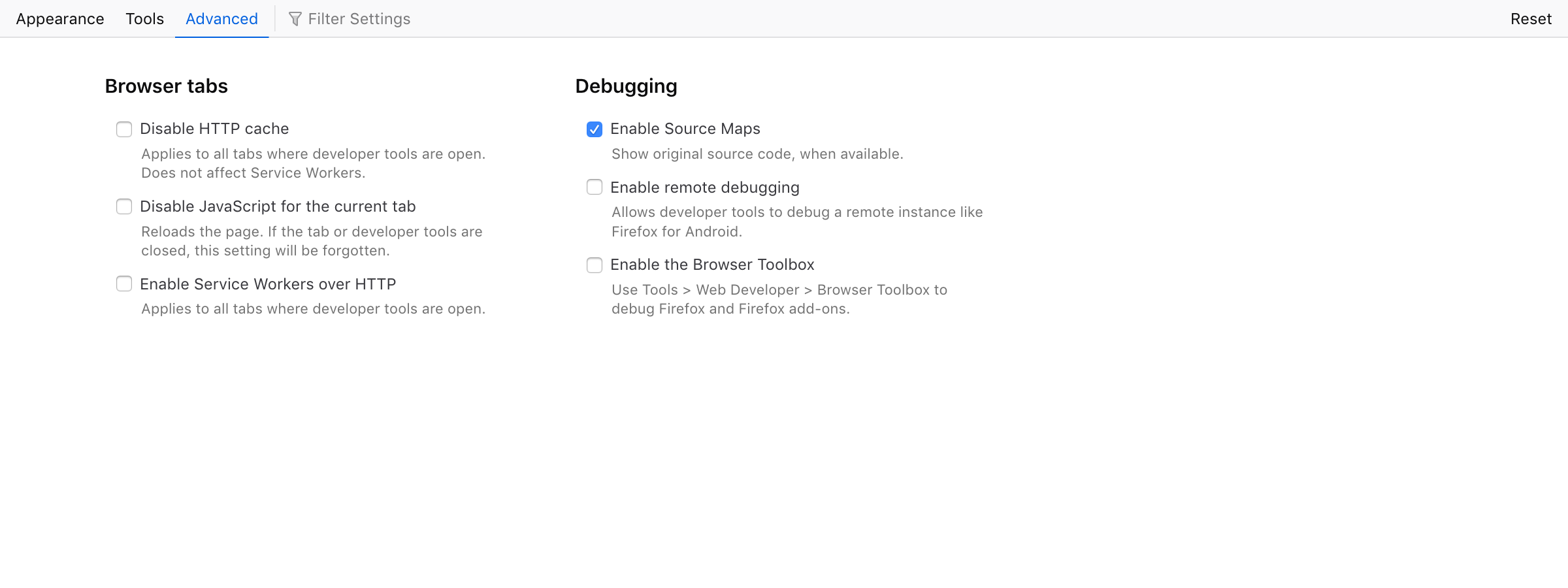
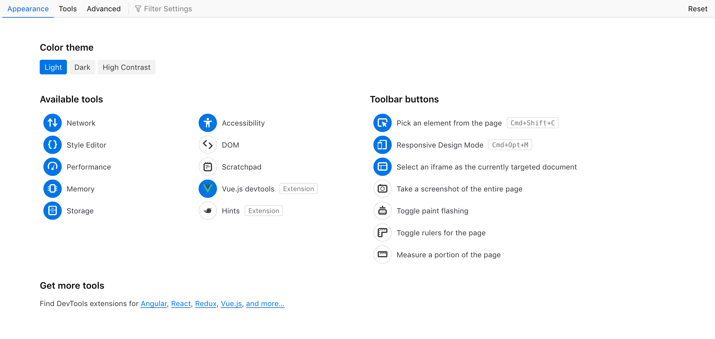
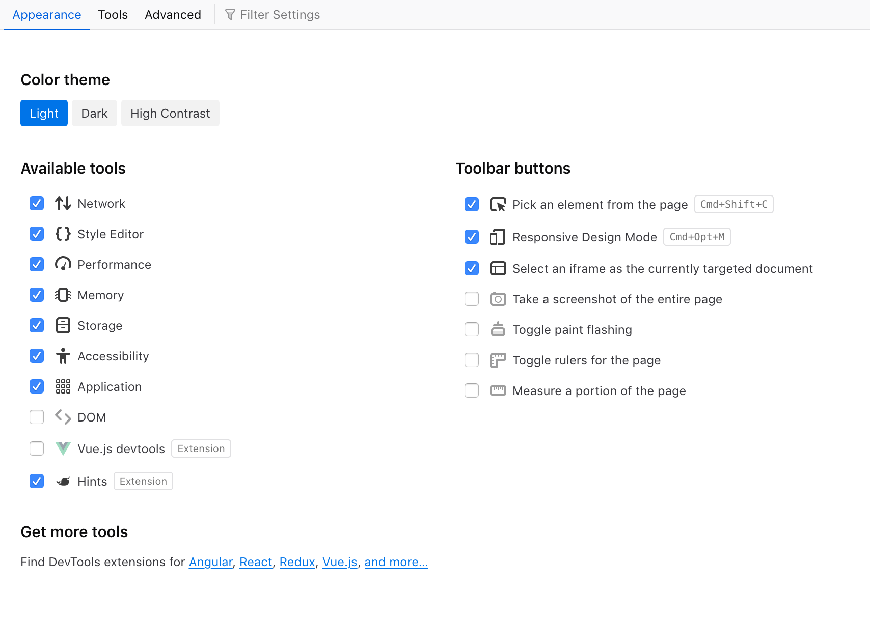
We split the Settings content into 3 tabs, tentatively named "Appearance", "Tools" and "Advanced". I also tried a fourth view called "Reset" to mock-up a reset feature.
My overall approach was:
- Give priority to the "personalization" aspect of settings: changing the color theme, hiding or showing tools. So these are grouped in the first tab, "Appearance", which is shown by default. This feels like a good opportunity to link to some webdev/design extensions on addons.mozilla.org too.
- Give a more readable structure to our remaining options. They're a bit all over the place, with some options only accessible in the current Settings page, some only in a specific panel's UI, and others accessible in both places (e.g. disabling HTTP Cache). My focus was on doing a bit of housekeeping, maybe we can review if all those settings are still useful today (e.g. the Remote Debugging one seems to have zero impact on the new
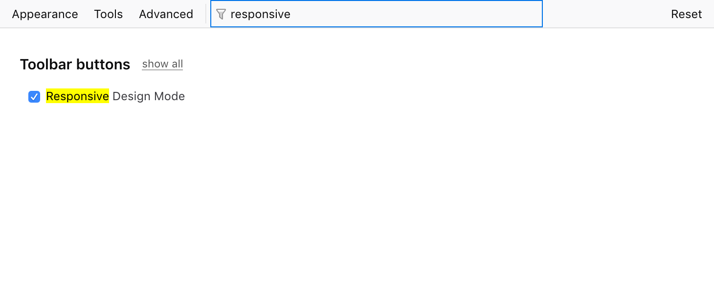
about:debuggingpage). - Allow users to find settings via text search (filtering), to better serve users who have something specific in mind.
Beyond the Settings page(s), we also want to move some preferences into a "doorhanger" menu in their respective panel, like we currently do in Style Editor or in Responsive Design Mode. For example, the Web Console has:
- two options in Settings
- one "Persist Logs" option in its main toolbar We plan to unify that into a single menu in the Console panel.
Netlify seems back up, so: https://fx-devtools-settings.netlify.com/ (Repository is https://github.com/fvsch/devtools-settings)
On the visual side:
- Overall style reuses shared styles (fonts, font-sizes, colors) from other DevTools panels.
- I used a toolbar style for the tabs. @bwinton suggested tabs on the side to be closer to the Firefox Preferences page, so I'm planning to try that next.
- I want to use a richer visual style for the toggles in the Appearance tab; reuse tool icons, maybe use icons for the light/dark themes (@violasong wanted a sun and moon); see if we can make it a bit more attractive.
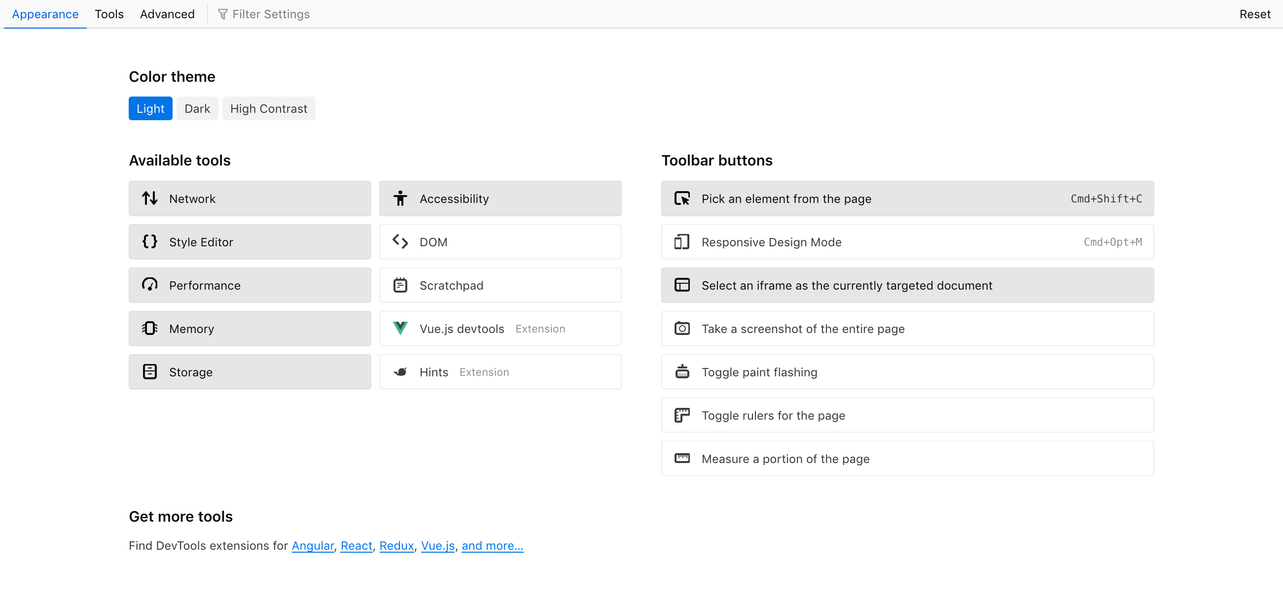
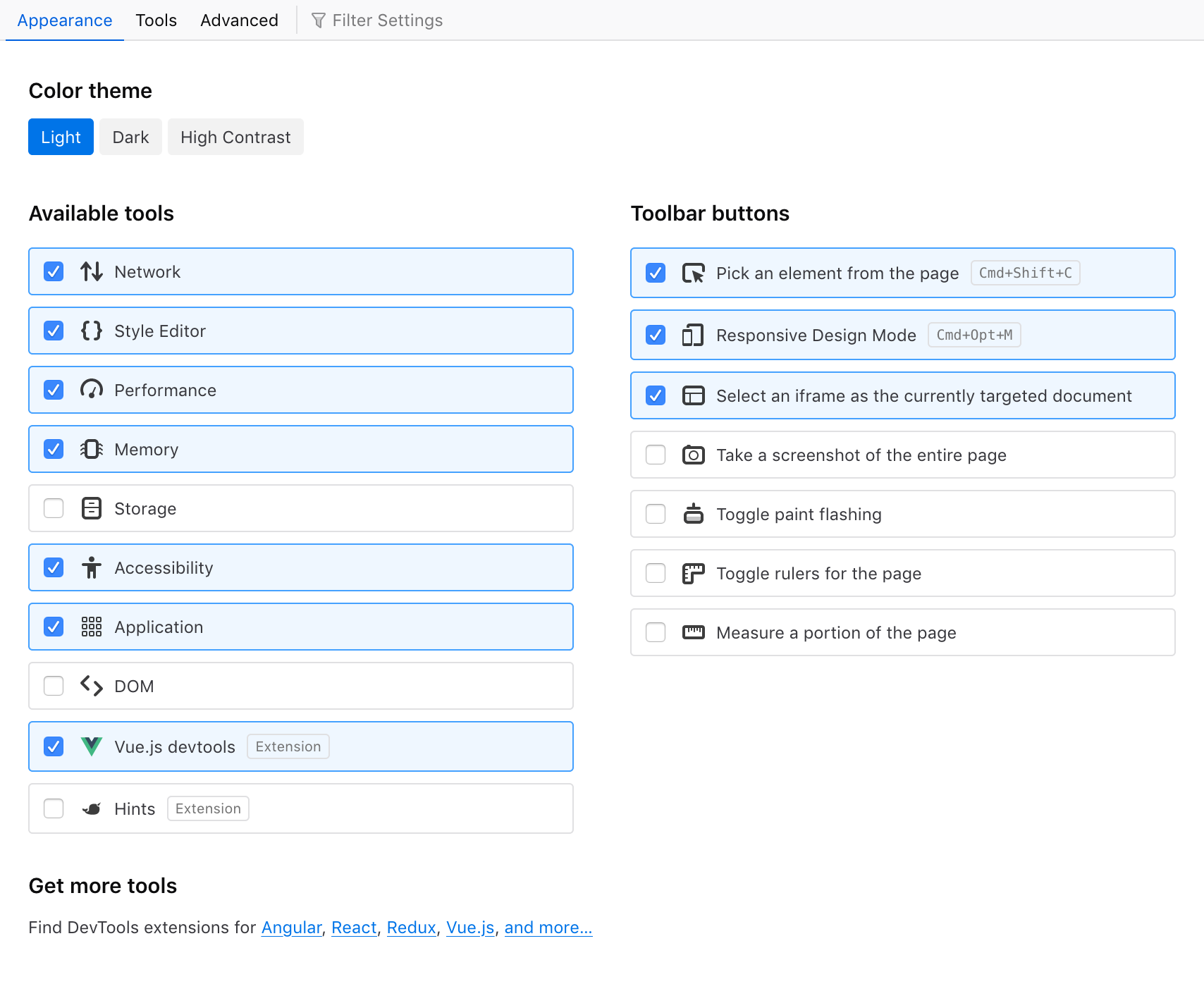
Here's a possible look for the Appearance tab, using each tool's icon as a kind of checkbox. I've tried half a dozen variations, including more blocky "button" looks that encompasses the icon and its label, but this is the option that worked best with short and long labels.
More button-y or blocky looks looked like:
Very nice variants!
Re: 1: Styling the icon for checked state is a neat way to combine the two visually, but I think it might be a bit confusing for this UI since they aren't directly on/off badges in the usual sense (e.g. in DevTools toolbars, this would change a mode or begin use of a tool). Rather they are settings that change something elsewhere (adds the item into the toolbar). So maybe it benefits from a bit of extra help, like a checkmark or switch-type visual.
Re: 2/3: The blocky style reminds me of this part in Preferences. I think a subtle colored background with the addition of a checkbox as the main marker could be nice. I guess the tradeoffs of this style are: Makes the hitbox feel immediately very big and easy to hit, but it is a little heavy-looking in this situation with fairly compact labels. (The hitbox actually doesn't work this way in Prefs - it's only the top 30px of the rectangles - but I'm assuming ours would.)
I'm curious about making the three columns the same width - we could shorten some of the toolbar button descriptions (which would be nice either way):
- Select element in page
- Select iframe as current target (or Target iframe)
- Take full screenshot
- Show rulers
- Measure in page (probably could be something better)
One way to organize the columns could be 3 matching columns with: Tools | Toolbar Buttons | Extensions (empty at first)
It's a bit similar to the solution for RDM settings, with Custom as an initially empty column at the end
Oh haha whoops, I just realized you styled it this way in your original design :).
I can understand why you changed it, but I guess the different-looking columns feel a bit odd to me.
@violasong Trying a blocky style inspired by Preferences. Kept the native checkbox, but bumped its size to 16px (from a 13px on macOS, I think it's 14px by default on Windows and 16px on Linux).
A more minimal style allows us to show a bit more content in a shorter space. We would be using the same style as for "checkbox" rows in other tabs, just with an extra icon.
- hover: light gray background
- disabled: icon set to 50% opacity
Pushed an update to https://fx-devtools-settings.netlify.com/ with tabs in a sidebar and a few content changes. Note: see with Firefox please, Chrome is missing some CSS support.
Looks awesome! Love the theme buttons and hover styling. The only thing I'm not sure about is the graying out of the icons that are turned off. I think the checkbox is a strong enough signal that having the much subtler signal happening at the same time seems a bit distracting.
Awesome work!
Couple of comments:
-
The
get more toolslink at the bottom should point to: https://addons.mozilla.org/en-US/firefox/collections/4757633/webdeveloper/ (this is the link we user for theTools -> Web Developer -> Get More Toolsmenu Not sure about the specific extension links, perhaps just link to the Extension-list we could be enough. -
When clicking on one of the Color theme buttons the focus rect is unnecessarily too wide The same for checkbox-labels. Not sure if this is a feature or bug
-
Agree with Victoria, the icons doesn't have to great out.
Honza