Misleading times displayed in the flame graph, should show number of samples instead
Profile: https://share.firefox.dev/341Msw7
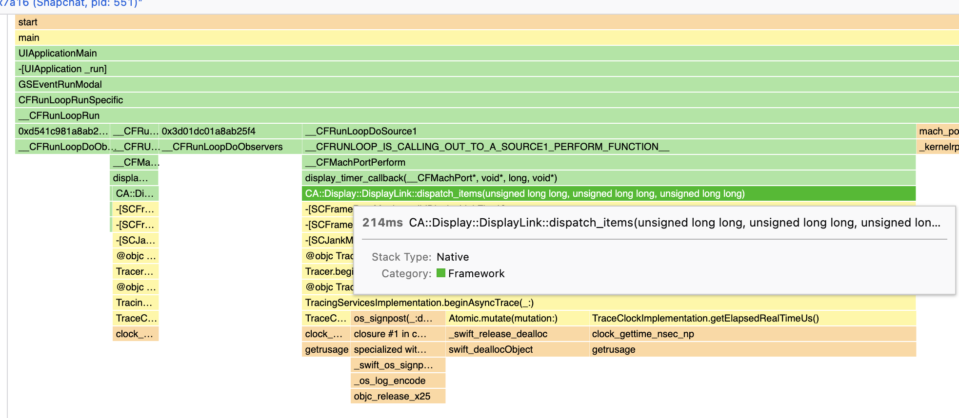
This is a profile where the profiler was not able to obtain a lot of samples. When hovering over boxes in the flame graph, I see some very large times displayed. It seems these times are computed by multiplying the sample percentage with the duration of the selected range? That's rather misleading. Let's display the raw sample counts instead.
Steps to reproduce:
- Load the profile. https://share.firefox.dev/341Msw7
- Hover the function NtGdiDdDDIMakeResident (in the middle at the top).
Expected results: The tooltip should display "22 samples (13%)", just as in the call tree.
Actual results: The tooltip displays "4,053ms (13ms)".
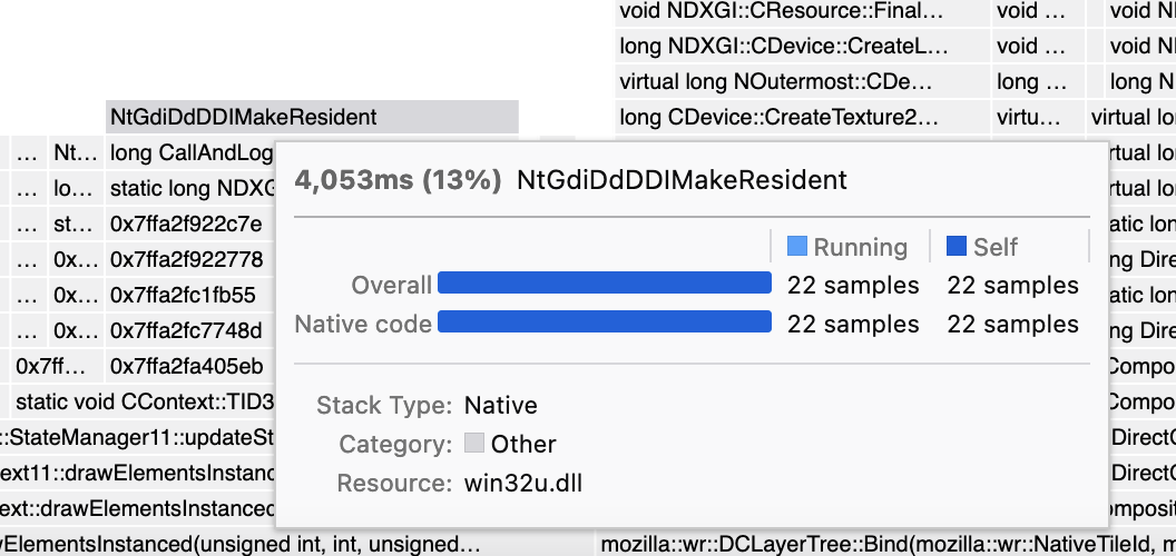
Oh, I just saw that it actually does display the sample count in a table further down in the tooltip. This makes this problem less severe. Still, I think presenting the "made-up times" in the most prominent place is misleading, and it would be better to display the number we know (sample count) first.
I don't think this is ready to be worked on just yet. For now it's just my opinion; I would like to get input from others about how this problem should be solved.
I don't think this is ready to be worked on just yet. For now it's just my opinion; I would like to get input from others about how this problem should be solved.
Okay. I'll be waiting
I kinda like the times there, especially because this lets the Flame graph show values that match the Stack chart. But I understand your concern. I wonder if it would work if we included something giving a hint about the level of confidence people should have in the number, maybe something like "80% of samples missing in this interval"
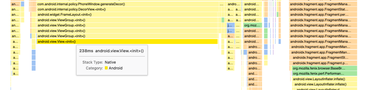
I ran into this problem and it makes me question whether I know how to interpret the profiler or not. In particular, I noticed the flame graph visualization appears to be generated from the number of samples taken for a given function while the stack chart visualization is generated from the duration of the calls. For example, in my profile https://share.firefox.dev/3caTNy7, here's the flame graph:
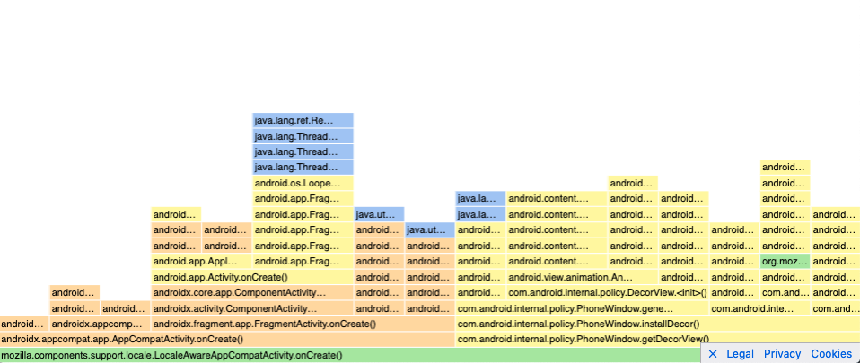
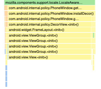
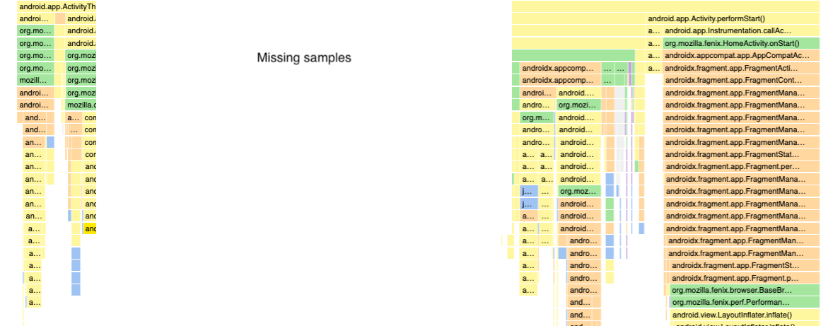
And here's the associated stack chart:
This leads to some questions: why are they generated differently? Is one visualization more representative/trustworthy than the other and if so, which one? How is the call tree generated?
My underlying assumption is that the duration is considered trustworthy but, if that was true, I'd expect the solution to this problem would be to generate the flame graph from the duration to make it consistent with the stack chart and both representative of what the user experiences. However, the proposed solution is to use the sample count instead – which is not a user metric – which calls my assumption into question and thus how I interpret the profiler results.
Given my confusion, I think addressing this problem may make the profiler more intuitive to use so it seems like it'd be worth addressing sooner rather than later.
I ran into this problem and it makes me question whether I know how to interpret the profiler or not. In particular, I noticed the flame graph visualization appears to be generated from the number of samples taken for a given function while the stack chart visualization is generated from the duration of the calls.
That is correct, almost - the stack chart is generated from sample data, but taking into account each sample's timestamp. It makes a guess at the duration of the calls, but it can't know what functions ran between two samples.
For example, in my profile https://share.firefox.dev/3caTNy7, here's the flame graph:
Ok, wow, this is extra confusing in this particular profile because of two issues:
- Large gaps between samples. You can see the gaps if you switch from "Categories" to "Stack height".
- The "focus on function" transform. This filters out samples and confuses the charts even more.
This leads to some questions: why are they generated differently? Is one visualization more representative/trustworthy than the other and if so, which one? How is the call tree generated?
- The flame graph is an "aggregate" view, like the call tree, and discards the sequence of time.
- The stack chart shows what happens over time.
The call tree and the flame graph are generated in the same way. The only difference is that the call tree does not show the "guessed times" that I filed this issue about, it only displays sample counts. So the sample counts that are displayed in the flame graph and in the call tree should be identical.
Both charts exist because they answer different questions. You use the flame graph or call tree to answer "How much time did we spend in a particular stack over the entire profiled duration?". You use the stack chart to see "What was the order of operations, and how much time passed before and after a certain landmark?".
Both charts work a lot better if they are applied to good input data, i.e. samples which were obtained at a consistent and quick rate.
When you have data with large gaps, here's how you get the "raw truth":
- Switch to the "Stack height" view and to the call tree tab.
- Remove any call tree transforms, such as focus function.
- Click each blue bar in the timeline individually, and see which stack gets selected in the call tree. This is the stack that was captured at that time.
This still leaves the question for how these charts could be made less confusing when the data has large gaps. I'm not sure how to answer that, and I will give it some more thoughts.
You could determine some heuristic for adding notices to the leaves of the stack timing. The android example is a really pathological example.
Samples:
A A A  A A    A                                           A  A A A
B B B  B B    B                                           B  B B B
C C C  E E    F                                           G  G G G
D D D

Stack Timing
[A---------------------------------------------------------------]
[B---------------------------------------------------------------]
[C------][E--][F-----------------------------------------][G-----]
[D------]     [/!\ Missing samples detected--------------]
This could be combined with a bit more information in the tooltip.
A healthy rate of sampling:
---------------------------------------------------------|
| 22ms mprotect                                          |
| -------------------------------------------------------|
| Stack Type: Native                                     |
|   Category: Android                                    |
|    Samples: _   _     _   _            _        _   _  | <- Draw a samples spark graph
----------------------------------------------------------

A pathological rate of sampling:
---------------------------------------------------------|
| 238ms [/!\ Bad Sample Rate] android.view.View.<init>() | <- Add a bad sample rate warning
| -------------------------------------------------------|
| Stack Type: Native                                     |
|   Category: Android                                    |
|    Samples: _                                          | <- The spark graph only has 1 sample
----------------------------------------------------------
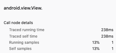
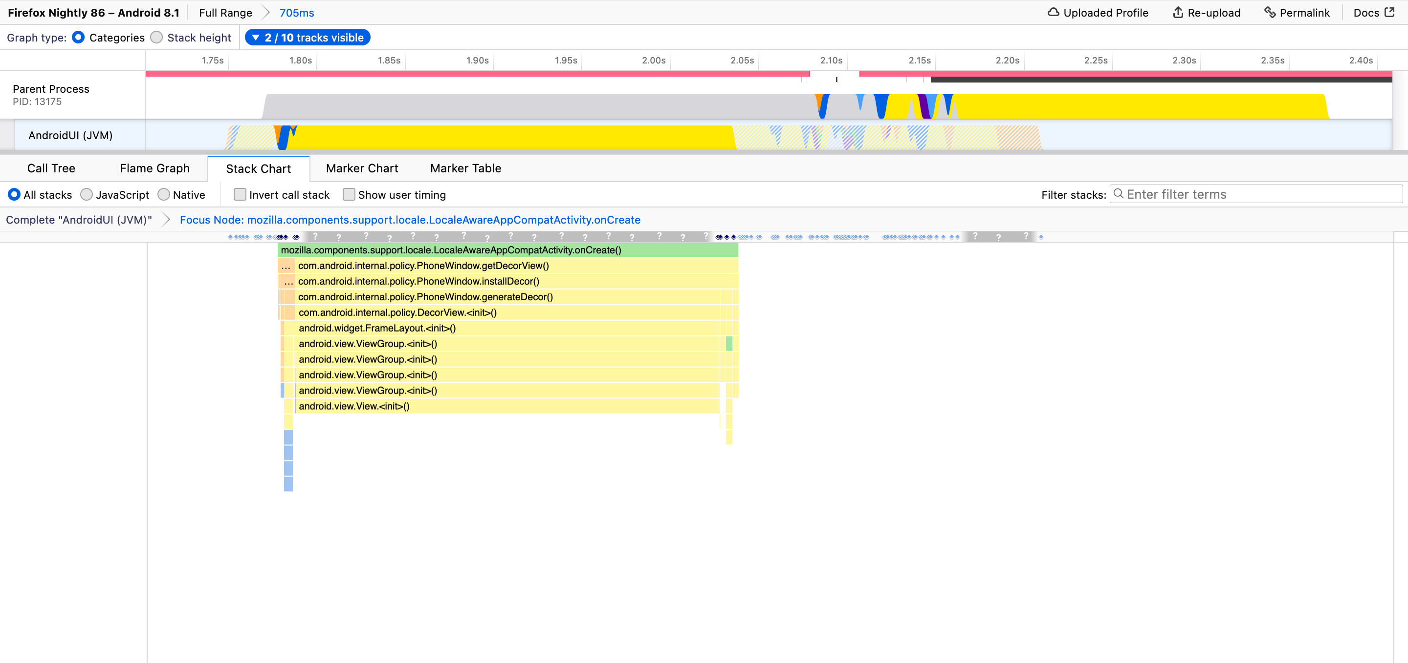
I think I've discovered where my confusion comes from: the method call that claims to take 238ms has only a single sample but, as a user, I would not expect a single sample to be able to produce a duration, especially not an extremely large one.
I assume the durations are calculated by the difference from the current sample's timestamp to the next sample's timestamp but I'm concerned that this can produce extremely misleading durations if the sample rate is inconsistent. The problem I'm seeing doesn't just affect the flame graph – this problem affects all calculated durations including the stack chart. In this same profile, we see View.<init> looks like it's taking a long time.
In reality, we're just missing data so instead I'd expect something like:
General concern
If you happen to get a profile that has an inconsistent sampling rate, I'm concerned that to successfully interpret the durations of the profiler as currently implemented (which I think is the intuitive way to read it), you need to already be aware of the problem I mention above, somehow notice the profile has an inconsistent sampling rate, and interpret the profile accordingly. This can make the profiler very misleading for an average user (e.g. non-perf team member) who may not be aware of these issues or even an experienced profiler user who overlooks the sampling rate.
I'm also concerned that this problem may manifest itself more frequently on mobile where devices are more resource constrained such that guaranteeing a consistent sampling rate is more challenging.
In practice, I don't know if it's practical to implement the profiler with this in mind or if it'd become misleading in other dimensions. Sorry if this is off topic to the original issue as filed – I'm not sure if they come from the same root cause or not.
@mstange Any thoughts?
Ah, it's nice just removing the drawing on the stack chart.
Stack chart with a gap:
[A----------------]                                       [------]
[B----------------]                                       [------]
[C------][E--][F--]                                       [G-----]
[D------]
Stack Timing with an annotated gap:
[A----------------][Missing samples----------------------][------]
[B----------------]                                       [------]
[C------][E--][F--]                                       [G-----]
[D------]
Maybe the "traced timing" could be capped, so if the sampling gap is n * sampling rate, then it will be treated as a gap. Where n is some scalar value like 3.
This is where the sidebar computes it: https://github.com/firefox-devtools/profiler/blob/0d98b6b6bd0e82d03560f64d49cee276da6d021f/src/profile-logic/call-tree.js#L628
And here is where the stack timing is computed: https://github.com/firefox-devtools/profiler/blob/6b0146209d963aaa1154a9777b71a9125f5b822b/src/profile-logic/stack-timing.js#L90
You could measure the sampling rate gap, and adjust things accordingly. It would definitely be easier to just add a gap. Otherwise you could add a new frame label to one of the derived threads.
+1 to change times into sample counts in both the Flame Graph and the Stack Chart. A fairly regular user of the Profiler just made the error of thinking that a particular action was taking a full 1ms, when it was in fact only seen in one sample.
I think the main culprit is that tooltips show times as the first thing at the top left, so it's difficult to ignore them! As Markus originally suggested, we should switch to the number of samples.
But having an idea of the time scales involved may still be useful or familiar to some people, so we could keep times, but make it very clear that they're only based on sample intervals and not actual call durations. E.g., at a minimum:
22 samples (13%) taken over 4,053ms
And to address concerns over irregular sampling rates and gaps, if we could detect them we should show a warning like:
⚠ Sampling interval much higher than requested 1ms: Average 184ms, up to 930ms. Measurements may be unreliable!
Is the proposal suggested here something that's already supported?
I'm working on converting Instruments into Gecko format (https://github.com/benjaminRomano/instruments-to-gecko). For the time profiler data collected, the sampling frequency is 1ms. This is encoded as a "weight" per sample.
When converting to Gecko, I noticed that the timings in the stack chart are incorrect in comparison to Instruments view. This is due to no samples being collected on the main thread for large periods (probably the thread is off-cpu).
I can workaround this for the time being by checking if the time since last seen event on the thread is greater than the weight and if so insert a dummy stacktrace; however, I'd expect there'd be a better way to achieve this.
I suspect this capability will also be helpful for simpleperf on Android when running without --off-tracecpu.
ref: https://android.googlesource.com/platform/system/extras/+/master/simpleperf/scripts/gecko_profile_generator.py
Side Note: Right now, the Instruments to Gecko converter has to manually de-obfuscate stacktraces and requires kdebug events to be included in the Instruments file (only true when collected from process startup). With XCode 14.3, these limitations are addressed assuming the Instruments file has been desymbolicated using xctrace symbolicate. I'll be pushing up changes for that later this week. That'll enable all instruments files to be converted into Gecko 😄
Ah, that's interesting! No I don't think we have worked on implementing this yet. We show the sample data in this thin blue line below the category graph in the timeline, I guess we could show something similar in the stack chart too.
On the more general topic, how big a missing samples gap should we consider a gap? would (5*interval) be reasonable?
Or would Gerald's idea of using this text in the tooltip (22 samples (13%) taken over 4,053ms) be good enough?