 firebase
Custom Style for Privacy Policy and TOS links
Is there a way to customize the colors the links for the privacy policy and TOS links? Based on the code in the preamble handler in version 4.3.0. It is using the primary color, and I'd like to change just the links without changing all of the other elements within the library that rely on the primary color. Could this be given it's own style and default to primary color?
@neuhoffm this would be possible, could you provide a screenshot of how it looks in your app and why you'd want it to be different?
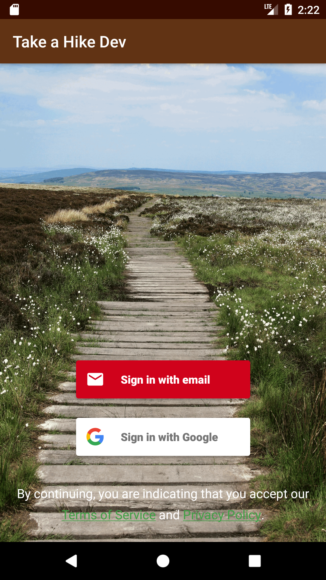
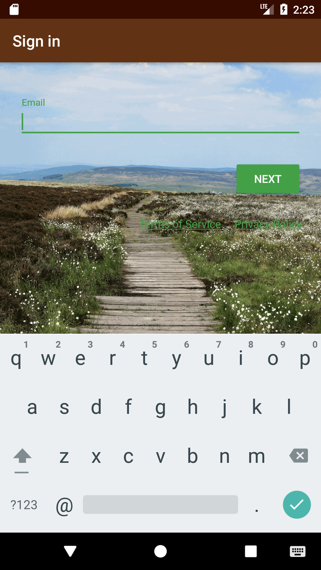
@samtstern definitely. I've included screenshots of both the auth selector screen as well as the beginning of the email flow. With a custom background, the individual links don't have enough size to them that allows them to be seen easily. Alternatively, if it would be possible to supply my own pp&tos footer, that could certainly be an option as well. Thanks!
@neuhoffm thanks for the screenshots! I can see why you need this now. Although I am wondering how you got your custom background in place? Just by overriding styles?
You got it! That's also how I was able to set the non-link text in the auth picker to white.
  <style name="LoginTheme" parent="FirebaseUI">
    <item name="android:windowBackground">@drawable/login_background</item>
    <item name="android:textColorTertiary">@color/colorWhite</item>
  </style>
Marked this as a feature request. In a future release I can add a style for the ToS/PP text. However this is a "handshake deal" as we don't consider our styles part of our API surface and if I was to break the style contract in a future release that would not be flagged in release notes.
Thanks! So to clarify what you mean is it's a feature request and if it's implemented it could change without being called out in the release notes, so I'd want to do additional testing when I upgrade to a new version of the library?