perspective

perspective copied to clipboard
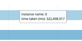
More readable styling for chart tooltips
Feature Request
Description of Problem:
When looking at tooltips on charts, the decimal point between floats are unclear and hard to read at a glance:
Potential Solutions:
Tooltips should be styled with a clear differentiation/highlight on the number, or the bold styling should be removed as it seems to (at least for me) hinder quick at-a-glance readability.
I am new to the open-source world, so can I take this issue. Also, I just need to add monospace font for the hypergrid, right?