 facebook
Content shift when collapsing or expanding the sidebar
Have you read the Contributing Guidelines on issues?
- [X] I have read the Contributing Guidelines on issues.
Prerequisites
- [X] I'm using the latest version of Docusaurus.
- [ ] I have tried the
npm run clearoryarn clearcommand. - [ ] I have tried
rm -rf node_modules yarn.lock package-lock.jsonand re-installing packages. - [ ] I have tried creating a repro with https://new.docusaurus.io.
- [ ] I have read the console error message carefully (if applicable).
Description
The displayed portion of the content changes visually when switching between the collapsed and expanded states of the sidebar. When I collapsed and then expanded sidebar at the bottom, the page display jumps from the bottom footer to the content section.
Reproducible demo
https://docusaurus.io/docs/deployment
Steps to reproduce
- Navigate to: https://docusaurus.io/docs/deployment
- Scroll to the bottom
- Collapse the sidebar
- Expand the sidebar
- Try 3 and 4 multiple times (You can notice the vertical shift of web page content)
Demo
https://user-images.githubusercontent.com/68207314/183418074-48a76574-e194-4b02-b7e0-e2dbf93c7d29.mp4
Expected behavior
No content shift when collapsing or expanding the sidebar
Need more expected details from the development team cc @Josh-Cena
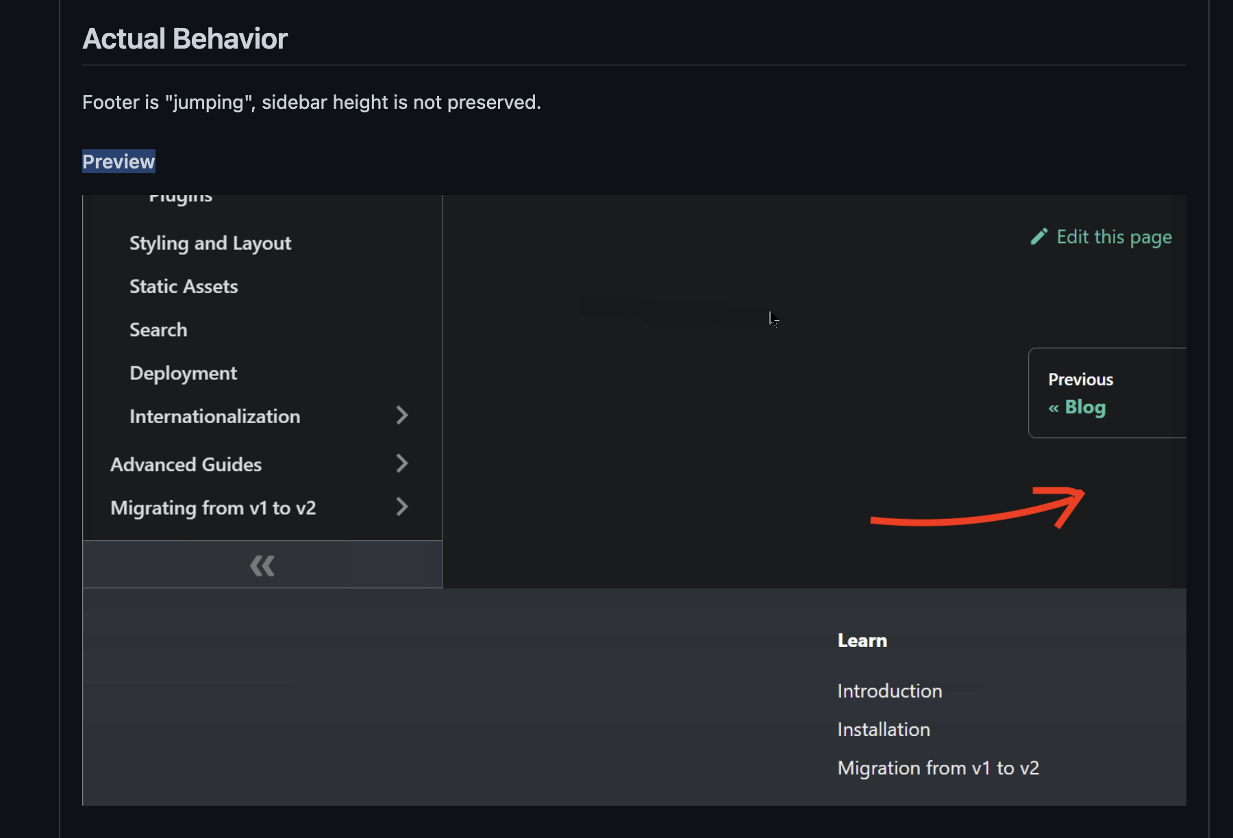
Actual behavior
Before the sidebar is collapsed, the page is at the bottom, but after the sidebar is collapsed and expanded, the page will jump to the Deploying to Layer0 section.
Your environment
- Public site URL: https://docusaurus.io/docs/deployment
- Docusaurus version used: 2.0.0-rc.1
- Environment name and version (e.g. Chrome 89, Node.js 16.4): Chrome
- Operating system and version (e.g. Ubuntu 20.04.2 LTS): Windows
Self-service
- [ ] I'd be willing to fix this bug myself.
Wait, it doesn't seem like a duplicate to me @slorber
https://github.com/facebook/docusaurus/issues/4415 is about when the main page container is shorter than the sidebar, in which case collapsing the sidebar would shift the footer up—but the page's scroll position stays the same. This one requires making the sidebar height be taken into account (i.e. keep rendering its content outside the viewport; see my demonstration in https://github.com/facebook/docusaurus/issues/4415#issuecomment-1094180496)
In this issue, the main container is much taller than the sidebar, and when you collapse and then expand the sidebar, the page actually scrolls up due to layout shift.
https://github.com/facebook/docusaurus/issues/4415 is about when the main page container is shorter than the sidebar
The example page is https://docusaurus.io/docs/markdown-features and the content is not smaller than the sidebar. If you fix the container width to something like max-width: 1000px !important the issue is solved and there's no more shift. The footer shifts up because the container height changes due to line wraps.
I'm confused, please give me concrete examples:
- which problem can be seen on which page exactly
- which problem can't be solved with
max-width: 1000px !improtant?
I think what you want to say is that we have a problem when the content is really small, such as in https://docusaurus.io/tests/docs
However afaik both issues are not about this case. Both example pages are using long-enough content pages:
- #7918 => https://docusaurus.io/docs/deployment
- #4415 https://docusaurus.io/docs/markdown-features
So, what I understand is that this issue is a duplicate, but you found another edge case to solve?

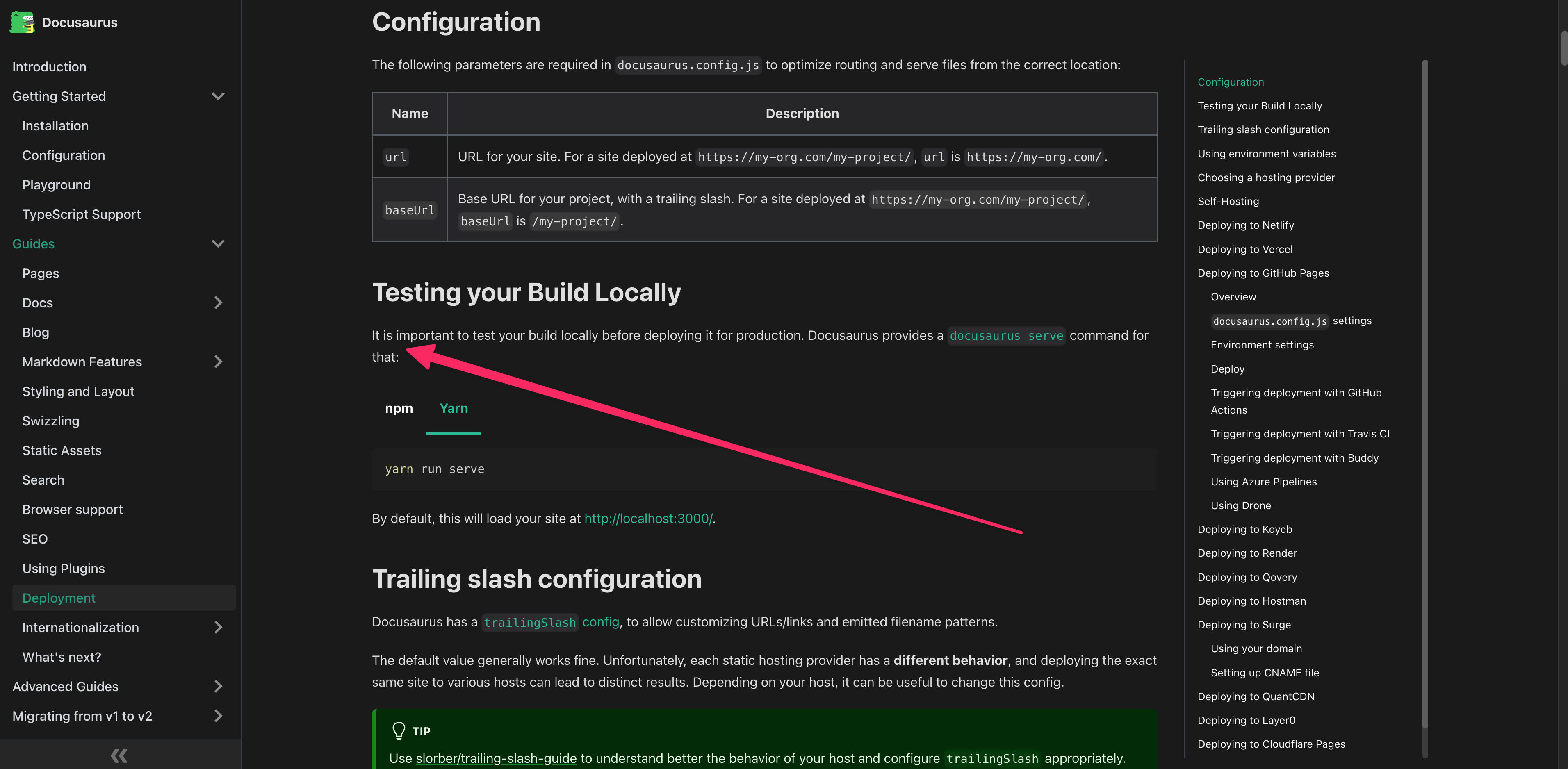
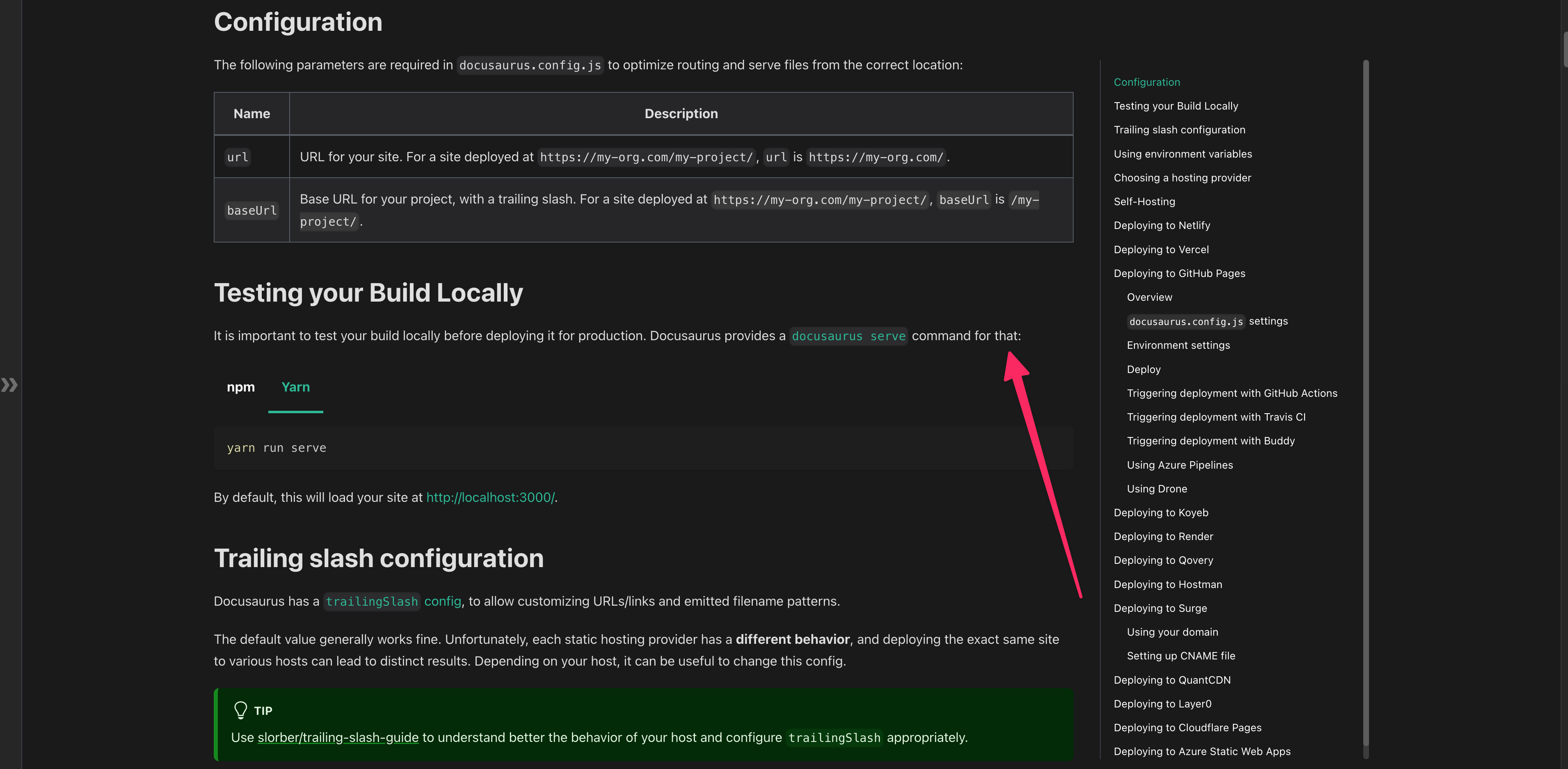
I don't think I was misunderstanding https://github.com/facebook/docusaurus/issues/4415, but it requires your screen to be taller than usual it seems. When you look at the preview GIF, before the collapsing, the bottom margin is larger than usual:
This corresponds to the case when the page is too short. In fact, one year and a half ago the Markdown features page was indeed much shorter: https://deploy-preview-4416--docusaurus-2.netlify.app/classic/docs/markdown-features
Still, I had to set my browser zoom level to 75% to reproduce that.
I see now 🤪 thanks for clarifying. The markdown page content has changed from smaller to taller.
So I'm going to move my comment here and remove it from the older issue. 👇👇👇
This behavior is because we toggle from max-width: 1320px to max-width: 1440px
Changing the dimension of the content container leads to some lines wrapping, leading to the layout shift. It's not the sidebar that changes height, but rather the scroll container that changes dimensions as we toggle the sidebar.
You'll notice that the layout shift is more important on larger docs, and at the bottom: this is just because there are more lines wrapping above :)
In the end => larger container VS no layout shift: you can only pick one of those.
I'd say the layout shift is a minor annoyance and usually we want to expand a bit the content container when more space is available.
Technically we could keep the same container size for large desktop screens, but for mobile we absolutely want to increase that container width anyway.
It wouldn't make sense to collapse the sidebar and still keep a small content container (< 500px in the screenshot above).
What I mean is: layout shifts are expected to happen, on purpose, because we want to expand the length of the lines
If you want 0 layout shift, I'd say it's your responsibility to ensure the content container keeps the exact same size. You can do that with CSS. I don't think we'd want Docusaurus to do that by default.
Now, a possible solution to mitigate this layout shift, particularly on very large documents where the layout shift can be significant (like the bottom of our deployment page)
- take some content node in the middle of the screen
- ensure it keeps the exact same viewport position after we have resized the container
Note we already do something similar when switching tabs (cf https://github.com/facebook/docusaurus/pull/5618), that can also produce layout shifts, and have some util already:
const {blockElementScrollPositionUntilNextRender} = useScrollPositionBlocker();
This won't prevent new line wraps in the visible viewport. Not even sure it's worth implementing this.
Is this layout shift a big deal in the first place and annoying some real users?