Accent colour in the volume slider
Problem
In the sound indicator, the volume slider uses a greyish colour as shown in this image on elementary 5:
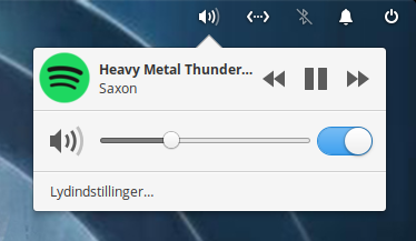 It is distinguishable enough on the light theme in elementary 5, but in the early access of elementary 6.0 that volume slider kind of blends into the dark theme, it probably depends on the quality of monitor, but on my old laptop where I tested the early access, it was hard to make out (didn't manage to get a screenshot of this before wiping)
Proposal
I propose the volume slider uses the accent colours you select yourself during the first time run of elementary 6.0.
Prior Art
I suck at making mockups but it would be something akin to what's done i Cinnamon:
I’m gonna transfer this to the stylesheet so we can look at doing this for all scales and not just here in the panel. I believe the accent class already works for scales, but if it’s not too visually disruptive it could bring a nice pop of color to always use accent color for them
Hm, not super opposed. If people want an accent-color-free experience, they can choose Slate. ;)
Is this issue resolved? I am looking for some beginner friendly issues to contribute to.