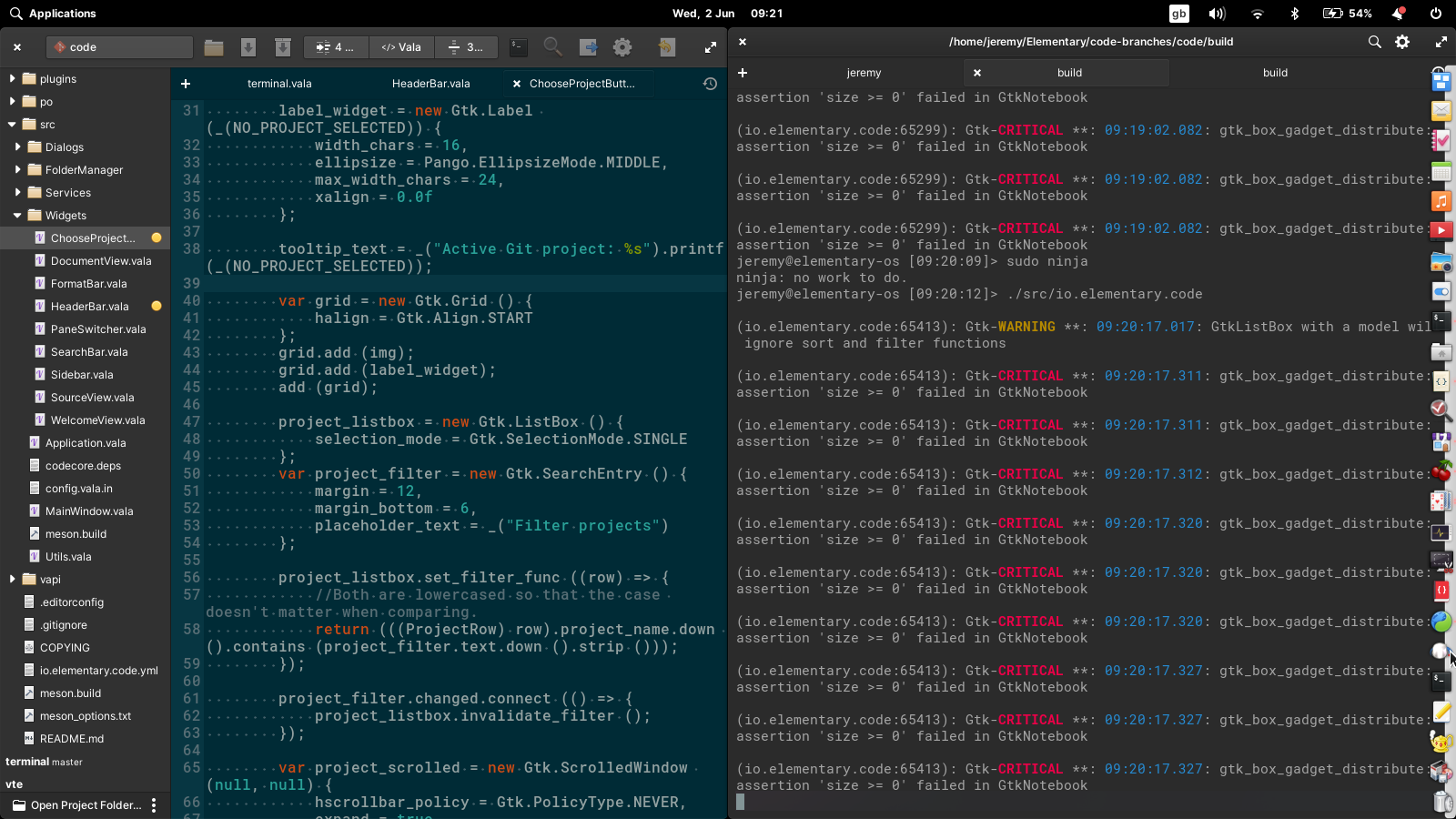
New project button prevents tiling with screen width below 1920px LoDPI
What Happened
With the addition of the project button in the headerbar, I can no longer half-tile Code.
Expected Behavior
I can tile code alongside a Terminal window or another Code window.
Steps to Reproduce
- Have or set a resolution just below 1920 wide (or 3840 for HiDPI) like 1600 (or 3200 HiDPI)
- Try to tile Code to one half of the display
Platform Information
elementary OS 6 daily build with Code from master
By removing the fixed separators and rreducing the minimum width of the choose project button to 16 characters it is possible to half-tile at 1600px width

To make Code usable at a smaller width than 800px would require a major redesign of the headbar.
Not a designer and all that, but two suggestions. First, why does the button need to have a minimum width in the first place? Alternatively, have you considered putting it in the project sidebar? Since it's project management, it would maybe make sense there, sort of like how we moved the "open folder" button in Odin. That also follows what lots of other editors do with their git status. Sorry if you've already been over these suggestions before.
Two more notes on the scope of the issue.
- I'd note that your screenshot above truncates the status info in the center (indentation/language/cursor position) to 1 character each, which is not great. There's no way to see information like the cursor position when it's truncated like that.
- This is also an issue beyond just tiling with small displays, although in those cases it's not quite as pronounced of an issue. It just restricts the smallest a window can get period. This interferes with my workflow a bit, although with the usual XKCD workflow disclaimer I know desire for small free-form windows is probably kinda niche. The smallest I can get it on my system (using the large text size, since I have an awkwardly dense loDPI screen) while keeping that data visible is wider than 80 characters, which means that the UI is requiring that my window is wider than would be necessary for the code. (I usually like to keep editors closer to 70 characters wide.) Since I have limited real estate, that's not great. This would also improve with a smaller button, to be fair.
The choose project button is fixed width to stop the following headerbar icons moving around as you change projects. Getting everything usable with a total width of 800px needs a more extensive redesign, admittedly. This is just a minimal fix. Format info is visible in the tooltip, I think.
That makes sense—thanks for the response.
@jeremypw I can't imagine it would be impossible to make the distance the icons start on the left have a minimum, rather than using the adjacent button (that may as well have a single letter label) to align them instead. Also as a seperate solution to the project button and central 3 buttons blocking smaller window widths, the labels could loose their label text below 800px