App Layout: Bottom sheet of Compose looks odd
We wanted to use a default bottom sheet but I agree it doesn't look very nice. Ill work on this next.
If it's as designed then I'll mark it as "not a blocker" and we can update it asap :)
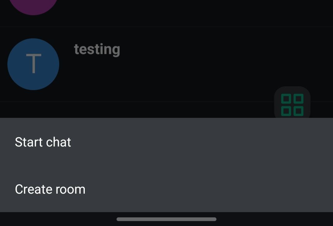
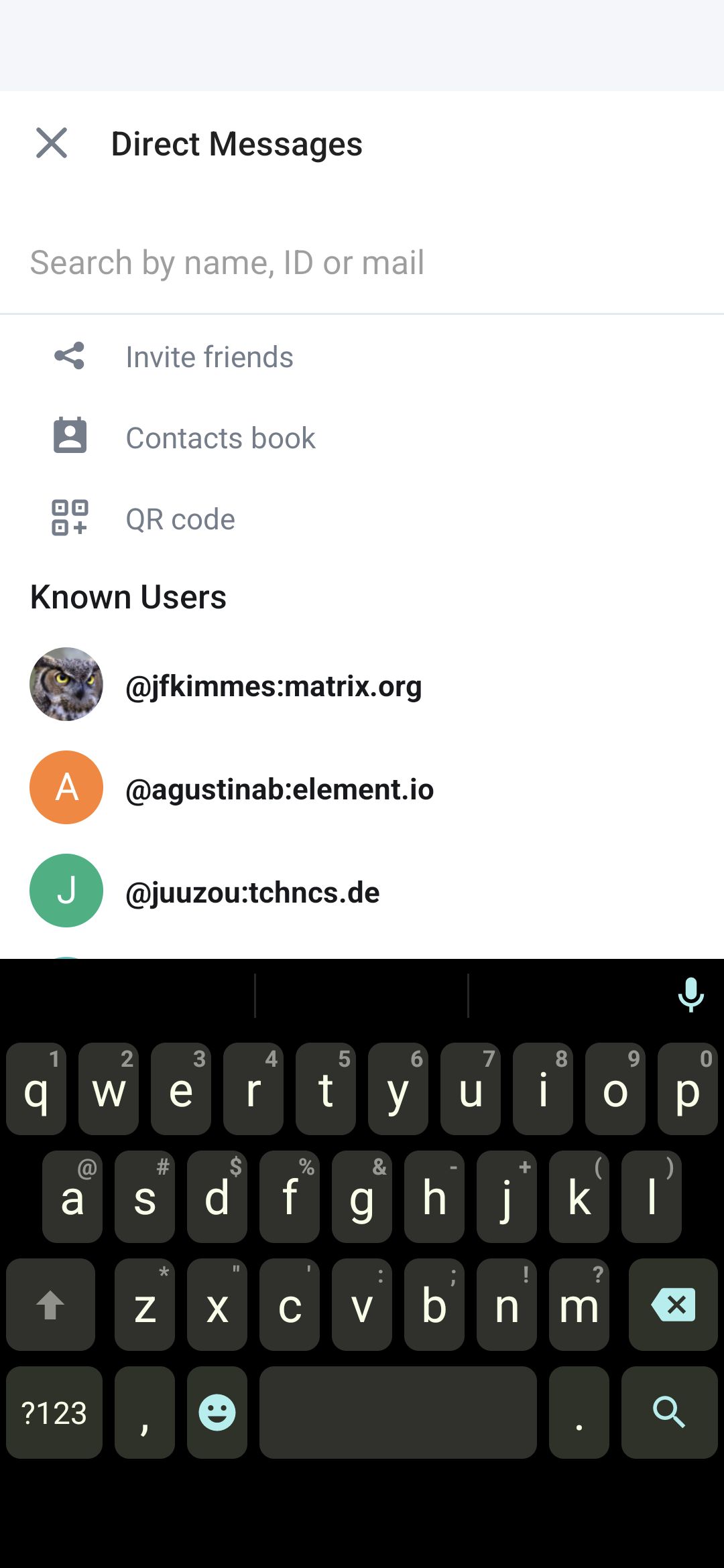
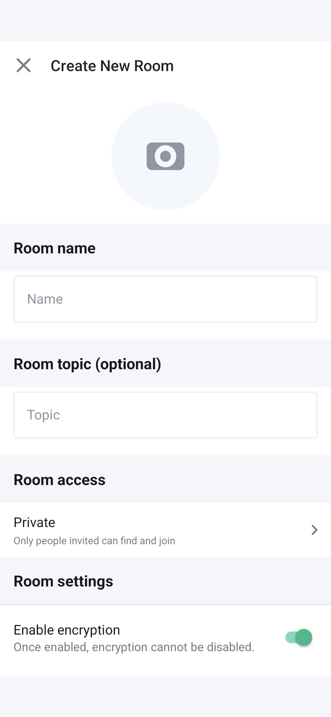
Updated the designs as promised, to match the current implementation of botoom sheet on android. Also broke down the options to match iOS. The buttons all link to existing screens, find below the screenshots for all of them.
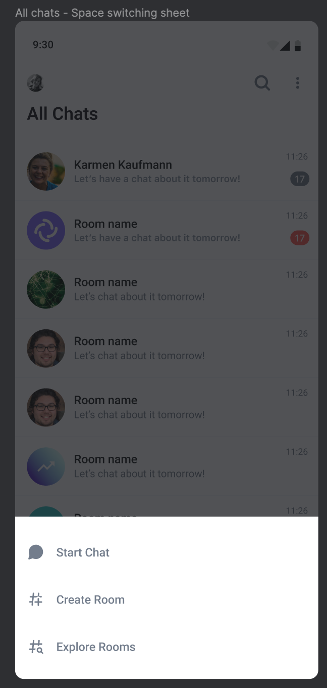
Start Chat -> Links to the start a DM screen
Create Room -> Links to create room flow
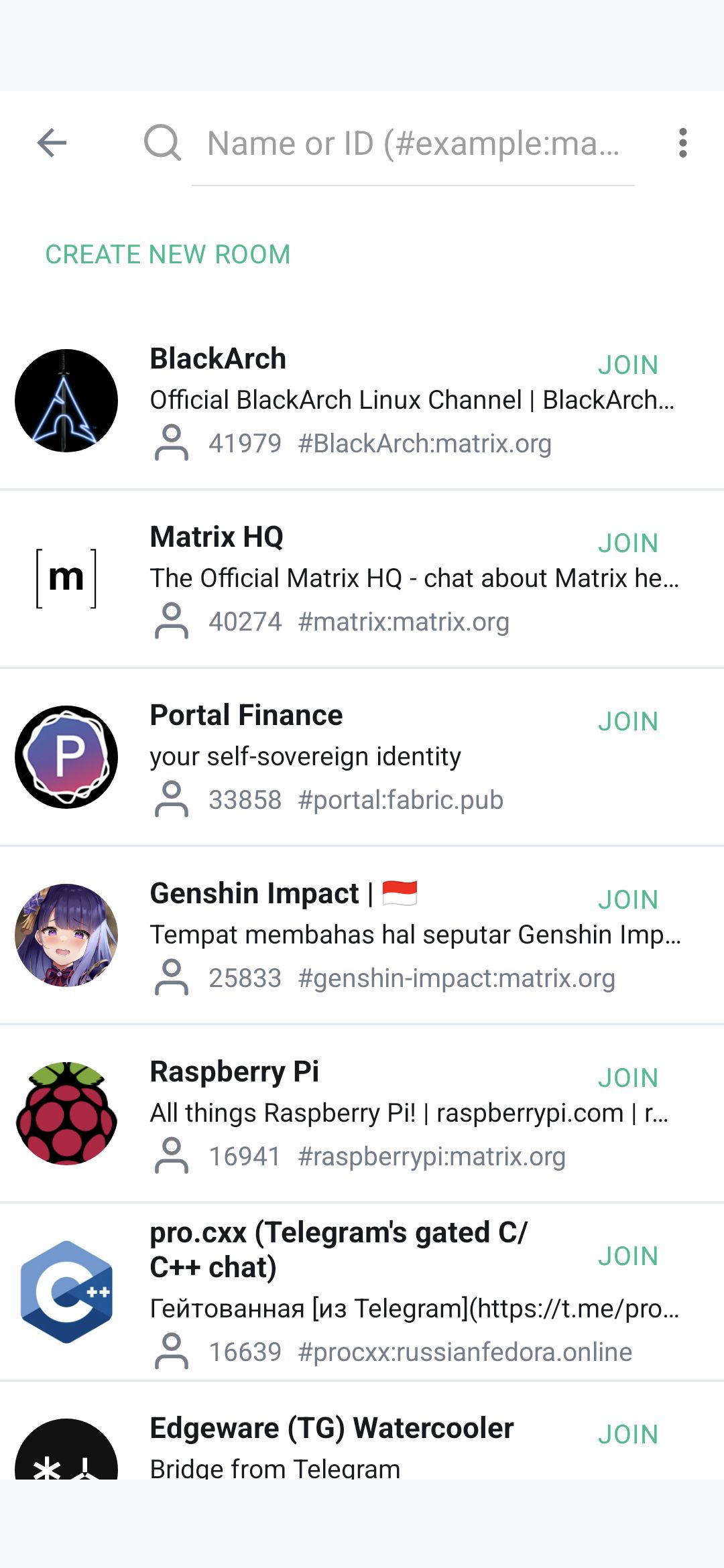
Explore Rooms -> Links to the explore room screen
Link to similar issue: https://github.com/vector-im/element-android/issues/6717