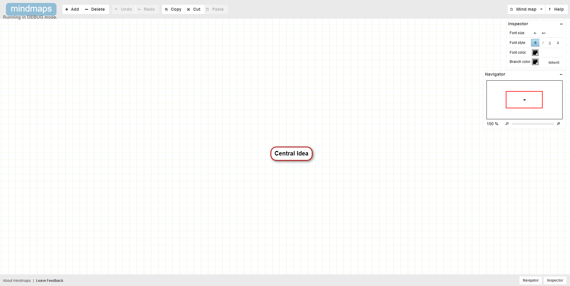
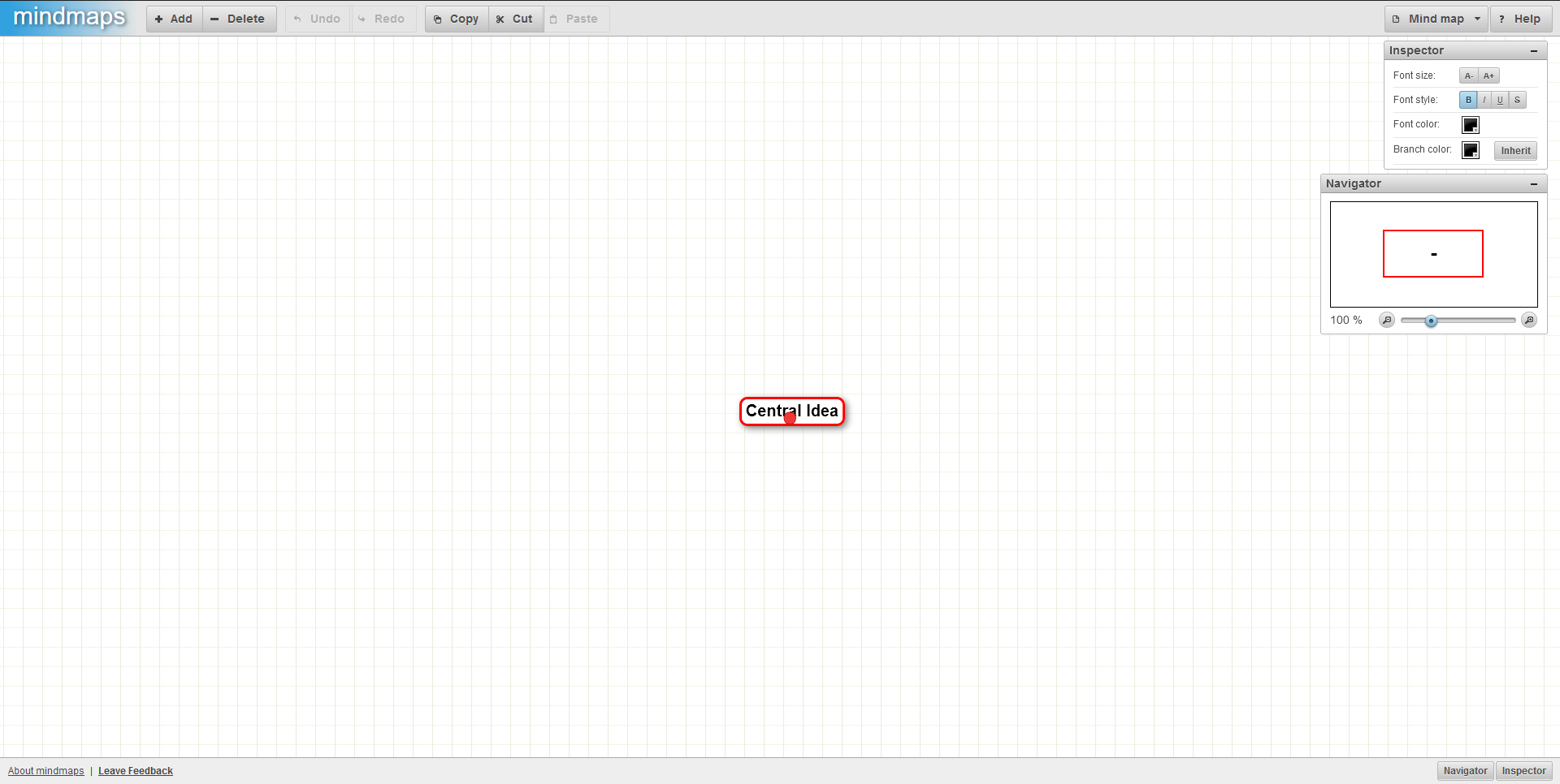
Improve the user interface styles by doing simple changes
Improve user interface styles by doing simple changes. No fancy CSS properties were used so compatibility should not be affected. The user interface was improved mostly by removing styles such as borders and shadows to make it fit with the modern UI Design fundamentals.
After
Before
Hi,
Thank you so much for taking the time to submit a pull request and sorry for the late reply (I don't get many of those!). Life's been very busy and I don't actively maintain this project anymore.
As much as I like modern UIs I think there is a case to be made here for "If it ain't broke, don't fix it". I'd argue that a very flat design style does not actually improve the usability of the user interface. It might look prettier but I yet have to see evidence that it makes apps easier to use.
As an example, let's look at the inspector window from your screenshots:
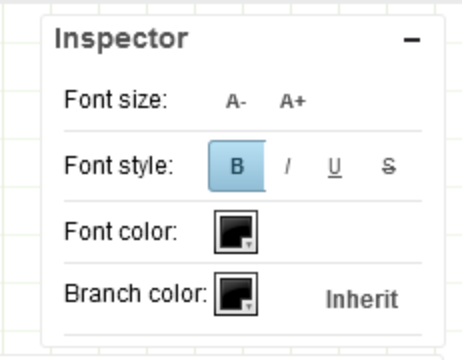
The issues that I see with this design:
- There is no visual distinction between the "menu bar" (the top part) and the body of the window, meaning there is no affordance that you can drag the window in the menu bar but not in the body.
- The word "Inherit" just floats on white background. It's actually a button but there is no affordance that that's something you can click on.
The old UI might be a little outdated by today's standards but it's an interface that just works and I've never received any feedback that it's difficult to use.
I'm keen to hear your thoughts but at this stage I'm leaning towards just leaving things as they are :)