[Accessibility][Win11] The color contrast of the dataGridViewCheckBox cell is less than 3:1
.NET Core Version:
- .NET SDK 7.0.100-preview.2.22108.9
Have you experienced this same bug with .NET Framework?:
- Yes
More Info:
- This issue can’t reproduce on Windows 10 OS.
- This issue can reproduce on Windows 11 OS both for Winforms NetFX and Core projects(can reproduce with 3.1, 5.0, 6.0, 7.0).
Problem description:
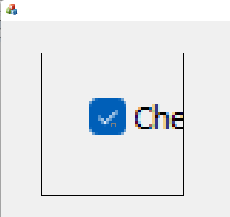
The color contrast less than 3:1 between background color of checkbox and background color of whole cell.
For Win11:

Expected behavior:
The color contrast should be greater than 3:1 between background color of checkbox and background color of whole cell.
For Win10:

Minimal repro:
- Create a .NET Core Winforms application with DataGridView control added.
- Add a DataGridViewTextBoxColumn to it.
- Build and run the project.
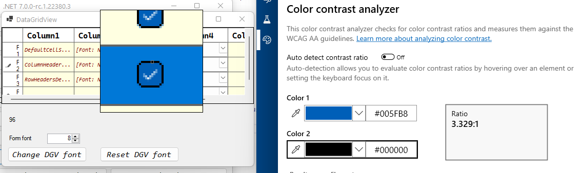
- Check the checkbox, then launch Accessibility Insights for windows tool and observe the color contrast. Or download the attached project, then execute above step 4. CheckBoxCellColorContrast.zip
You can manually override the default colors to meet the contrast requirements. But visually impaired users will typically use something like a high contrast theme in Windows. Overriding the 'default' colors with specific ones, will break this.
Style in Win11 depends on native style which you can see below on a screen of the MFC app:
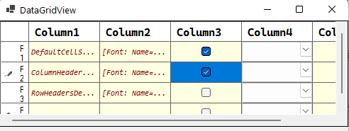
I can add a black border (only for Win11) to highlight selected checkboxes. It looks like this on the screen:
@merriemcgaw is it an appropriate way?
@NikitaSemenovAkvelon I would also check to see how it looks on Win 11 in the new high contrast themes as @tinodo mentioned above. It needs to look good on all the different contrast views as well as normal view.
@Olina-Zhang I just noticed the changes in Win11 high contrast themes, it might be worth taking a look at all of our regular controls and verifying them in the new themes. I hope that some of the colors we may have hard coded don't wind up looking ridiculous. If they do look bad, we'll need to figure out a more holistic solution, so please do file an issue with the list of controls that violate the guidelines or just look plain awful 😺. That would be .NET 8 work for sure.
With any of the contrast themes, checkboxes have contrast colors. So, if a user uses a contrast theme, he won't have any trouble.


@NikitaSemenovAkvelon in that case I think you can go with your approach.
@dmitrii-drobotov - a reliable and future-proof fix for this issue required UXTHeme team opening up some APIs for us. Putting this bug on hold until that happens,
I think for now we should. @KlausLoeffelmann and I are tackling getting some APIs opened on a separate track. If that opens up, we'll be able to do a lot of things.