Count task states per task prefix and expose to Prometheus
Keeps an accumulated count on task prefix of number of tasks that have been in each state, and exposes this on Prometheus endpoint.
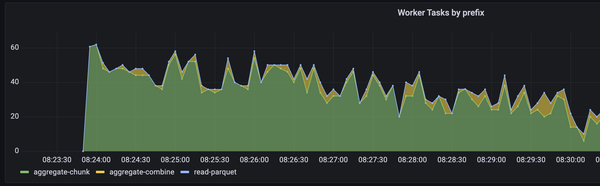
Here's an example plot of this data in Grafana:
- [x] Tests added / passed
- [x] Passes
pre-commit run --all-files
Can one of the admins verify this patch?
Admins can comment ok to test to allow this one PR to run or add to allowlist to allow all future PRs from the same author to run.
Aside from the "foo" comment this all seems pretty clean to me. I recommend adding a screenshot of the prometheus chart that this enables for motivation.
cc'ing @fjetter for when he gets back. Maybe also @crusaderky in the meantime?
cc also @jacobtomlinson , although I suspect he won't have much to say about the implementation
Unit Test Results
See test report for an extended history of previous test failures. This is useful for diagnosing flaky tests.
15 files ± 0 15 suites ±0 6h 37m 42s :stopwatch: + 14m 6s 3 155 tests + 2 3 069 :heavy_check_mark: ± 0 85 :zzz: +1 1 :x: +1 23 350 runs +15 22 441 :heavy_check_mark: +11 908 :zzz: +3 1 :x: +1
For more details on these failures, see this check.
Results for commit 299ff1de. ± Comparison against base commit 044225ae.
:recycle: This comment has been updated with latest results.
The test failure on that's specifically py38 on win doesn't appear to be related to anything I changed. Can someone help with this?
I am wondering if totals are actually the most useful counter here. Wouldn't the current value be more useful?
If you collect current values, you'll lose what happens between the times that you sample (i.e., scrape the prometheus endpoint).
With a counter, it's easy to get the number of tasks that transitioned for the entire sample interval—plot the difference between the counts. That seems more useful if you're sampling at interval that's relatively large to the duration of task transitions, and it more and more approximates the current value as your sampling (i.e., scraping) interval gets smaller.
With a counter, it's easy to get the number of tasks that transitioned for the entire sample interval—plot the difference between the counts. That seems more useful if you're sampling at interval that's relatively large to the duration of task transitions, and it more and more approximates the current value as your sampling (i.e., scraping) interval gets smaller.
That's true but I'm typically interested at the current value at a given point in time (i.e. rather a gauge in the prometheus sense). To make that graph you are showing you need to calculate a differences between states, don't you? How does the formula look like that you're plotting?
That's true but I'm typically interested at the current value at a given point in time (i.e. rather a gauge in the prometheus sense). To make that graph you are showing you need to calculate a differences between states, don't you? How does the formula look like that you're plotting?
Something like increase(dask_scheduler_prefix_state_totals_total{cluster="$cluster",state="processing"}[10s]).
That's true but I'm typically interested at the current value at a given point in time (i.e. rather a gauge in the prometheus sense). To make that graph you are showing you need to calculate a differences between states, don't you? How does the formula look like that you're plotting?
Something like
increase(dask_scheduler_prefix_state_totals_total{cluster="$cluster",state="processing"}[10s]).
So the plot doesn't show prefixes in state processing but rather prefixes that were transitioned to processing in the last 10s. IIUC the following would spike once and then be flat for the entire duration of the computation. Is this what you intend to show?
import time

def do_stuff(x, delay):
    time.sleep(delay)

client.map(do_stuff, range(10), delay=60)
I think that we actually want to show the derivative of tasks that have transitioned into the memory state. This is closer to what the task stream represents today.
I think that we actually want to show the derivative of tasks that have transitioned into the memory state. This is closer to what the task stream represents today.
This is easy to get with the metrics exposed here.
So the plot doesn't show prefixes in state processing but rather prefixes that were transitioned to processing in the last 10s. IIUC the following would spike once and then be flat for the entire duration of the computation. Is this what you intend to show?
Pretty much. (I think it would actually be transition in last 5s, since with 5s sample interval I think this gives you the difference of two samples that are 5s apart, but I'm not highly confident about this.)
Stepping back, there are three related numbers:
- How fast tasks (for a given prefix) are finishing (transitioning into
memorystate) - How many tasks (for a given prefix) are being processed
- How long the tasks take to process
This PR exposes (1). @fjetter, I think you're asking for (2), and noting that (1) and (2) come apart more when the time to complete individual tasks is relatively long. Is that right?
(1) and (2) are also interesting different when you're comparing tasks that take significantly different lengths of time to complete... for example, if you see that task prefix A is completing tasks much faster than task prefix B, you might want to know if this is because B is waiting on A, or because A is just a fast thing to do.
My sense here is that (1) is valuable, and (2) or (3) or both would also be valuable, but that having (2) wouldn't remove the value of also having (1). Is that wrong?
(2) was done, I think, in https://github.com/dask/distributed/pull/7083
It was good! But I think that this is better. Sampling at 5s felt lossy. This feels like it gives the same information, and without loss. The reason for (2) over (1) I think is that it doesn't require any additional state in the scheduler, but the state here seems fairly innocuous.
How fast tasks (for a given prefix) are finishing (transitioning into memory state)
Yes, I see value in this derivative. Earlier I've been using the scheduler_tasks Gauge to infer progress on a computation and the slope was often a very important diagnostics tool. Thinking about it a bit longer, I'm actually pretty excited about the prospect of having this by task prefix.
I think I was thrown off by the graph title which I would choose differently.
What I was thinking about is more along the lines of this scheduler_tasks gauge but split up by prefixes.
An earlier attempt to build visualizations on task groups is for instance this PR https://github.com/dask/distributed/pull/5320 This PR used durations which is a much harder problem since we get duration measurements only for historic data. not sure if we can publish prometheus metrics with a custom timestamp, can we?
A similar but simpler visualization could be built if we simply exposed the current state as a gauge and create such a stacked chart w/out durations (not as powerful but a good first step).
I actually think it is best to just add both and see how we can make use of them. The only problem I see is that we do not have an easy way to manage deprecations with these metrics but I'm OK with that for now.
Explicitly, I am proposing to add
diff --git a/distributed/http/scheduler/prometheus/core.py b/distributed/http/scheduler/prometheus/core.py
index d8a8f00c5..46e962117 100644
--- a/distributed/http/scheduler/prometheus/core.py
+++ b/distributed/http/scheduler/prometheus/core.py
@@ -54,9 +54,17 @@ class SchedulerMetricCollector(PrometheusCollector):
             labels=["task_prefix_name"],
         )

+        prefix_states = GaugeMetricFamily(
+            self.build_name("prefix_states"),
+            "Current number of tasks in a given state by prefix",
+        )
+
         for tp in self.server.task_prefixes.values():
             suspicious_tasks.add_metric([tp.name], tp.suspicious)
+            for st, val in tp.states.items():
+                prefix_states.add_metric([tp.name, st], val)
         yield suspicious_tasks
+        yield prefix_states
With this we could actually also "deprecate" the tasks Gauge since this prefix_states includes the same info (after an aggregation)
I suggest to do this in a separate PR.
I'm actually pretty excited about the prospect of having this by task prefix.
Yay! I've also updated the example plot in the PR description.
not sure if we can publish prometheus metrics with a custom timestamp, can we?
I'm not currently aware of a good way to do something like that, but I'm thinking about this.
A similar but simpler visualization could be built if we simply exposed the current state as a gauge and create such a stacked chart w/out durations (not as powerful but a good first step). [...] I suggest to do this in a separate PR.
Sounds good, agree that it makes sense to do this separately.
I've gone through things again and everything seems fine to me. I'm +1 on merging.
However, after reading through comments and thinking a bit more about this I realize that we are losing duration information. I didn't realize this in the first pass. We had this implicitly when we were sampling. I didn't think about how losing sampling was also causing us to lose am implicit weighting on longer tasks.
I expect we'll want something slightly different if we're looking to recreate the task group progress chart (which I do think we want). Looking at the code I think that we maybe already have this state in TaskPrefix.all_durations["compute"]. I suspect that if we were to publish that as a counter that that would give us the chart that we want.
(if so, hopefully @ntabris doesn't mind the previous exercise as a good learning experience)
I think that there are now two options:
- If @ntabris is ready to be done then we merge this and handle the rest in follow-up work. I'm +1 to hit the green button.
- If @ntabris wants to do a bit more work then we also publish
all_durations["compute"]and focus on that for near-term charting.
then we also publish all_durations["compute"] and focus on that for near-term charting
If metrics are cheap then maybe we publish all of all_durations, similar to how we do now with states. This would give us transfer, serialization, and disk costs as Dask sees them. This is maybe a bit redundant with actual hardware metrics, so of only modest value.
I still think this is worth having. The rate of tasks in a given state is still interesting information. I could see average or max rate to be a valuable metric to compare performance related changes and it is definitely a cheap metric to have.
I opened https://github.com/dask/distributed/issues/7107 for a follow up conversation about the task stream