 creativecommons
[RFC] Asking recommendations and suggestions for improving UI of the project
Problem
This issue is created to ask maintainers and contributors improving and deciding on the UI of the modernized CC-Resource Archive.
Description
I would like to ask the maintainers the following:
- What color scheme and theme(font families, styling etc) would you want to be used in the project?
- In terms of UI elements like cards, buttons etc, do they need to have a styling similar to the main webpage to have a visual similarity between them?
- What features do they think is most important of the resource archive? so that its functionality could be enhanced.
Implementation
- [x] I would be interested in implementing this feature.
cc @TimidRobot @possumbilities
The project should follow the visual language of Vocabulary, and should be visually similar to opensource.creativecommons.org and search.creativecommons.org since they're built from Vocabulary's visual language.
We should not implement the codebase of Vocabulary at this time, it's just a visual reference at the moment to build from.
Vocabulary has more documentation here: https://cc-vocabulary.netlify.app/
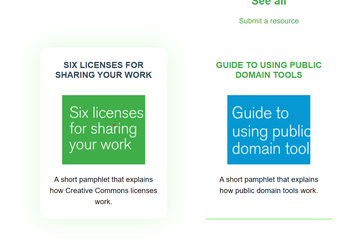
@possumbilities Could you please take a look at this thumbnail design and let me know if it's okay? I've finished the coding part. I would be delighted to hear any suggestions or modifications that you may have.
For a more smooth outlook, I think adding a bit of border radius will remove the sharpy corners from the cards. Also the font-sizes are overwhelming.
I strongly think that the theme of the website must follow the brand theme or the theme that is followed in the https://creativecommons.org website, as it is the main website of the Creative Commons. So the website must have some shade of orange, instead of the green color as currently used in the https://resources.creativecommons.org website, to make the brand look more professional by following a specific theme in all of its websites. I have a rough idea of what the landing page will look like on a desktop screen. Please look at the media attached to this post or open the Figma design:
https://www.figma.com/file/4STnHHevP1ZqdDO0QV67QD/cc?type=design&node-id=0%3A1&mode=design&t=WK2Oj3MsPfv9Xo6V-1
There are some more functionalities on this page. For example, on hover, the cards will scale up in size by 3 to 5 percent, etc.
Note: This is not the final design; it is just a rough sketch of how the divs in the website would be arranged and shown on the landing page.
I would love to make the required changes to the design and implement them in code.
cc @TimidRobot @possumbilities