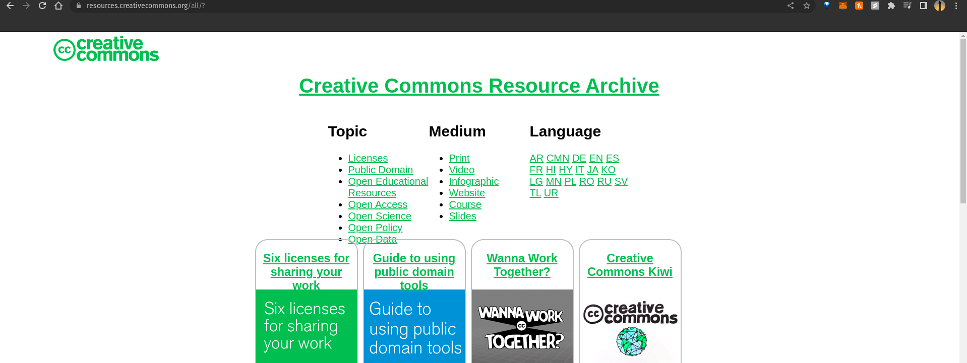
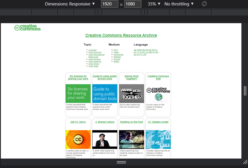
[Bug] The topic list div covers the cards below it
Description
The div which contains the topic, medium, and language list in the all.html file covers/flows on top of the thumbnail box below them.
Reproduction
- visit the link on a laptop: https://resources.creativecommons.org/all/?
Expectation
The site is expected to adjust the positioning and sizing of elements according to screen size for better accessibility. The issue arises because the list div overlaps the cards, leading to accessibility issues. One of the critical problems with the current CSS properties is that the list div overlaps the cards on different screen sizes, causing a poor user experience. To resolve this issue, we can implement responsive design techniques with CSS styling to add some space between the cards and the elements above them. This will ensure that the list div does not overlap the cards
Screenshots
Environment
- Device: Laptop
- OS: op!_ OS 21.10
- Browser: Chrome
- Version: Version 111.0.5563.64 (Official Build) (64-bit)
- Other info: display resolution: 1920 x 1080
Resolution
- [x] I would be interested in resolving this bug.
I am not able to reproduce this on my PC. Could you try hard reloading the page? and see if the error still exists.
@adityakm24 I am not able to produce this error as well. Could you provide more details?
I just tried it using my laptop running OS: op!_ OS 21.10 and in incognito mode using chrome. The issue still persists
@adityakm24 Chrome incognito mode with the same dimensions.
I have adjusted and tried all dimensions but wasn't able to reproduce. I think the bug only exists on your machine which is weird. Could you check the website in a different browser? Maybe firefox?
@Xaid-vfx Same here. @adityakm24 Could you share a screen recording for this, following these steps -->
- Load the https://resources.creativecommons.org/ page.
- Click on See all.
- See if there is any error in the console.
I haven't been able to reproduce either, yet. Marking as work required just in case it is occuring.
Hello @possumbilities ,
Since Submit a resource link is added, there is enough space and padding between the cards and the filter links. I could not reproduce this issue as well. Lemme know your thoughts.