[Feature Request] A few UI and UX suggestions
I've been using this for a little short while and I'm super impressed with how stable and capable this UI is, thank you for creating it. I have a few suggestions to improve the general usability of ComfyUI, and hopefully make it even better.
1. Use the middle mouse button for panning
Right now the left mouse button serves two conflicting purposes: the action button, used to interact with nodes, move them around, connect them, etc, but also the panning button, used to move the canvas inside the viewport. That leads to a lot of issues with users having to carefully avoid clicking on nodes so they can move around the canvas.
This can be easily solved by separating these two actions. The middle mouse button is currently unused, and that's a common button used on other node-based UIs for panning (for example: Blender's shader and geometry nodes, and Unreal Engine's Blueprints).
This change would also allow changing the Select with Area functionality to used without the CTRL button modifier. Since the left mouse button wouldn't have any navigation functionality anymore, the Select with Area could be simply done with clicking and dragging the left mouse button, making it even easier to find for new users.
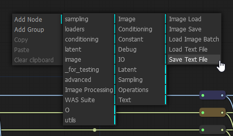
2. Unify the New Node menu, and the Node Search box
The New Node menu (right mouse click) and the Node Search box (left mouse double-click) both serve the same purpose: add the nodes to the canvas. There is not really any usability benefit from having them be separate. Ideally these should be part of the same UI element. My suggestion would be to add a search box to the top of the New Node menu and give it focus on open, so that the user can right-click and just start typing to find a specific node, or choose to browse through the list to find their desired node. This would free the left mouse double-click for any other future need.
This functionality almost exists when dragging a connector from an existing input or output, but it displays the search as another menu item that needs to be selected before it can be used, which is an unnecessary extra step, and should exist when creating a new node from scratch as well; there is no real benefit from having different behaviours when creating a new node from a connector or not. See for example how this is done in the Unreal Engine Blueprints system:

3. Select the contents of editable fields when opening
When one clicks on something like the Seed field in the KSampler settings, it's inevitably to paste a completely different seed value. Same thing with a field like the Width or Height in a EmptyLatentImage or ImageScale node, they will likely type a completely new value. It's tiny issue, but it compounds over time, that if you click on that and just type a new value, it will not replace the old value because the original wasn't selected when the text field was displayed so instead of replacing the width of 512 with 768, you may end up with a width of 512768 by mistake. The expected behavior when editing fields is that the old value will appear selected and be replaced if the user just starts typing.
For numerical fields, it can also be helpful to allow using the up and down arrow keys on the keyboard to increase or decrease values, instead of moving the text cursor. Typically after every change using the arrow keys the contents should also be selected again, even if they were not selected, allowing the user to start typing a new value to replace the entire content of the field.
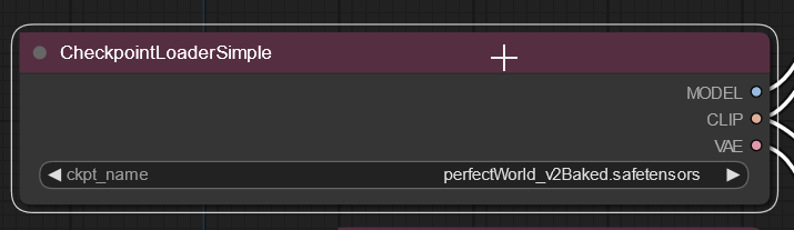
4. Clean up file names for display
File names displayed by nodes like CheckpointLoader, LoraLoader, and VAELoader can look way too long and cover the corresponding label, which makes them hard to read and simply looks bad:

This can be improved with a few different measures:
-
Hide file extensions: with files using extensions like
.safetensors, displaying this info just adds unnecessary information. This should not be displayed. - Hide folder paths: while helpful for those that make use of folders for file organization on the selection dropdown, displaying the path in the node itself on the canvas is not necessary. Remove these so only the file name is displayed on the node.
-
Trim file names to the width of field: even these measures might still not be enough to prevent files with long names causing issues. To prevent that, the text block should display the file name up to the visual size of the field, trimming the remaining characters and displaying an elipsis character (
…)
So with these measures, instead of the existing example in the image above, with some added stuff for the sake of demonstration, covering the label on the left:
1.x Mixes\wyvernmix_v7_this-is-an-example.safetensors
... it would display something more focused and helpful, such as:
wyvernmix_v7_this-is-an-ex…
move the canvas inside the viewport.
Note, can hold down space bar for panning. The middle mouse button is commonly used for panning and adding its support can help.
The New Node menu (right mouse click) and the Node Search box (left mouse double-click) both serve the same purpose: add the nodes to the canvas.
It's true that both serve the purpose of adding nodes, but the RMB menu also shows the hierarchy, which is especially important for add-on nodes.
I think of it as the list menu is focused on node names, while the hierarchy menu focuses on purpose.
This can be improved with a few different measures
There's also "stretch the box out" (:
When boxes are the size and colors (or titled for specific purposes) , the template extension can be used to save them as sets. Showing folder names is important to me as I have almost 200 lora categorized by their folder structure. Likewise, models are divided by whether they are baked vae or generic, to make it easier to remember which I might want to load an external vae, or switch vae from the internal. Etc.
Extensions can also be important. Did I just load the vae, the yaml, or the checkpoint?
Note, can hold down space bar for panning.
TIL. That definitely helps, but it has a few issues of its own: it doesn't work when hovering a text field such as the ClipTextEncode (the prompt); it will also 100% backfire if you had that field selected in the first place since it will just add space characters when you expected to pan around the canvas (it was literally what happened to me the first time I tried it after reading your post); and it doesn't behave like one would expect from other applications like Photoshop, where holding the space bar activates the "panning tool", and you still need to click and drag to pan. One might argue the former is easier, but I found the behaviour odd to use since I can click with a lot less button travel than I can press the space bar, so I found I kept moving back slightly because I moved the mouse slightly backwards instead of going to a full stop while depressing the space bar. Nitpicking, but still it's worth bringing it up.
It's true that both serve the purpose of adding nodes, but the RMB menu also shows the hierarchy, which is especially important for add-on nodes.
You are right, my point is only that they don't need to be two separate things. You could achieve both results with one menu, as per the UE Blueprints example, which shows both the hierarchy at the bottom, and the search functionality at the top of the same UI element.
There's also "stretch the box out" (:
Yes, and that is very helpful indeed, and I use it to solve this issue. However the things proposed are to prevent the UI from reaching an "error state" where one UI element is covering another, which to me (as an UI/UX designer) is a visual bug.
Showing folder names is important to me as I have almost 200 lora categorized by their folder structure.
Myself as well (the organization, not the number of loras; I think I'm at around 50), but that information is only useful to me until I actually select them. Once I picked one, all it matter is "did I pick the right one", and unless you make a point to naming multiple loras with the same name but keeping them at different folders, which I doubt, then the name should usually provide enough information anyway.
Extensions can also be important. Did I just load the vae, the yaml, or the checkpoint?
Don't you get that information from whatever node you selected, even more clearly since it's a bigger font over a color background at the header, as well as the label at the left of the file name? If it says "checkpoint", you loaded the checkpoint. Not trying to be snarky, I just don't see how the redundancy helps when the more visible information answers this question more easily, and the redundant data actually makes it harder to read the part that matters there which is "which file I loaded". Keeping it as simple as needed for the core need makes it UI more efficient.
Alas, the file path and extensions hiding could also be made optional, in case some users prefer to see them. The most critical suggestion there is really the use of trimming and elipsis to hide overflowing characters in order to prevent the visual bug that happens there. While I do believe what I said to be more efficient, I wouldn't want my preferences to be imposed on others if that's unnecessary.
Thanks @wyrde for your feedback as well as your tips. :)
Once I picked one, all it matter is "did I pick the right one", and unless you make a point to naming multiple loras with the same name but keeping them at different folders, which I doubt, then the name should usually provide enough information anyway.
I do. lora_name/v1.safetensors and lora_name/v2.safetensors is very common in my naming convention.
@DivinoAG I strongly support all the suggestions... But posting many individual issues as a single one is a bad practice. It leads to a meaningless title like "Some suggestions from me" and makes it undiscoverable for other users to both support it and propose enhancements. It would be much better if you've split this mega-issue to a few separate ones (there are already a few about selection/panning).
@DivinoAG Great suggestions. Would you mind separating these out into separate issues? eg. The mouse panning one can be consolidated into this issue: https://github.com/comfyanonymous/ComfyUI/issues/624