Default graphs not showing correctly multiple updated values for epoch
Hi When working on warm restarts in my experiments I noticed that default comet graphs don't correctly display metric values for overlapping epochs. Eg. when I update some metric values on a second, third training the values displayed are randomly chosen from the logged metrics.
I'll display it with an example:
from comet_ml import Experiment, ExistingExperiment
from comet_ml.api import API, APIExperiment

import pandas as pd

# here doing a first training
experiment = Experiment(project_name="test", disabled=False, auto_metric_logging=False)
experiment.set_name('overlapping_3.2.7')
for i in range(100):
    experiment.log_metric('test_metric', i**2/100, epoch=i, include_context=False)
experiment.end()

# next doing a warm restart and re-training
experiment = ExistingExperiment(previous_experiment=experiment.id, disabled=False, auto_metric_logging=False)
for i in range(50, 100):
    experiment.log_metric('test_metric', i*0.5/100, epoch=i, include_context=False)
experiment.end()

# and finally fine-tuning
experiment = ExistingExperiment(previous_experiment=experiment.id, disabled=False, auto_metric_logging=False)
for i in range(75, 100):
    experiment.log_metric('test_metric', i**1.5/100, epoch=i, include_context=False)
experiment.end()
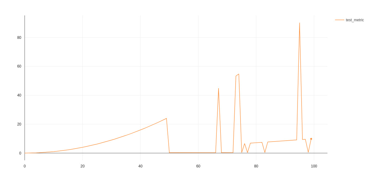
Logged metric generates a following graph:
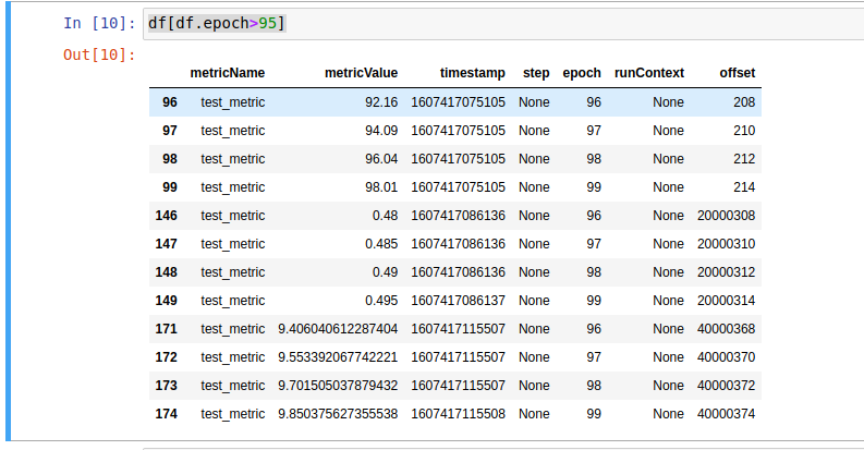
However, checking experiment data with APIExperiment shows that data is logged as expected:
api_experiment = APIExperiment(previous_experiment=experiment.id)
metrics = api_experiment.get_metrics('test_metric')
df = pd.DataFrame(metrics)
df[df.epoch>95]
So the problem might lay in the graph selecting the right (freshest I imagine) value to display. Here is a link to example experiment.
Hi @potipot Thanks for reporting. We pick the last point on each epoch and display that on the chart. (since they share the same X axis point)
steps and timestamps are all shown.
hope this answers your question.
I posted this issue because that expected behavior doesn't always work. If it was so, the spikes wouldn't appear
Hey @potipot Im not sure I understand, lets take an example (epoch 96) metric value:
- 92.16
- 0.48
- 9.406
we have 3 Y values for the save X value (epoch 96) only 1 is displayed (seems like 92.16)
what would you expect to see in this case ? (first point, last point, avg ? mean ?)
in addition you can rename your metrics on each warm restart or even create a new experiment so charts wont overlap and you can have a more fine grained look on each attempt.
In this case I would expect to see the metric with the freshest timestamp. Yes I could name another metric but that would disenable me from using a common plot for all experiments in the "panels" section. For now I just decided to start new experiments whenever I do a warm restart but the issue with unexpected value display remains.
In that example I would expect to see a rising curve till epoch 50, then a line from 50-75 and finally second line with higher offset for epochs 75-100.
I didn't want to post the entire dataframe, so that excerpt is just for few epochs, for which all 3 metrics have been recorded.
@potipot you can plot multiple metrics on the same plot in the panel section

Ill take a look at this, we are supposed to pick the last metric (by timestamp) @ferc please take a look
Hi @potipot , also when using the line chart panel, when you select X axis value from the time series options (time, epoch, step etc...) you can pick the aggregation function :
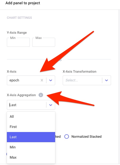
Thanks, when manually creating a panel, the graph is displayed as expected. I stumbled upon the issue reported initially, when using automatically generated panels.
got it, you are referring to the single experiment page charts tab!

this is probably a bug! will take a look into this and fix Thanks again for letting us know
I accidentaly archived the originally linked experiment but made it available again, so you can take a look here: https://www.comet.ml/potipot/test/507d9da87eb94b6b90496b65a28e7ab4?experiment-tab=chart&showOutliers=true&smoothing=0&transformY=smoothing&viewId=BDKFHHURRKKieMGP0i5MJDVzQ&xAxis=epoch
This issue is stale because it has been open 30 days with no activity. Remove stale label or comment or this will be closed in 5 days.
This issue was closed because it has been stalled for 5 days with no activity.