ckeditor5

ckeditor5 copied to clipboard
Ordered list style icons are too similar to one another
📝 Provide a description of the improvement
Currently, the ordered list marker selection dropdown icons are very similar. The lower- and uppercase roman numerals look almost the same.
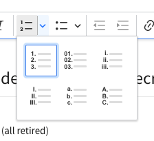
It would be good to make them more differentiated/crisper to easier see the difference.
We could also consider rearranging the dropdown to have numerals/roman/Latin in separate rows, two (thematically) per row.
📃 Other details
- Browser: latest Chrome
- OS: macOS Catalina
- CKEditor version: 35.1.0
- Installed CKEditor plugins: generic
If you'd like to see this improvement implemented, add a 👍 reaction to this post.