 ckeditor
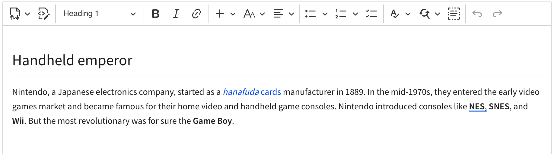
Declarative nested toolbars
📝 Provide a description of the new feature
Let's add a new format of configuration to config.toolbar to make it possible to group toolbar items into drop-downs so that we can squeeze a massive toolbar
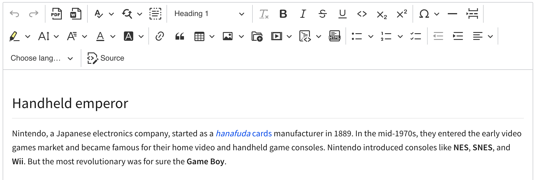
into something compact
Proposed scope of changes
We're going to need a functionality in the ToolbarView component to allows declarative drop-downs with nested toolbars.
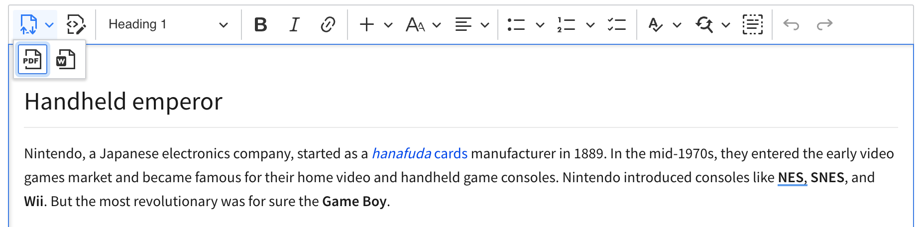
Example toolbar configuration
toolbar: [
{
label: 'Import/Export',
icon: 'importExport',
items: [
'exportPdf',
'exportWord'
]
},
'sourceEditing',
'|',
'heading',
'|',
'style',
'|',
'bold', 'italic', 'link',
'|',
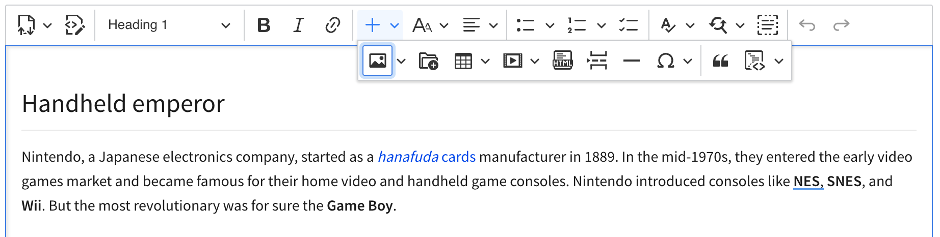
{
label: 'Insert',
icon: 'plus',
items: [
'insertImage', 'ckbox', 'insertTable', 'mediaEmbed', 'htmlEmbed',
'pageBreak', 'horizontalLine', 'specialCharacters', '|',
'blockQuote', 'codeBlock'
]
},
// ...
Notes:
-
labelcan be just any string (we could provide translations for several popular ones like we do in the heading feature), -
iconmaps to an object with pre-defined icons (or a SVG string like inImageStylefeature) -
itemscorresponds to the standard items configuration syntax. It support recursive drop-downs with toolbars.
Changes to the source editing feature
To save space, I say we remove the label from the button. Not sure why we decided to have it there in the first place. I suppose we wanted to replicate the look of CKE4.
- Alternative 1.: Source editing feature could register two components in the factory. One with the label and one without.
- Alternative 2.: Use advanced toolbar item config (see below) to avoid multiple components in the factory.
Changes to the text language feature
To save space, let's remove the label from the button and have a new icon there. This will degrade the UX but OTOH this feature is not very popular.
- Alternative 1.: Text part language feature could register two components in the factory. One with the label and one without.
- Alternative 2.: Use advanced toolbar item config (see below) to avoid multiple components in the factory.
Other works
- Let's have a new icon for all export features.
- Let's have more icons developers could use for their dropdowns. I think they already exist so we only have to move them to
ckeditor5-core.
Drawbacks
Drawback: Deep stacking
The drawback of this solution is that in some cases, there's a deep stack of drop-downs/toolbars to reach an option
Drawback: Drop-downs are passive
It could be confusing for some users that these drop-downs (their icons and states) are static:
It may look like the icon should change depending on the current selection but it won't. This is just a static icon to give users an idea of what's in there.
Proposal: More config for the dropdown
The syntax I propose is as follows:
{
	label: 'Insert',
	icon: 'plus',
	items: [ ... ]
},
but there could be extra fields like withText so the dropdown' looks
instead of
Proposal: Advanced atomic toolbar item config
To avoid having multiple components registered by a feature just to have one with a label and the other without it, I think we could have advanced configuration format for toolbar items:
toolbar: [
	// ...

	{ name: 'sourceEditing', withText: false, otherOption: ... }

	// ...
]
This should be pretty straightforward. When ToolbarView uses component factory to create a component named sourceEditing
https://github.com/ckeditor/ckeditor5/blob/e86c4029b1b4ea184f2451f23b24ce603afead55/packages/ckeditor5-ui/src/toolbar/toolbarview.js#L359-L369
it will then call
const component = factory.create( name );

if ( component instanceof DropdownView ) {
	component.set( component.buttonView, options );
} else if ( component instanceof ButtonView ) {
	component.set( component, options );
}
to set options passed in the config. Since things like withText or tooltip or label are observable properties of ButtonView, this will simply use the public API to customize the component.
Note: It will fail if the component has these properties bound to some external state/model but for many cases this should work.
If you'd like to see this feature implemented, add a 👍 reaction to this post.