cal.com

cal.com copied to clipboard
Different Page formatting on Profile and Team page
I noticed that there is a formatting difference on Profile compare to Team page view, which is not really nice.
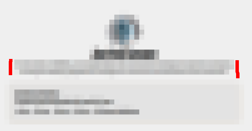
On the user profile page the description is full-width which looks nice as its the same width as the event-types under it:
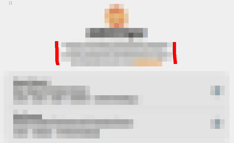
On the team profile page the description is in a block and about 50% the width of the event-types, which looks quite ugly:
Please make both profile and team description on profile, the same width or 90% of the event-types.