💡 Whitespace/Typography
When it comes to text layout, there are competing concerns. I think one of the main concerns for a newspaper related to the process of typesetting, and cramming as much text as possible to reduce costs. These concerns are less relevant on the web, so I think the css of scroll is currently cargo-culting the text layout choices for a different medium.
The question is, how much of the busy feeling of the newspaper layout is due to the text layout, rather than simply due to the multiple columns and lots of content.
Consider the paragraph indent. It is an space efficient way to visually separate paragraphs (only a few extra spaces). If space is very cheap however (as it is on a screen, esp. for vertical space which can easily be navigated with scrolling) then p {margin-top: 0.5em;} gives each paragraph a better separation and gives the whole text more structure and is easier for the eyes to navigate.
I would also advocate for a significantly wider cell width and more line-height:
.scrollPage { column-width: 50ch;}
.scrollArticleCell { width: 50ch;}
.scrollArticleCell p {
    margin-top: 0.5em;
    line-height: 1.4em;
}
As text-align: justify; causes whitespace to be distributed between words, the more words per line, the more consistent the word-spacing. Since the screen has ample space in the vertical direction, extra whitespace can be added between each line to reduce the frequency when the eye finds the wrong line after a saccade.
Very cool! Thanks for the code!
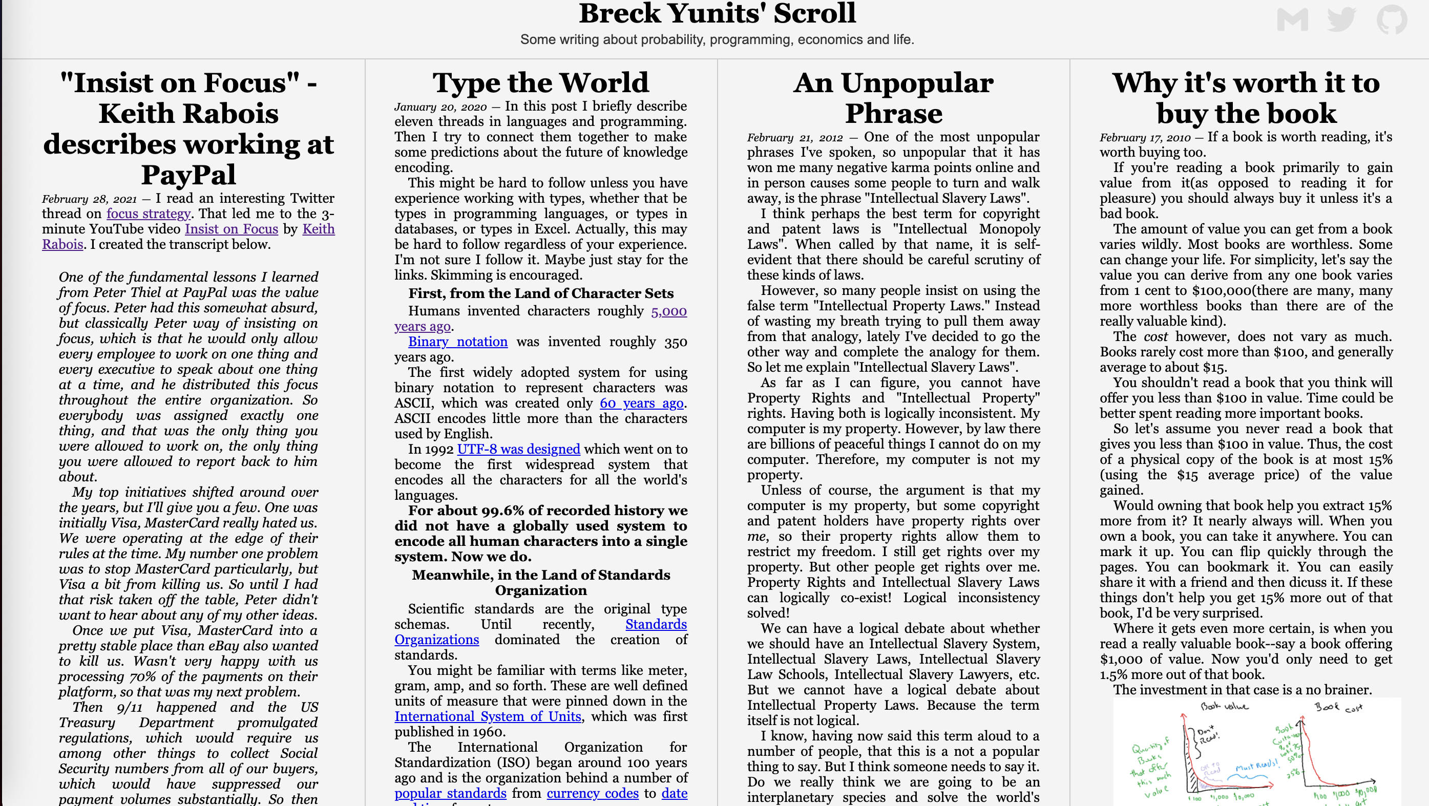
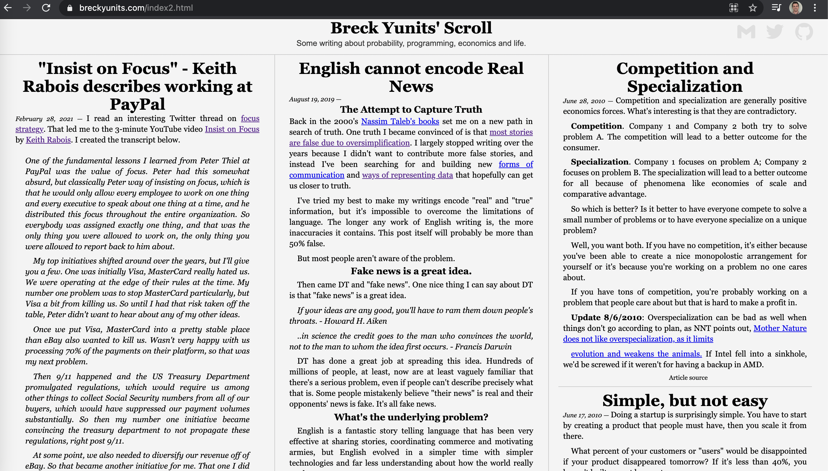
Just copy/pasted that snippet onto the page here: "https://breckyunits.com/index2.html"
Before:
 After:

I think you are getting at one of the main problems right now: it doesn't look so nice and is not necessarily easy to read.
I wonder how to objectively quantify that though without compromising reading speed (both linear but also random access scan speed). To elaborate more on that, and address your related comment:
as much text as possible to reduce costs.
I don't think information is crammed into newspapers to reduce costs. I think it evolved that way to maximize value for the reader.
The high information density on the scroll page accomplishes two "S's":
-
Serendipitous reading. allows for rapid scanning to increases chances of encountering the right article at the right time. When I visit a new blog, it's unlikely that I'm reading the best post for me, so making scanning as fast as possible is one goal. I think newspaper layout gets this and has done it for 150+ years (https://www.amazon.com/York-Times-Complete-Front-Pages/dp/0762466596)
-
Syntopical reading (https://www.amazon.com/How-Read-Book-Classic-Intelligent/dp/0671212095). I like the idea of enabling people to quickly "get inside the author's head". I think being able to skim someone's 100 posts in the time it would take to read one in a linear fashion may be a more valuable kind of reading. I think it would be fun to see what someone's Twitter looks like as a Scroll (https://github.com/publicdomaincompany/scroll/issues/12)
So maybe it would help to numerically define what the current design does for reading/scanning/syntopic speed, and then perhaps there's even an easy way to back of the envelope measure that, and create some CI measurement to check how CSS design changes would affect those metrics. Perhaps words per screen; articles per screen; lines per screen; characters per screen; not too sure, just spitballing.
On 50ch vs 35ch per line, I got the 35ch from that NYTimes book which is 50k datapoints that perhaps ~35ch is the ideal length for maximum human reading speed. I definitely get that this is not typical online, but given that all our content is always public domain and people can take it and remix/represent it as they wish, I think it would be good to focus on the most information dense. I think a lot of current news sites like NYT and WSJ display single articles over a longer space not to make it better for the reader, but rather give them more real estate to slow the reader down and show them more ads. But maybe I'm being too cynical.
Thanks for identifying the knobs to turn! This is an important issue to figure out.
Some time ago I created this: https://mbarkhau.keybase.pub/readable-text/index.html
It may be useful to identify some metrics for the CI system.
I got the 35ch from that NYTimes book which is 50k datapoints that perhaps ~35ch is the ideal length for maximum human reading speed.
Everything is a compromise. Consider that offline typesetting dedicates more resources to typesetting than a browser can reasonably be expected to do. The browser has to render very quickly because pages rendering gotta go fast. The NYTimes can probably do a good job of typesetting with 35ch. If readability were more important and CPU time/web accessibility were not an issue, then you could use LaTeX.
Suffice it to say, if you start with the premise that scroll is for web publishing, I don't think 35ch is the right choice, but it's totally fair to establish metrics before any choices are made.
offline typesetting dedicates more resources to typesetting can probably do a good job of typesetting with 35ch. If readability were more important and CPU time/web accessibility > were not an issue, then you could use LaTeX.
Very good way to look at it. When I think of it like that, it makes sense why things "look good" in print but worse when I try to copy that on the web.
https://mbarkhau.keybase.pub/readable-text/index.html
This is amazing. Helping me play with different combos. I wonder if it would be worth it to connect something like this to Scroll to instantly play with different combos (and perhaps make building custom themes easy).
I see what you mean about the justify problem.

Need to explore that more.
I tried 50ch, 40ch, and 35ch, and at least for me the reading speed seemed to be fastest at 35ch. Back of the envelope though I need to get more scientific about that.
On measurements vs theory: Since measurements are so tricky with this, I try to work from first principles. The most important aspect here for me is to have more consistent whitespace between words, which you increase the probability for if you have more words per line. This is more of an aesthetic thing but can impact readability if the visual artifacts distract from the text.
Whenever you adjust line length, it is best to also adjust the line-height. Longer line length -> higher line-height. The reason is, that your eye needs to track back farther and you can increase the chance that the eye will hit a more distant target if the vertical separation between targets is larger. The wider the white gutters between the lines, the easier it is for the eye to keep track as it sweeps back from right to left.
@mbarkhau just curious, but what was the impetus for creating https://mbarkhau.keybase.pub/readable-text/index.html?
Handy tool, sounds like you have a background in typesetting?
Handy tool, sounds like you have a background in typesetting?
@zk I don't, it's just a fetish. The purpose was as the site says: "This is an experiment to evaluate text layout parameters and measurements."
I recall, return sweep was not such a good measure. Typographers already have an appropriate term that correlates: leading. Text density (which is perhaps more of a consideration for print) did not behave quite the way I expected, I think it may be broken.
I'm closing this issue for now, but always open to ways to improve typography in the default theme! (And probably will have a better template/theming system in the future)