core

core copied to clipboard
Styling of search field for users is overlapping elements
The styling of the new feature for the users overview page is not optimized. It is now overlapping elements in the user table.
Details
| Question | Answer |
|---|---|
| For UX/UI issues | Firefox 94.0 |
Expected result
Better optimization for the side block
Actual result
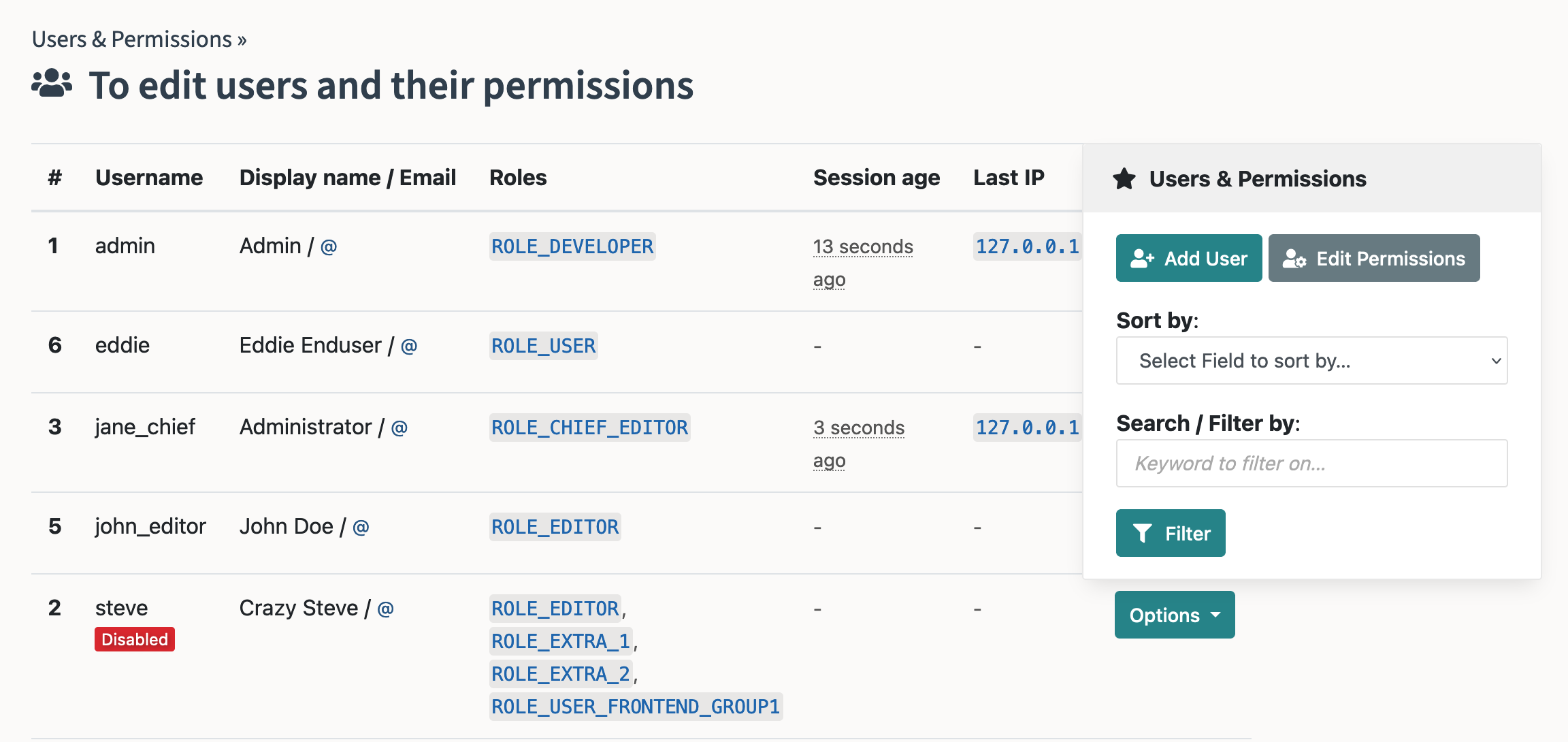
It seems like we can't resize either the table or the side block. Resizing seems to break the elements.
Maybe make it a button which opens the modal?