Enable a non-linear network traffic option (click to toggle between linear and non-linear)
Helps to make visible the low bandwidth traffic and high bandwidth (or spikes) concurrently. (Previously the low bandwidth traffic becomes invisible in the presence of spikes).
Old format:

New format:

Old format:

New format:

(clicking on the graph will toggle between the new format and the old format).
Love the idea, the problem with these things is there's gonna be someone who is annoyed by the behavior change.
When I do things like this, I always maintain the old behavior somehow, so that kind of reaction against gets suppressed more easily.
Concept ACK, this seems like a good idea to me, given that, what you really want to see in graphs like this is the gross magnitude and not so much very small variations in the throughput.
Love the idea, the problem with these things is there's gonna be someone who is annoyed by the behavior change.
When I do things like this, I always maintain the old behavior somehow, so that kind of reaction against gets suppressed more easily.
I agree, which is why I've now (latest commit) made it toggleable - just click on the graph to switch between the two display options.
Concept ACK.
Love the idea, the problem with these things is there's gonna be someone who is annoyed by the behavior change. When I do things like this, I always maintain the old behavior somehow, so that kind of reaction against gets suppressed more easily.
I agree, which is why I've now (latest commit) made it toggleable - just click on the graph to switch between the two display options.
Obscure, but OK.
Adding a label to the highest horizontal line would be useful.
I did consider this, but as it's not the current functionality, and it would make the highest point on the graph no longer reach the top (as the label would need extra space) I decided against it. Could be done as a separate pull request though.
Adding a label to the highest horizontal line would be useful.
@RandyMcMillan #492 also reduces the need for this as now you can point to a point on the graph to get details.
e.g.
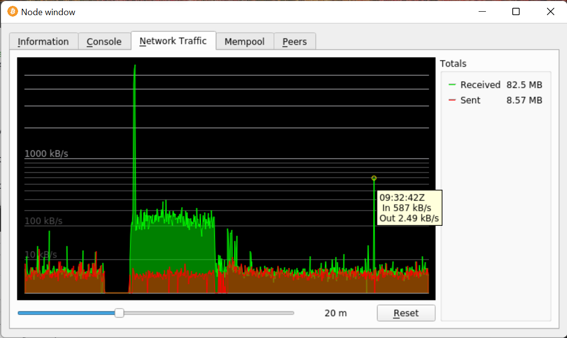 (displays time in the same format as in the debug,log so also makes it easy to find the corresponding point in the log file).
The following sections might be updated with supplementary metadata relevant to reviewers and maintainers.
Conflicts
No conflicts as of last run.
@rebroad - added this in PR https://github.com/bitcoin-core/gui/pull/539
https://github.com/bitcoin-core/gui/pull/539/commits/10f8e797bcd6d8f8910b7560a6e132d197b5f97b

NOTE: I was careful to preserve commit authorship attribution: 👍🏽 https://github.com/bitcoin-core/gui/pull/539/commits
Closing this as it has not had any activity in a while. If you are interested in continuing work on this, please leave a comment so that it can be reopened.