[UX] Admin bar: Move "Add new X" to the bottom of each fly-out menu
Most of the time when I am using my admin bar, it's to manage the things I already have. Adding new things is something that only happens at the beginning of a project, and honestly I almost always get there from the listing page, not from the admin bar. (The only exception to this rule is the "Add content" link, which I use often)
I'd like to recommend that we move all the "Add new X" links to the bottom of the fly-out menu, instead of the top. This will also have the added benefit that as you are navigating to the "Add new X" button, you get a chance to browse all the existing Xs, and perhaps find the one you were about to create! (I'm not sure anyone else creates duplicate items often, but it happens to me more than I'd like to admit).
If you are in a hurry and don't want to do all the admin-bar scrolling, you can also click the top "List Xs" link, since that page will have the action link for "Add new X" on it :)
Before:
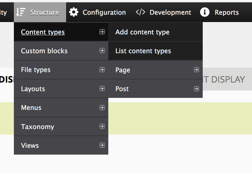

After:


PR: https://github.com/backdrop/backdrop/pull/3277
Works for me in the sandbox site!
It's a great improvement, in my opinion. Reading the suggestion, I expected it would feel strange as I'm quite used to the current item order. But the suggested order didn't feel strange at all, it just feels right to me.
My gut assumption was that it made sense to have the "add" option at the top. After testing, I found that I like have the "list items" option at the top and really don't mind have the "add item" at the bottom. In truth, I am probably more likely to list items before adding one anyway.
So, I don't feel strongly about this either way. But, I see some utility and it sounds like at least two other people (@jenlampton and @olafgrabienski) really like it. So, I'll endorse this change.
...I found that I like have the "list items" option at the top
My only note re this is that you can get to the same page by clicking the parent menu item. But I guess that this makes it work the same as the default primary tabs behave.
In truth, I am probably more likely to list items before adding one anyway.
I have the same habit, but a the same time, we are still suffering from things like #1001/#1003, which would make the "add new xyz" menu items become inaccessible or show below the viewport if there are too many menus/content types/what-have-yous in the menu 🤔
The convention for creating a new X in most software is to have the "New" option at the top or very close to the top of the list, so it's going again proven practice for software development and user interfaces in general.
I also agree with Klonos, that on smaller viewports the link may be off the screen.
The PR worked for me.
But it does seem counter-intuitive.
Hope this helps :)
The convention for creating a new X in most software is to have the "New" option at the top
I suspect this is why the "Add new.." links ended up at the top in the first place. In practice though, having the link I rarely use in a more accessible position makes all the common tasks slightly harder.
the "add new xyz" menu items become inaccessible or show below the viewport if there are too many menus/content types/what-have-yous in the menu
This was my thinking exactly. :)
I'd like to put the less-used items at the bottom, below the more-used ones. In my experience, 95% of the time I am looking for a link that already exists. When those lists are long, the link I actually want is more likely to be below the viewport if there is an "Add new X" link taking up precious space at the top.
We looked at this in UX/Design meeting. This one seems simple enough that I will mark it RTBC.
This code is ready but I don't think this is much of an improvement. With large lists we're moving a useful link to the bottom that is potentially off-screen. The Add new item is at the top of the listing pages, it seems strange to make the menu inconsistent compared to the listing page.
I still have concerns about this change (I would be less concerned if we implemented something like #5884). The premise of the requested change is basically this:
Most of the time when I am using my admin bar, it's to manage the things I already have. Adding new things is something that only happens at the beginning of a project, and honestly I almost always get there from the listing page, not from the admin bar.
I agree with this, but that means that this change here will improve the UX for site builders/admins on existing sites that are on a BAU mode - at the same time, I think that it will worsen the UX for new sites that are under active development, and for people demoing Backdrop and using it for the first time.
@jenlampton would you agree to make this an option/checkbox under the admin bar settings? Should only be less than 10 lines of code, and it will make everyone happy. As for what the default should be, we could start gathering metrics on it, and decide and change later if it turns out that this is a popular thing.
With the concerns expressed above I don't feel comfortable committing this as-is. Removing the RTBC tag.
Alternative PR, which provides this feature as an option in the admin bar settings: https://github.com/backdrop/backdrop/pull/4359
PS: I've also wrapped the settings and components in separate fieldsets. We've added quite a few options over time (and we'll add more, like #5983), so the form lacks grouping/structure (visually seems like an endless stream of checkboxes). Let me know if I should move that into a separate issue/PR.
Thanks @klonos! I like that this is configurable now. I'd personally never use this setting, but I'm glad those who would can now do so.
I've left a review on the PR. Main thing is wondering if we shouldn't use radio buttons instead of a single checkbox. Then it'd be more obvious that the choices are top or bottom.
I prefer it to be configurable too, since it is not possible to find a solution that is valid for everybody. I usually do not add much content types, for example, and I pass more time to edit them than adding them; for me, Add [X] at the bottom is preferable, but that is not the solution for who has many content types (and maybe passes more time to add new content types).
@BWPanda I've addressed all of the PR feedback, including switching to radios for this setting. Here's what it looks like (happy to get suggestions for text used):
@BWPanda thanks for the PR you've filed against mine 🙏🏼 ...I agree with the changes, but the PR seems to be bringing in changes from other PRs (see details in the PR comments). I've rebased my branch, but that didn't fix things. Can you please also rebase yours and let me know so that I can check again? ...if you don't have time or if these irrelevant changes persist after you have rebased your branch, then I can apply your changes manually. Happy to do it either way.
@klonos I provided a diff file in the PR as I couldn't figure out a proper PR.
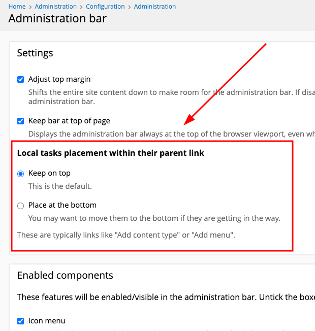
...here's a before/after screenshot for those reviewing the design/aesthetics:
This looks great now and I'm in support of having this option. There's one issue with the PR in that it needs an update hook to set the new default. Even though the code is written in a way that the missing config value will not have a negative impact, not having a value set on existing sites can cause weird behaviors.
@klonos or @quicksketch - Is this really a Feature Request or would this qualify as a UX improvement that could still get into 1.28?
I added an update hook to the PR. It WFM. Needs only a quick code review of the update hook since that's the only change since last RTBC. @stpaultim
I resolved merge conflicts to get the update hook into 1.x. I tested the update hook locally and it worked as expected. Thank you for adding that @herbdool!
I merged https://github.com/backdrop/backdrop/pull/4359 into 1.x and 1.28.x.
https://github.com/backdrop/backdrop/commit/94659a9816a452b33414e1cbce6046cfbc0af137 by @klonos, @BWPanda, @herbdool, @jenlampton, @olafgrabienski, @stpaultim, @bugfolder, @albanycomputers, @kiamlaluno, and @quicksketch.
This works fine, but we have a small but rather obvious regression with the help text for the various options. Re-opening for a quick fix.
Small PR to fix the regression: https://github.com/backdrop/backdrop/pull/4809
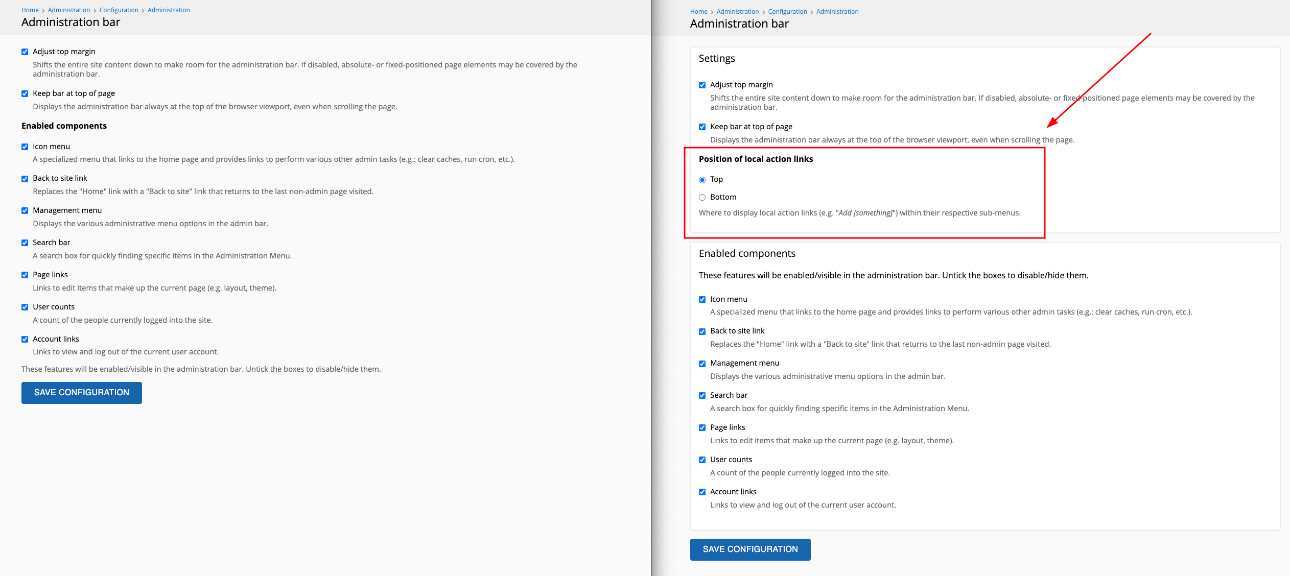
Before/after screenshot:
The individual help text items got lost, and the description text for the checkboxes got duplicated in the wrapping fieldset.
...based on earlier screenshots in this thread, I think that the regression occurred somewhere between the addition of the update hook and the rebase and conflict resolution 😬
Thanks @klonos. I'm not sure if this warrants making another release immediately. If the form still works, we can address the regression in 1.28.2 and just try to get another release out in the next couple of weeks.
@klonos please create a follow-up regression issue to help us track it better.