Need example to color the line conditionally between data points. i.e., multi color line chart
What problem does this feature solve?
I struck in plotting the multi color line chart based on some condition. The color between two data points in a line chart depends on the values of the other parameter.
I can use visual map, but it's based on the ranges and coloring the line dividing it into pieces, which doesnot solve my requirement.
Please provide an example to achieve this. Please comment if you need any clarification.
What does the proposed API look like?
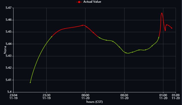
https://user-images.githubusercontent.com/20918310/69040429-ca206b00-0a13-11ea-82aa-a3c804101d38.png
Hi! We've received your issue and please be patient to get responded. 🎉 The average response time is expected to be within one day for weekdays.
In the meanwhile, please make sure that you have posted enough image to demo your request. You may also check out the API and chart option to get the answer.
If you don't get helped for a long time (over a week) or have an urgent question to ask, you may also send an email to [email protected]. Please attach the issue link if it's a technical questions.
If you are interested in the project, you may also subscribe our mail list.
Have a nice day! 🍵
Initially I implemented with visualMap continuos, but it's not plotting the graph as expected. If required I can share the dataset which I'm using.
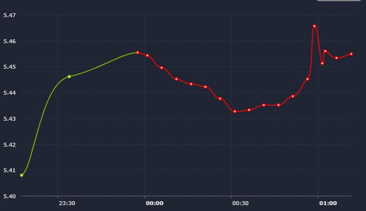
With visual map:
Expected Behaviour:
Actually Color between two points are dependent on other parameter. Say there are three lists
- [5,8,10,6,12]
- ['2019-10-12T10:05:00.000Z','2019-10-12T10:10:00.000Z','2019-10-12T10:15:00.000Z','2019-10-12T10:20:00.000Z','2019-10-12T10:25:00.000Z']
- [3,1,2,1,2]
Graph will be plotted between 1 and 2. The filling color of line between two data points is dependent on the values of third list.
The color of the line is not dependent neither on values of y-axis nor on values of x-axis . So I can't use dimension to set the color. It's dependent on other values which we're not plotting on the graph. In the above comment I mentioned it.
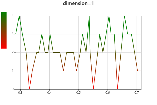
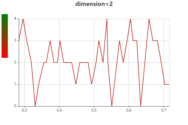
Put that value in the data like [[x1, y1, extraValue1], [x2, y2, extraValue2]] and set dimension to be 2.
Faced the same problem. Setting the dimension to 2 and mapping by extraValue didn't work for me. This way only the color of item dots is changing but the series line color remains the default.
i have the same issue,it only work when dimension is 0 or 1,which is not what i really want.
option = {
// Make gradient line here
visualMap: [{
show: true,
top:'10%',
type: 'continuous',
dimension:2, //don't work
min: 1,
max: 3,
inRange:{
color:['red','green']
}
}],
xAxis:{
min:'dataMin',
max:'dataMax',
},
yAxis: {},
series: [{
type: 'line',
showSymbol: false,
data:[
[0.284,3.000,3.00],
[0.296,4.000,4.00],
[0.307,3.000,3.00],
[0.320,2.000,2.00],
[0.331,0.000,0.00],
[0.341,1.000,1.00],
[0.356,2.000,2.00],
[0.363,2.000,2.00],
[0.374,3.000,3.00],
[0.385,2.000,2.00],
[0.395,2.000,2.00],
[0.402,3.000,3.00],
[0.413,2.000,2.00],
[0.424,2.000,2.00],
[0.436,2.000,2.00],
[0.448,1.000,1.00],
[0.459,2.000,2.00],
[0.472,2.000,2.00],
[0.483,2.000,2.00],
[0.493,1.000,1.00],
[0.506,2.000,2.00],
[0.514,3.000,3.00],
[0.526,2.000,2.00],
[0.537,4.000,4.00],
[0.540,2.000,2.00],
[0.551,0.000,0.00],
[0.566,2.000,2.00],
[0.573,3.000,3.00],
[0.584,2.000,2.00],
[0.595,3.000,3.00],
[0.605,4.000,4.00],
[0.612,3.000,3.00],
[0.623,3.000,3.00],
[0.634,0.000,0.00],
[0.646,2.000,2.00],
[0.658,4.000,4.00],
[0.669,3.000,3.00],
[0.682,3.000,3.00],
[0.693,2.000,2.00],
[0.703,1.000,1.00],
[0.716,1.000,1.00],]
}]
};

This issue has been automatically marked as stale because it did not have recent activity. It will be closed in 7 days if no further activity occurs. If you wish not to mark it as stale, please leave a comment in this issue.