 ankidroid
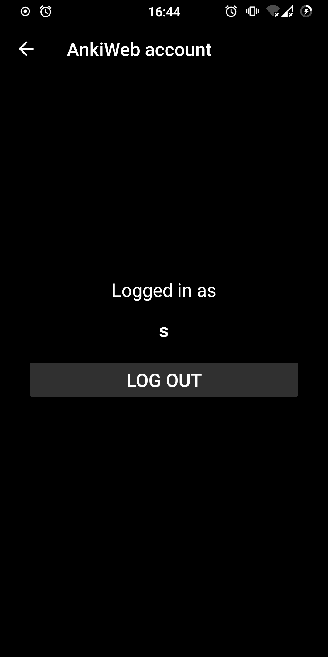
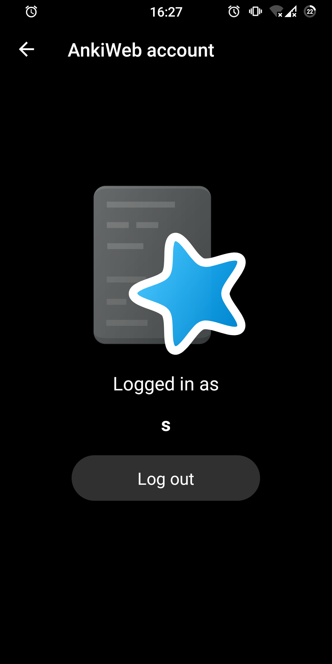
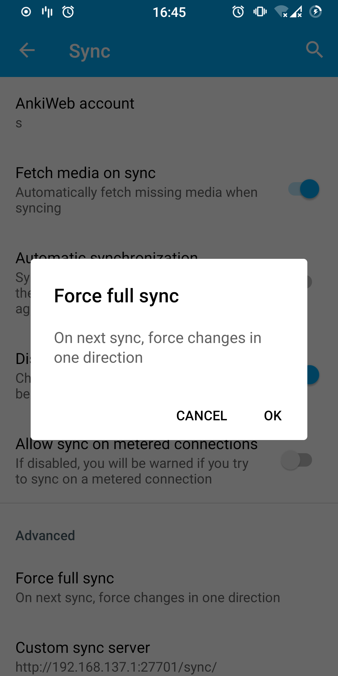
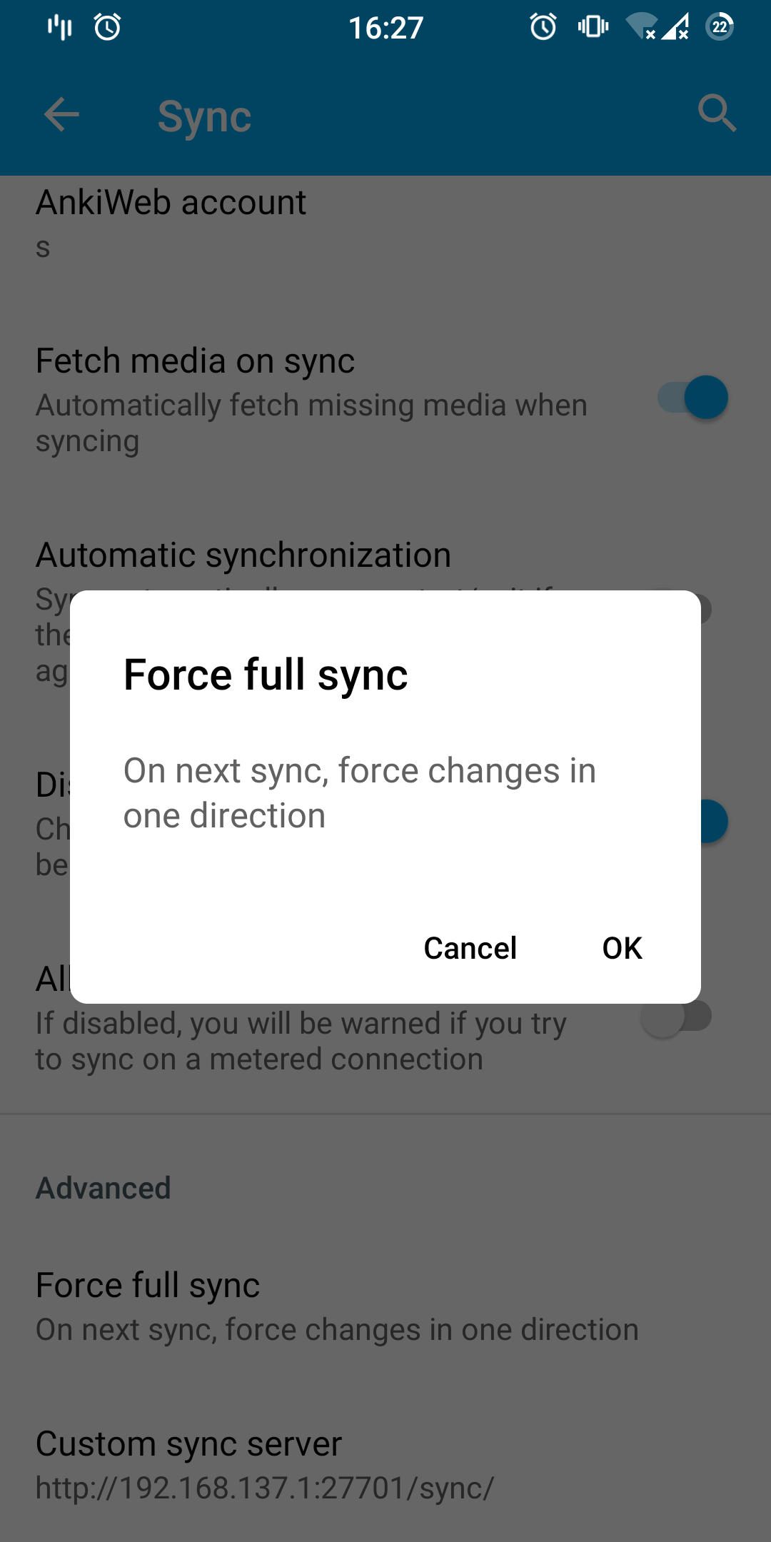
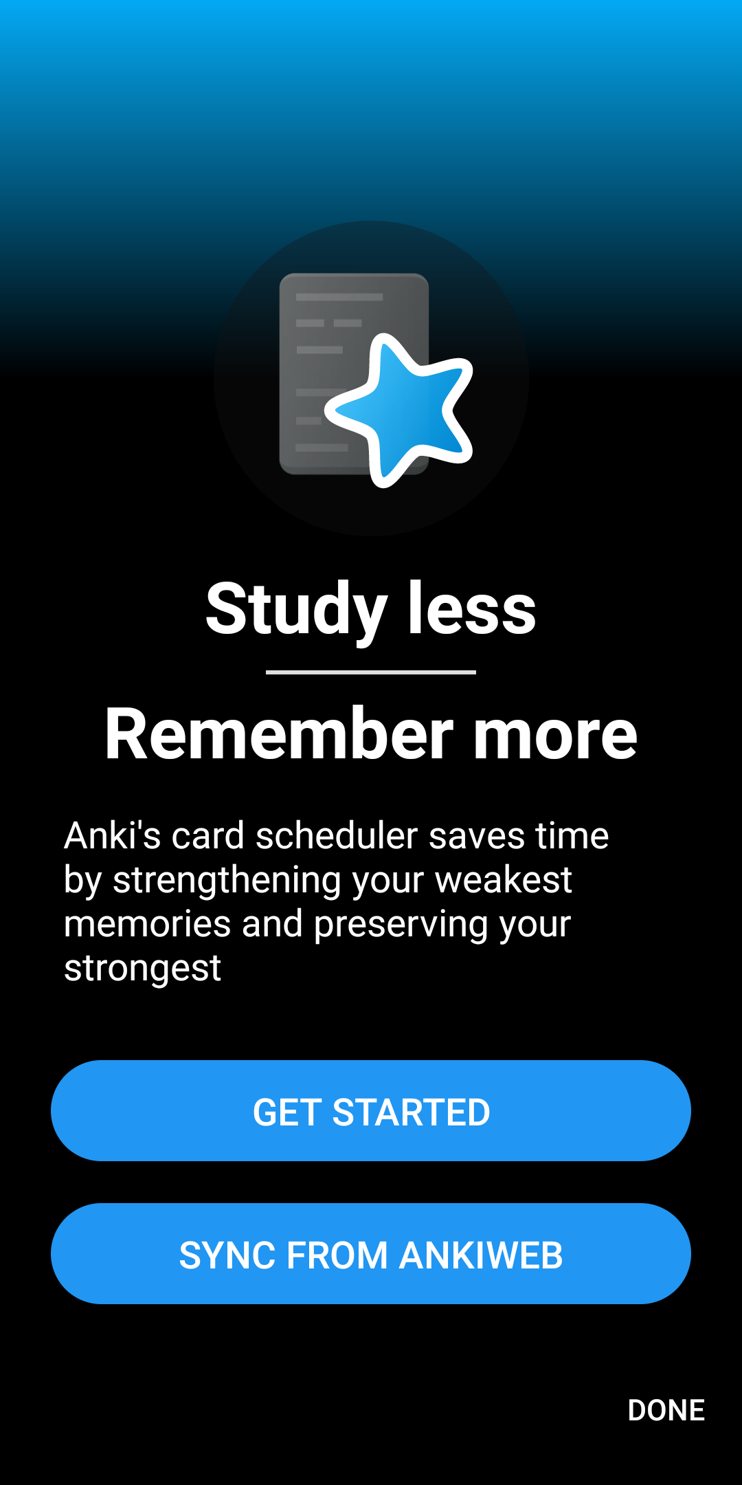
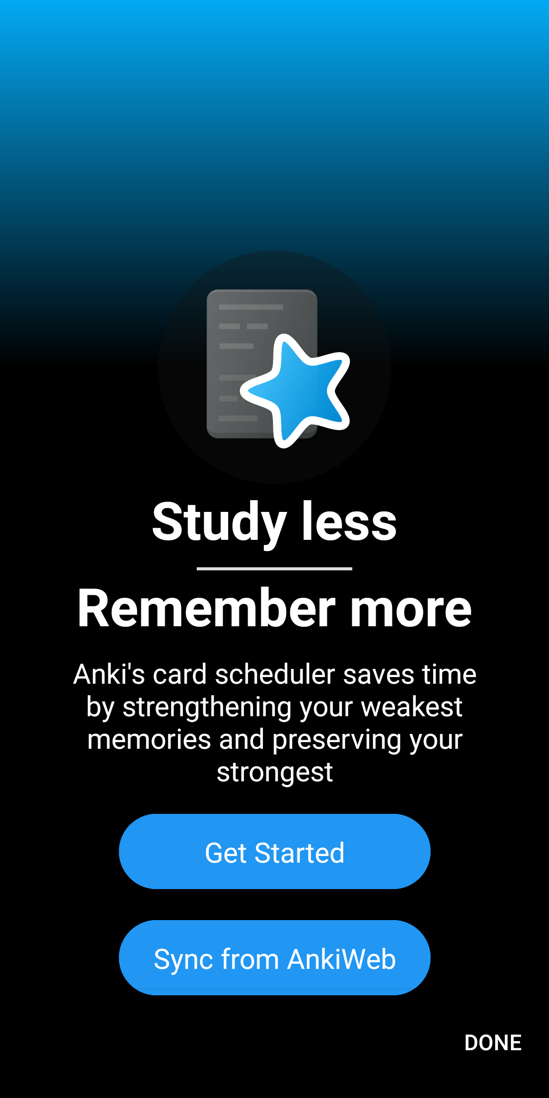
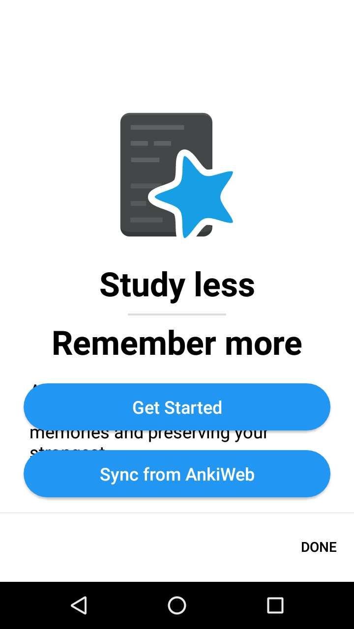
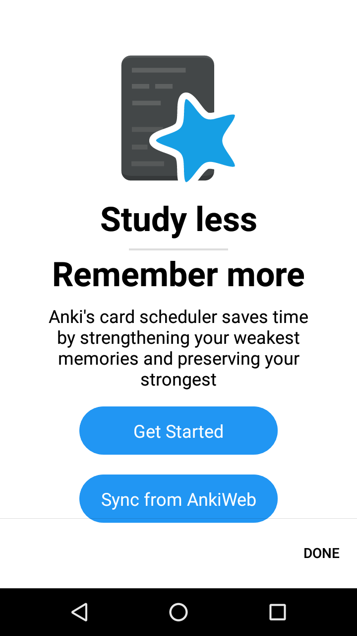
Make things rounder and stop screaming at users
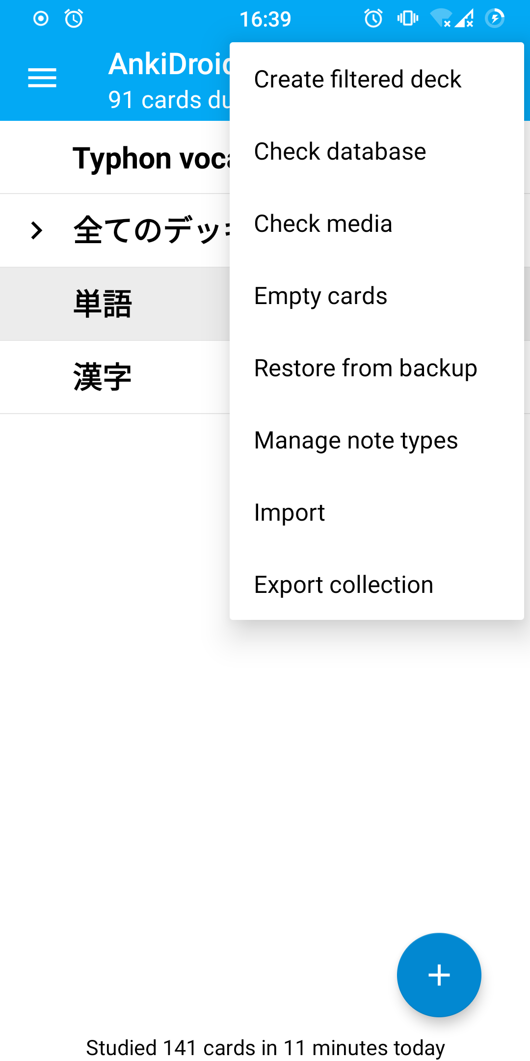
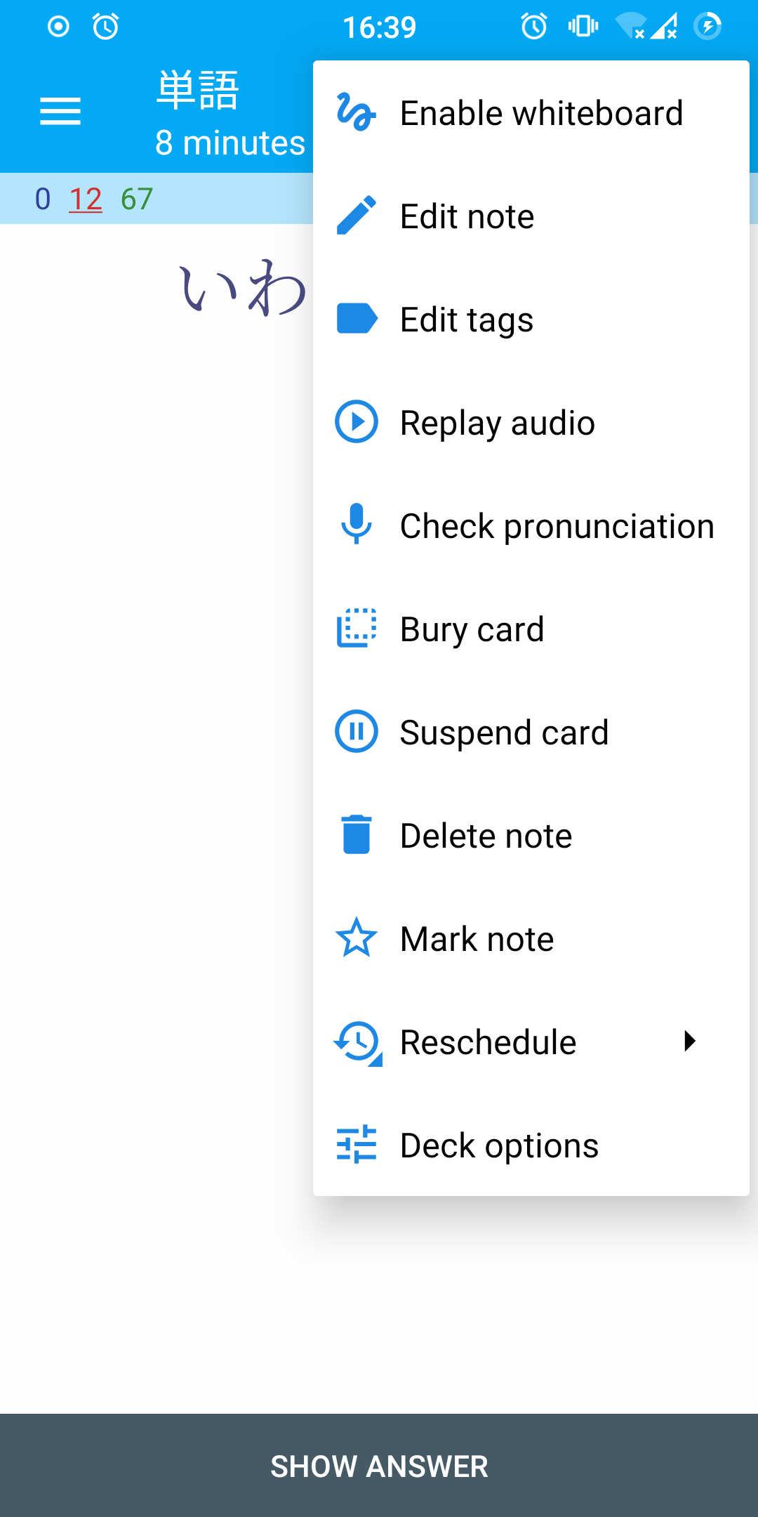
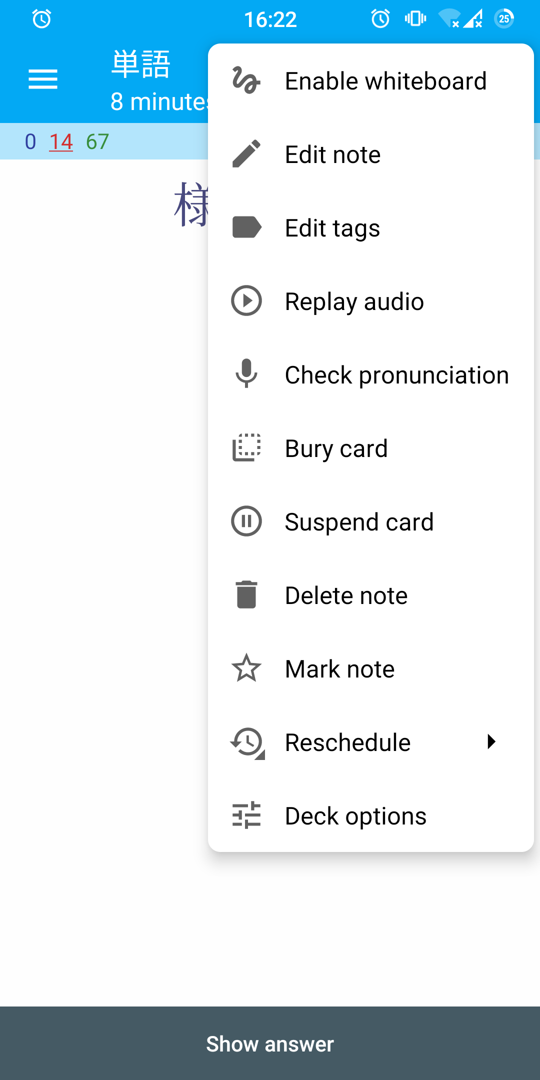
For the most part this makes various popup corners rounder and removes button labels in ALL CAPS. Roundness now follows the default Android 11 looks. Also, menus with icons were tweaked to have better looking padding and regular colors. I also changed a few things around the stuff I touched. As usual, please see individual commit messages for details.
This does not cover everything, particularly in places that might require significant overhaul. Notably,
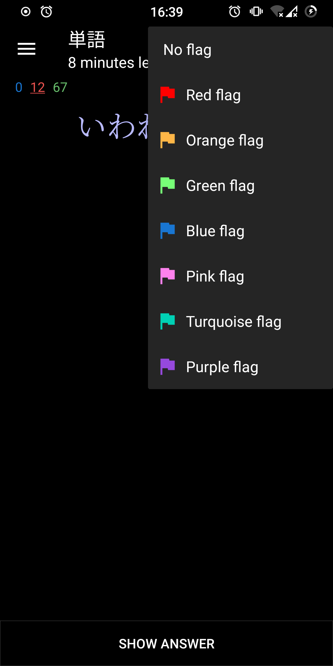
- Filter by flag in Card browser menu—hopefully this is turned into a chip;
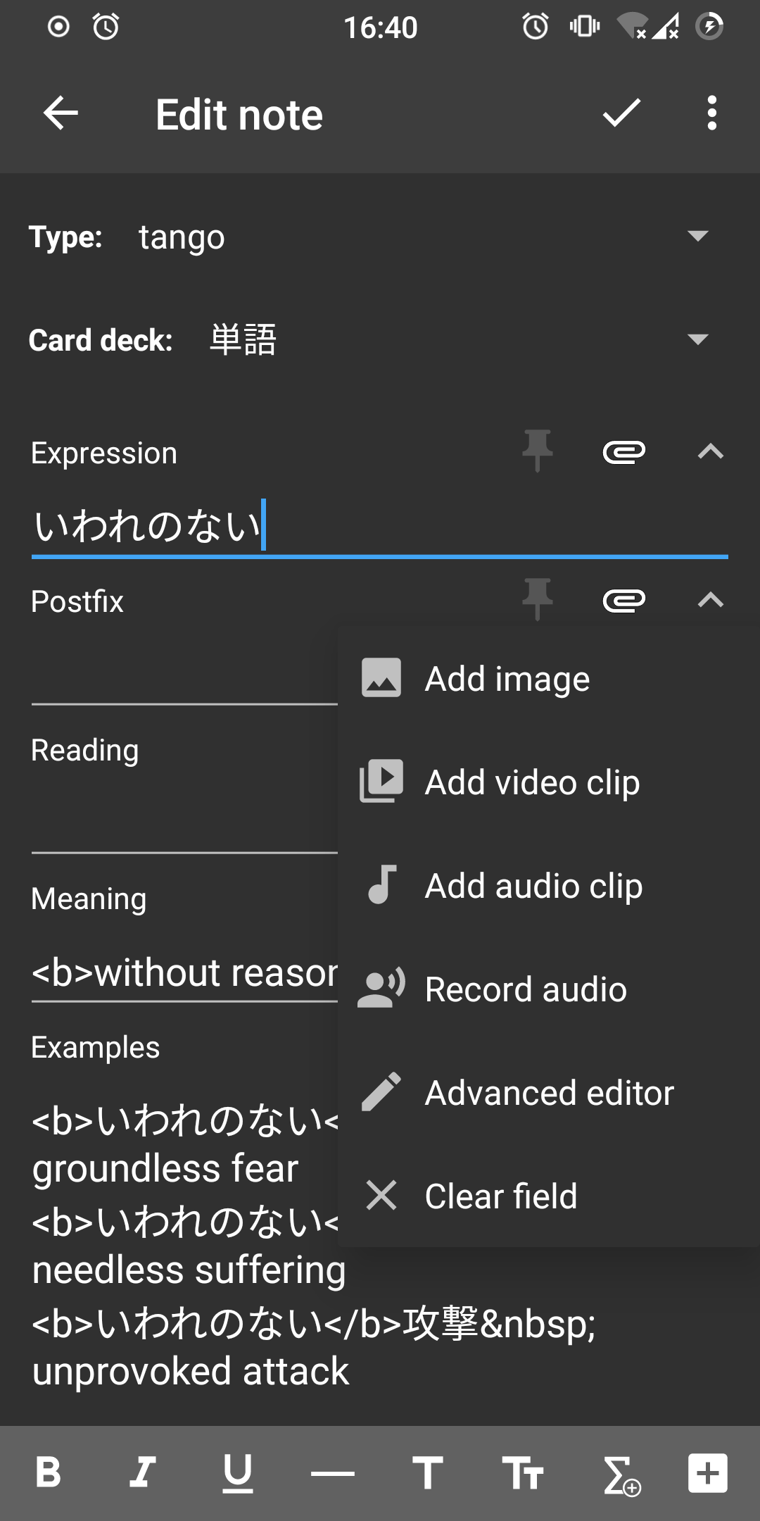
- Editor Tags & Cards buttons—these probably better be reworked into something else;
- Advanced editor—I think it should be removed altogether;
- Crop image—it does not follow app theming at all;
- Deck options—this one is fine on recent Android versions but shows jagged edges on 6. It would probably be better to deal with this by rooting out all the hacky stuff from it;
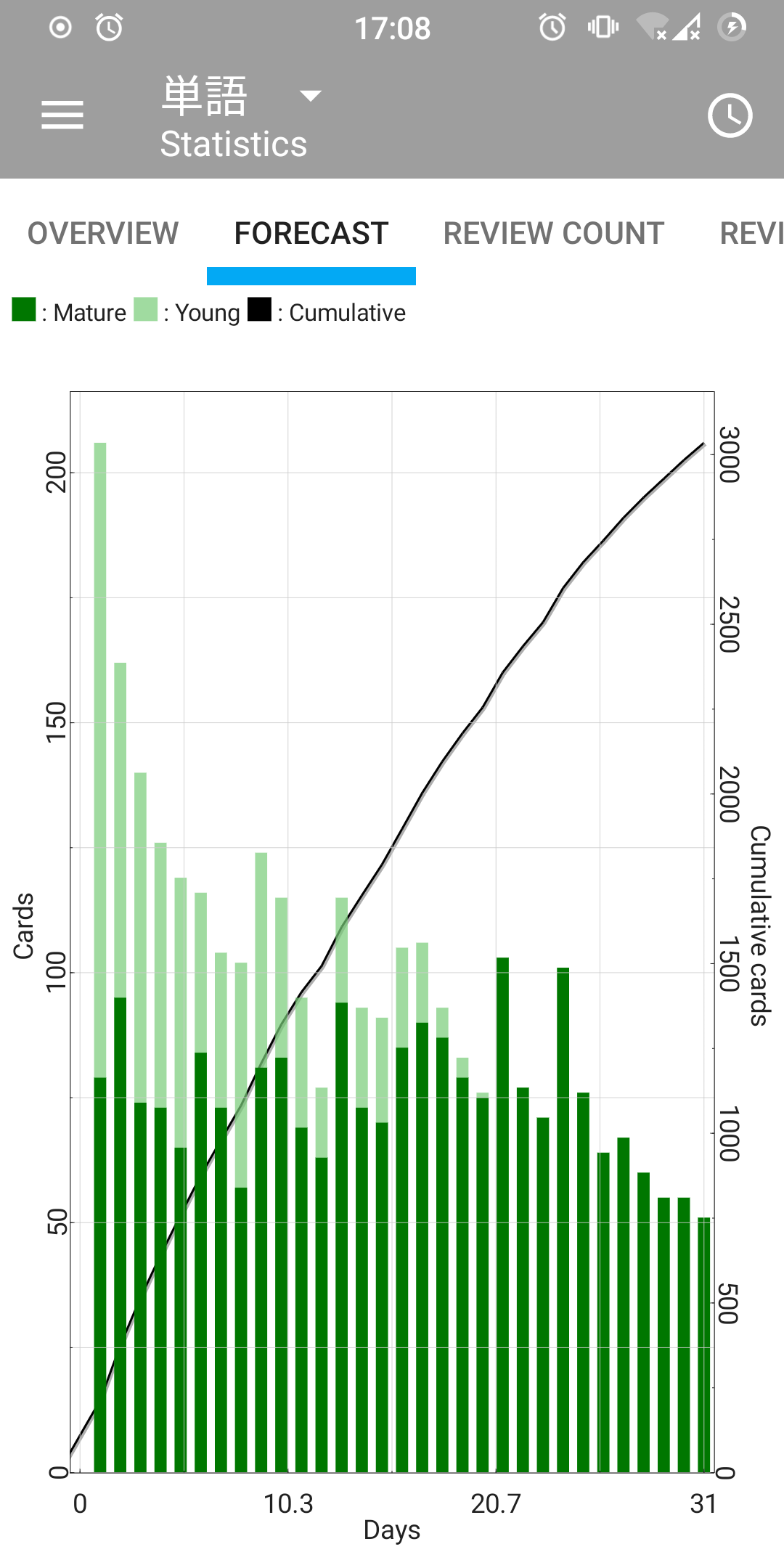
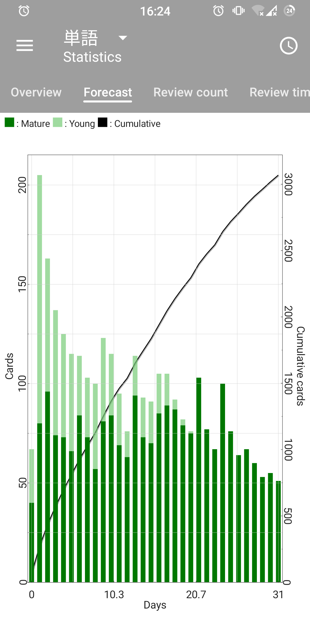
- TEXT in Statistics → Overview;
- Probably I missed something else?
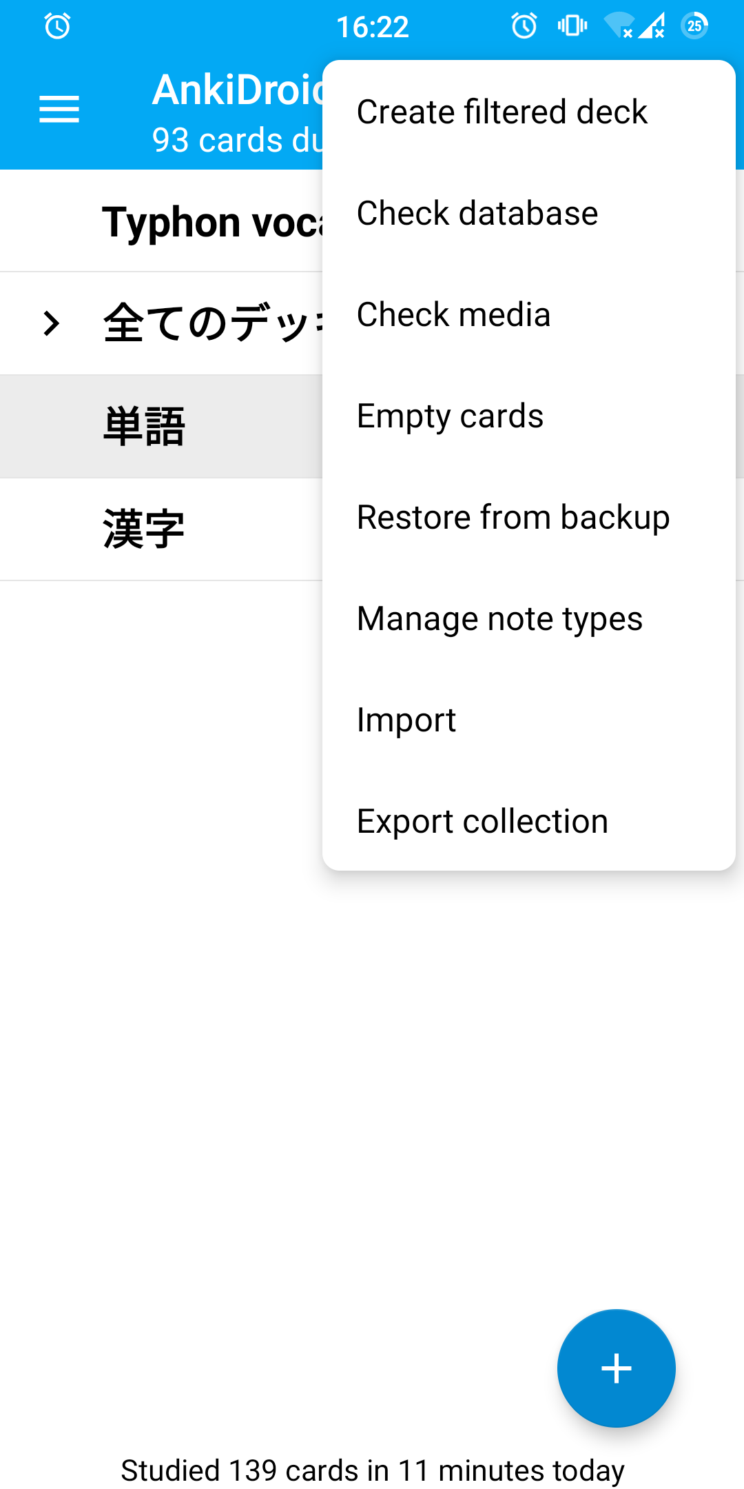
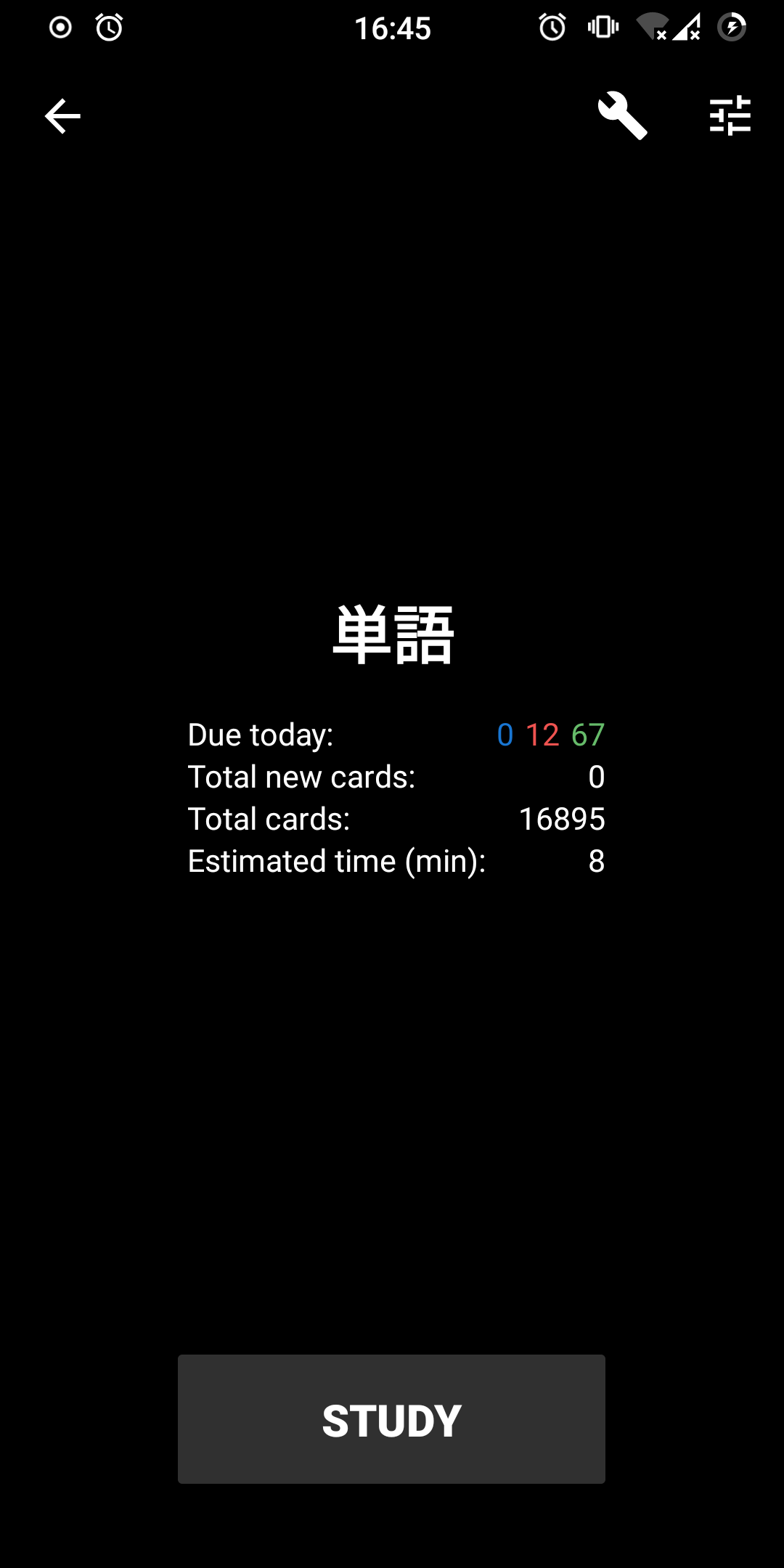
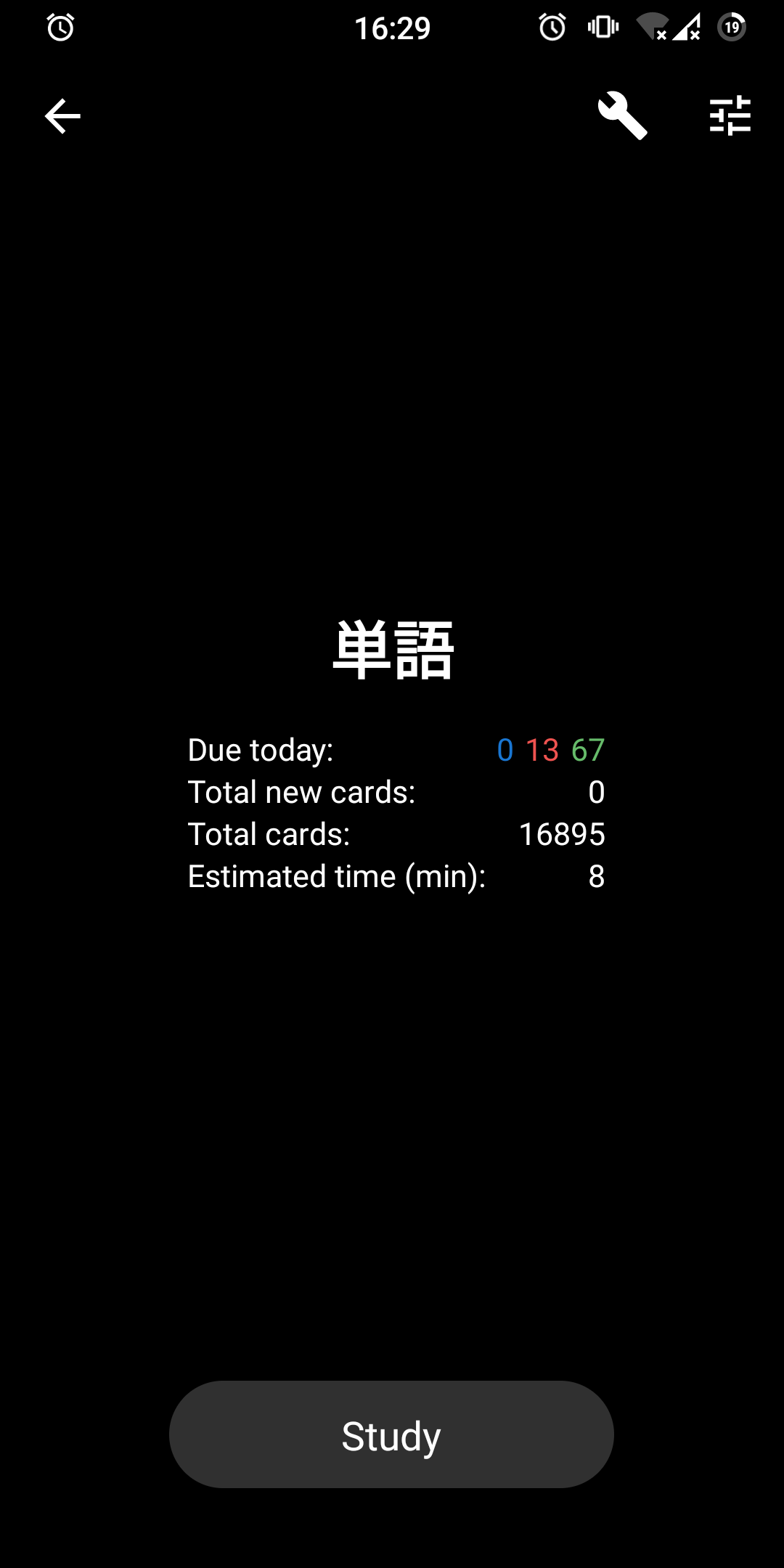
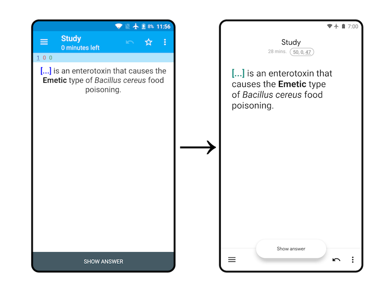
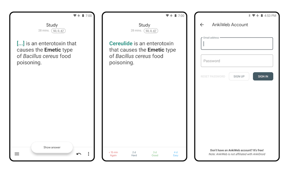
Anyway, screenshots. Left: before; right: after.
I suppose the next big step would be to fully move to material theming. At this point gradual changes become counterproductive; I'd love to rip out every customization, switch to material and rebuild the UI top down. Big big work. Some of the above points should be addressed first though.
Accessibility scanner complains about the white text on blue/gray background in tab layout. This is an ongoing problem with the toolbar color being too light in light themes and should be solved by changing toolbar color.
How Has This Been Tested?
Manually tested on my Xiaomi Mi A2 (Android 11) and Motorola Moto G 1st Gen (Android 6).
Checklist
- [ ] You have a descriptive commit message with a short title (first line, max 50 chars).
- [x] You have commented your code, particularly in hard-to-understand areas
- [x] You have performed a self-review of your own code
- [x] UI changes: include screenshots of all affected screens (in particular showing any new or changed strings)
- [x] UI Changes: You have tested your change using the Google Accessibility Scanner
Overall, I really like the changes and agree with the path to take about the UI. I don't have time to review it right now, but I should do it on the weekend if nobody else beats me up. Feel free to ping me if I forget it.
About the points on the PR description, I agree with them, although I don't recommend spending time on Deck options or Statistics, as they eventually are going to be replaced by upstream's HTML pages when the new backend is the default
And I would include Filtered Deck options on the pending list, which is quite hacky as well
Also this have an Lint issue
Updated to fix the lint issue. Also I found a menu with flags in Card browser so I dealt with that as well, and I decided that at this point it's better to go recursive with fixing up the menus.
The rounder corners look good.
Also, menus with icons were tweaked to have better looking padding and regular colors.
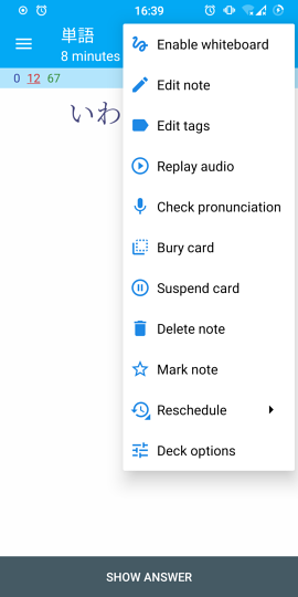
@oakkitten Personally, about the color of the icons of the menu of Study screen, I like and am attached to the current blue one,
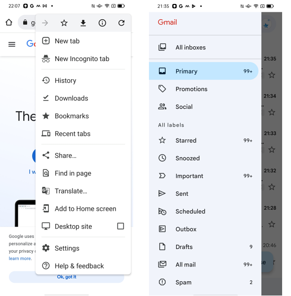
 but, as you probably think, it may not be the standard style of the latest Material Design. I've thought so since seeing the following the designs of Google Chrome and Gmail. I've begun to prepare myself to say goodbye to the current blue icons.
Accessibility scanner complains about the white text on blue/gray background in tab layout. This is an ongoing problem with the toolbar color being too light in light themes and should be solved by changing toolbar color.
I support the solution like the following one, using white or pale gray or pale blue. Google Chrome and Gmail do so.
- White theme with dark text (instead of every theme having light text)
Originally posted by @nickdvlpr in https://github.com/ankidroid/Anki-Android/issues/5126#issuecomment-451238994
Originally posted by @nickdvlpr in https://github.com/ankidroid/Anki-Android/issues/5126#issue-383325736
Blue toolbar doesn't seem to suit the dark gray icons (even if the color of the bar becomes darker).

Rebased to address some of the suggestions. I have absolutely no idea what's going on with the failing unit tests here.
The only thing that is blocking to me is the bottom navigation's pill background contrast
This is a problem, but I think this change is a step in the right direction. Previously it wasn't immediately clear which item is selected, as you can have both darker and lighter color for selection. Of course, the big clue is that of the three items only one can be selected, but this is still confusing. This changes the behavior to a more standard, Android way, and the problem will disappear once the toolbar color is changed to a light color like @snowtimeglass mentions.
but, as you probably think, it may not be the standard style of the latest Material Design. I've thought so since seeing the following the designs of Google Chrome and Gmail. I've begun to prepare myself to say goodbye to the current blue icons.
I think I would prefer the icons to be the same color as text. Blue toolbar indeed seems to be not agreeing with the dark grey icons somewhat, but if the icons are the same color as text, there's the agreement! I definitely don't like the blue color though. I didn't change it all the way to the color I like because this is probably best done as a part of a PR that changes the entire theme. I didn't want to make such decisions just yet so opted for what seems to be the more standard and uncontroversial color.
1: CI is broken
2: I'm okay with the light pill color depending on the time frame of changing the bars colors, as I'm already foreseeing someone complaining about the low contrast in the future. This will probably take some time/discussion, as this is a "big" change on the app appearance. I think that there is a colorPrimaryDark attribute already chosen for Light and Plain themes, which may be a good temporary solution while the bar's color isn't changed.
I was thinking about inverting the colors, displaying a fully white pill and making the icon itself blue. I didn't go with it as this effectively makes the icon appear flipped. These icons need to be changed anyway, I guess I just might draw some that can be inverted, how about this? I planned to do this later but might as well do it now.
Fine by me. I've reran CI tests, and they had some errors
Optional: have you tried using filled icons when they are selected? (as Material recommends https://m3.material.io/components/navigation-bar/overview)
I don't know what's happening with CI, tests pass (on ubuntu/macos) in my repo.
I thought about filled icons, but
- It would be better for consistency to make the CSS icon behave similarly. I am not sure what'd be a good way to do that, simply outlining the letters CSS seems like a bad idea;
- TBH I just don't want to deal with this right now, and it can be done later anyway.
Odd. I've rerun 5 times I think? My PC is currently busy, so I can't run it locally for the moment.
About the filled icons, I don't think it's bad to have one icon that is not outlined (in this case, CSS). You can have Google Maps as an example. But that's an issue for another day.
@oakkitten finally got to run this on my PC and the same errors appear here.
Rebased onto current main, also changing DrawableWrapper to DrawableWrapperCompat to appease CI.
I think the before / afters are a tangible user-visible improvement and will go a long way towards reducing the "Ugh, this app looks like it's from 2008" complaints on our play store reviews
Needs a compile fix
e: /home/runner/work/Anki-Android/Anki-Android/AnkiDroid/src/main/java/com/ichi2/anki/ModelBrowser.kt: (129, 17): Unresolved reference: addNewNoteTypeDialog
The conflict has somehow survived your force push :thinking: Today has been a huge day for merges, so maybe you caught another one in flight, if so apologies