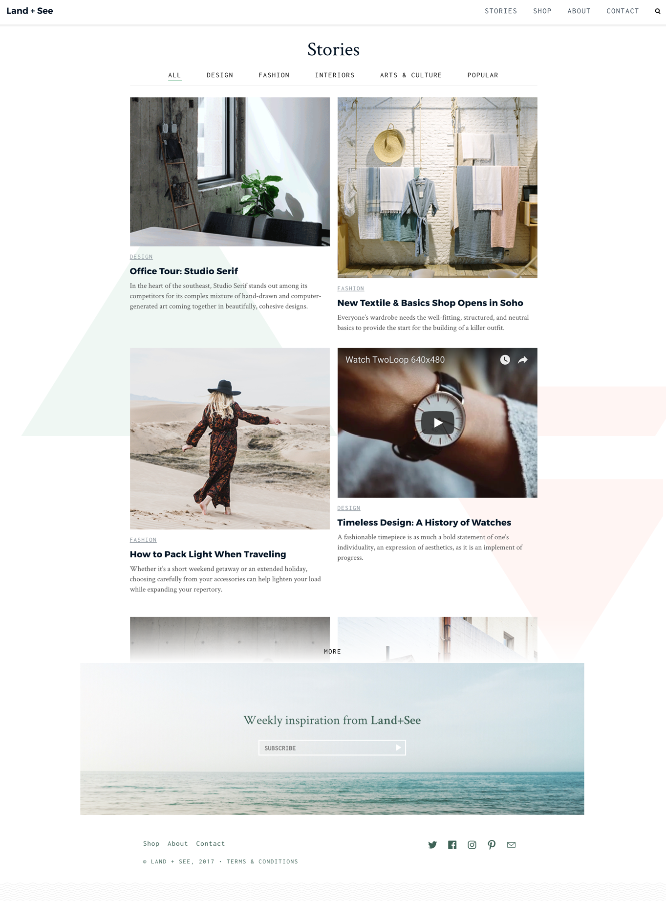
[Land and See - Stories pages] "Read more" bar feels off
Current
Just looks weird. I couldn't get it to consistently show up. This one is off because it doesnt line up with the subscribe box and even if it did it might not seem clickable. In another version I saw it was cutting the images off in a weird place.
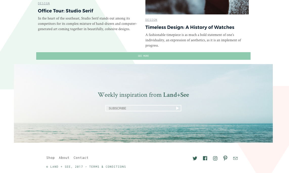
Should be Do we need this? @ericlindley-g I don't remember seeing this before...If we do need it, I would opt for more of the shadow treatment we're giving the Stories > Filter bar to show content that can be revealed...
This was not part of the mocks, but is a consequence of amp-list requiring a defined height. It is a part of the amp-list component. The alternative was to make the list as large as it needed to be for up to the largest content page size on page load. This meant that the paging nav at the bottom of the list could possibly be many times the scroll distance from the bottom of the nearest content, depending on the category passed on the query param. You're correct that it doesn't always show up. The AMP Runtime will determine if it can resize a list based on content requested, and will display the overflow if it can't. More on that, here: https://www.ampproject.org/docs/reference/components/amp-list
Got it — thanks for explaining, @afilbert
Two thoughts:
@spacedino , do you have more details on the treatment you're imagining here for the button? (in case we don't figure out another solution)
@camelburrito , is there a tweak we can make to this? In particular I'm noticing that on wide screens it truncates really early (not too far into the first viewport)
This seems to be a limitation with amp-list on other templates too. We solved it by giving a height that is the tallest amongst all devices. We will need to fix this from the amp-list component , ideally by providing an auto resize option (with optional animations )
hm... @ericlindley-g this would be a good candidate for infinite scrolling...OK if we keep this UI pattern, then this would be my visual design recommendation below....I am not really sure if we want to show this as a good pattern to mimic....It feels a little like a bait and switch with only showing 2 results and then the "Sign up for newsletter"...I would at least recommend we show 4 results before the cap...or just no cap at all....
For now the workaround sounds good— @afilbert, is @spacedino's proposed UI feasible?
+1 to this being a good infinite scroll candidate in the future (will need to generate more dummy articles).
AMP Runtime ultimately decides whether to show an overflow element. Our design placing the amp-list near the top of the page increases the likelihood of needing to specify an overflow. In developing this, I noticed that sometimes amp-list would load the CORS response fully. The height of the list would then be calculated to include all items on page load. Other times, that didn't happen; resulting in the list being truncated to whatever initial height I defined for amp-list.
The list is responsive, changing depending on the width of the viewport. On mobile devices, the column has one story stacked on the next, whereas the tablet or desktop views have two. The Design and Interiors categories currently feature two stories apiece, so I default the desktop view and the mobile view to heights that don't leave additional white space between those two stories and the footer content.
That's kinda the tradeoff with amp-list as it currently works. We have to define an initial height. If that height works well for a category that has 3 or more items, it looks funky with categories that have less than 3 items. This can result in potentially significant white space after the story content and before the footer.
One way to completely avoid the amp-list overflow is to try and determine the total height of the page-load category results with the most stories and set that to the initial page-load height. Again, that results in a ton of white space and scrolling for categories with significantly less content.
Anywhere between the minimum and maximum content will produce either white space or the overflow, depending on the category's total returned stories.
I think infinite scrolling is a better approach to fetching more items than prev/next paging controls, particularly with the amp-list fixed height limitation. It's important to note, however, that the "SEE MORE" or redesigned "MORE" overflow control isn't actually fetching more stories. It's just revealing what content has already been fetched, but whose height couldn't be determined by AMP Runtime in time for page load.
Please let me know how you'd like me to proceed.
Determined that we'd find a nice height middle-ground and go with the gradient "MORE" design as mocked.
Was really hard to trigger (which means we probably have a good default height), but I managed eventually:
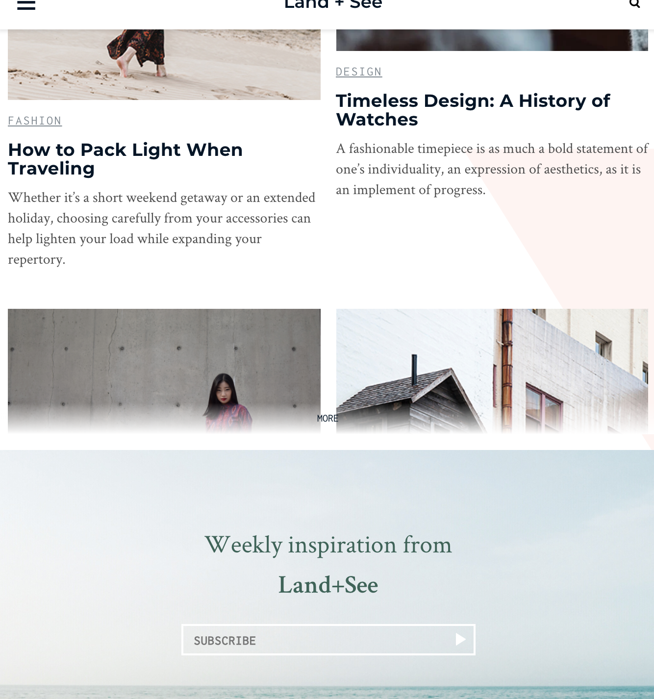
Seems like at least the gradient should be stronger, to give the text more background protection, but generally in the right direction!