Accessibility - Colour Blind Friendly Icon Selection
Hi there,
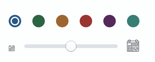
I'm red/green/blue colour blind and struggling a bit with your colour selection icons on entities:

Could you add some labels so I know what's Red/Green/Blue, please?
Hi @frasercrichton
Thanks for bringing this to our attention. We'll see if we can make this colour palette a little more contrast heavy as well as providing descriptions for the colours.
Thanks for raising this issue.
Thanks @Rosencrantz !
@kjacks As discussed, in the short term let's add a 7th "color" that opens a palette picker so it's possible to select whichever color you want.
@frasercrichton Will having a color picker help to resolve the contrast issue? We felt this was a relatively quick fix, and possbily a starting point for something a bit more robust in the future.
Could be. Colour pickers can look a bit like patches of all the same colour sometimes. Even a bit of text labelling would help. And yup contrast would be great. It's a weird thing to explain - colour blindness. It’s really hard when colours are in close proximity.
Sorry, I should clarify that a bit. What I meant by label is the classic https://www.w3.org/WAI/tutorials/forms/labels/ label with say a title that appears when you hover over the icon to say what colour it is rather than cluttering the screen.
Next steps here:
- Add a title tag to each of the existing colours that provides a tooltip explaining the color
- Add a color picker that allows "any" color to be selected. IT does not need to retain the selected color in a favorites sections (yet)
Closed in https://github.com/alephdata/react-ftm/pull/838