canvas-kit

canvas-kit copied to clipboard
 Workday
feat: New Segmented Control component
Summary
Fixes: #1777
Contains a new Segmented Control component to Preview package.
Release Category
Components
Checklist
- [ ] MDX documentation adheres to Canvas Kit's standard MDX template
For the Reviewer
- [x] PR title is short and descriptive
- [x] PR summary describes the change (Fixes/Resovles linked correctly)
- [x] PR Release Notes describes additional information useful to call out in a release message or removed if not applicable
- [x] Breaking Changes provides useful information to upgrade to this code or removed if not applicable
Where Should the Reviewer Start?
modules/preview-react/segmented-control
Areas for Feedback? (optional)
- [x] Code
- [x] Documentation
- [x] Testing
Testing Manually
Test summary
Run details
| Project | canvas-kit |
| Status | Passed |
| Commit | 0b2bc89b6e ℹ️ |
| Started | Oct 25, 2022 5:47 PM |
| Ended | Oct 25, 2022 5:53 PM |
| Duration | 06:00 💡 |
| OS | Linux Ubuntu - 20.04 |
| Browser | Electron 94  |
View run in Cypress Dashboard ➡️
This comment has been generated by cypress-bot as a result of this project's GitHub integration settings. You can manage this integration in this project's settings in the Cypress Dashboard
![cypress[bot] avatar](https://avatars.githubusercontent.com/in/9078?v=4 "Published by a pub.dev verified publisher")
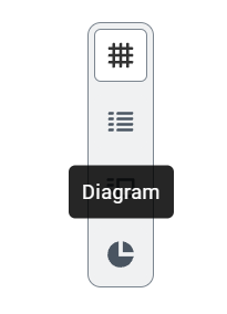
I noticed there's no focus styling for buttons in a segmented control states table.
To contrast, the SegmentedControl in main has focus states:
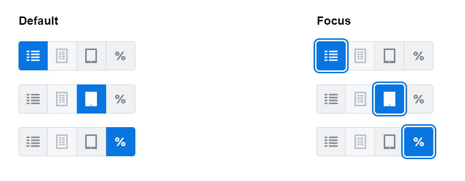
A state table might help or at least represent the different states the SegmentedControl supports:
- hover
- active
- disabled
- focus
- "toggled on" with those states