How should we handle searching?
How should we handle searching sections of the block directory?
I have a couple ideas...
Search in Tabs

Pros
- By opening search as its own page, we can show recommendations, as in this "Add Blocks" search screen.
- Search fits well within the tab bar.
Cons
- Since we'd be opening a new page, you potentially lose the context of your search.
- Some sections might not need recommendations, like Manage and Reusable, so those pages would end up being empty.
- Not every page has a filter bar.
Search in Header

Pros
- Matches the upload flow I'm currently envisioning for the Block Directory, where pressing "search" would toggle open a search form that shows up at the top of the page content.
- Will be in the same spot on every page.
Cons
- The header could start to feel busy, especially on the Reusable Blocks page.
- If searching doesn't open a new page, then we can't show any sort of recommendations.
Inline Search
Pros
- Matches the current list table search experience.
- Directly inline with your current context.
- Search would filter list table results immediately.
Cons
- There isn't always a space to add the search, so the layout could end up feeling awkward with search floating above the list table.
- If searching doesn't open a new page, then we can't show any sort of recommendations.
- Since search would filter the list table results, you might not notice anything has changed.
- Not every page has a list table, so the search bar would be in a different position on those pages.
One more idea that came up in this week's design chat:
Inline in the Tab Bar
Pros
- Always visible
- Natural placement
Cons
- Not all pages have a filter bar
- The filter bars that do exist are quickly filling up
While it may not look especially beautiful, I'm preferable to the "Inline in the Tab Bar" approach. It provides the quick functionality that I'd like as a user. And it also provides a fairly consistent placement of the search that wouldn't change from page to page. As @enriquesanchez commented, would the search, in this placement search across all tabs, or just the tab selected?
Maybe the search input doesn't need to be so wide?
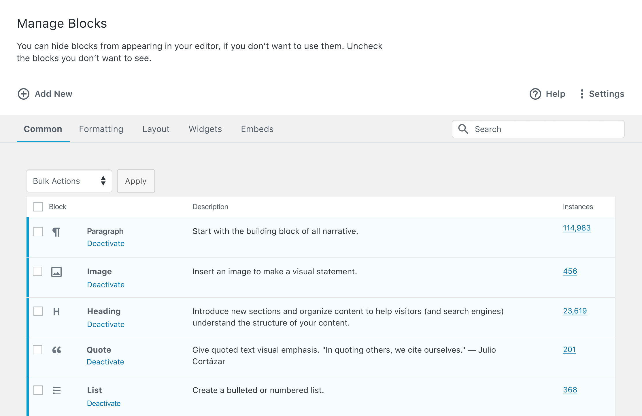
My second preference is the "Inline Search" above the table. I would assume this search field would search within the selected tab's table only. I do like how it aligns with the bulk actions too! But this placement wouldn't work as well on the browse pages.
Okay, explored the header & search bar within the tab bar options more:
Header

- Click on "Search" to toggle open a search bar in the body of the page you're currently on.
- Type a search term and press enter to search.
- Search results open in a new page, with the search bar at the top.
Tab Bar

- Search bar lives inside the tab bar, which will now appear on every page except for the "About Blocks" overview landing page.
- Type a search term and press enter/click the button to search.
- Search results open in a new page.
The Header option actually feels odd to me now that I'm seeing it there. A couple things stand out:
- It seems weird to have the actual search bar appear so far away from the button that's been pressed.
- The persistent active state makes it seem like those buttons up there are functioning like a second, higher-level tab bar. I'd thought of those as just one-off click buttons, so that seems a little unexpected.
That may all be irrelevant though, because the tab bar option feels really natural to me. 😄 It appears in an expected location, and I like having the search field visible by default. My only suggestion would be to see if we can get a non-attached button working. The drop shadow seems a little odd next to the text field that has no drop shadow.