Valour

Valour copied to clipboard
🚸 UX - Improvements to "Your friends"
2 things that needs to be improved in the "your friends" section, please take a look at the below attached image.
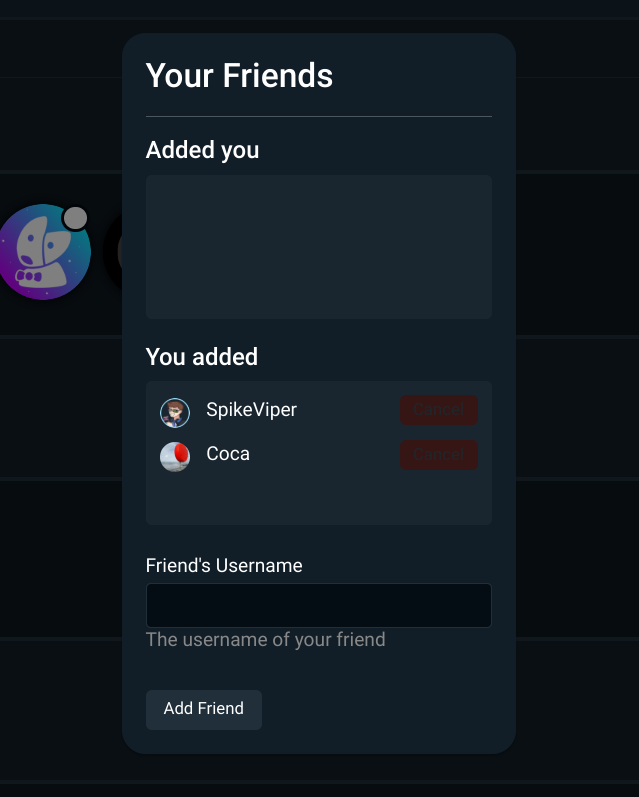
- Improvement 1 - the "cancel" button is too dark thus harder to see, lighten it up, maybe change it to white for a much better clarity.
- Improvement 2 - I also highly recommend renaming "You added" to "You requested" And also rename "Added you" to "Added friends". Why? This would make it more clear, because right now, under "you added", it sounds like I already added the listed users as a friend, but it's just a request the user on the other side needs to accept, then only it will appear under "added you", which can also be more clear if renamed it to "added friends".
The name "Your friends" is also a bit misleading, since it's not a menu for your current friends but friend requests you make and received
@Coca162 Maybe like this?

So "your friends" in the image above can be renamed to "manage friends".
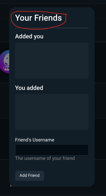
And in the image above, "Your friends" can be renamed to "Add friends"
I think that will make things clear.
I don't think the first should really be renamed, the second could be "Manage Friends"