[Feature] Add timeline task view
Add timeline task view in one page. So we can see all weeks task or month in one view.
This is some example from other task managers for your better understanding.
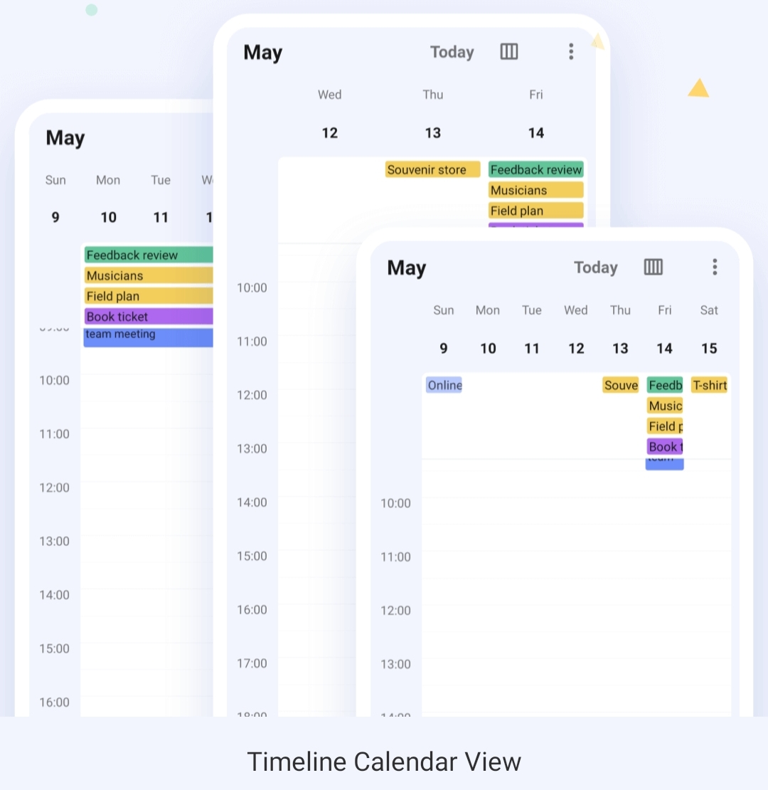
Hey @mojienjoyment ! Thanks for your proposal! Basically calendar views are considered in #213 , but it's true that I was lacking a bit of inspiration, so thanks for the screenshots! Let's keep both tickets open for now, but in this one I would consider especially the timeline view (second screenshot) In general the list can already be grouped and ordered by date, so partially it can already be done, but not as nice in your examples.
Timeline view would work well for Journals as well. In some ways better than a calendar month or year view with dates with entry(s) highlighted as some journals might not have many entries in some calendar periods.
Journals would only need date, not time. Blank days could be hidden (optionally). A journal timeline view could simply indicate if each day had one or more entries (perhaps a coloured blob corresponding to the calendar(collection) the entry is in (that'll not look good on my e-ink screen device, better put the initial of the collection on the blob) and some facility to jump to a particular date rather than scrolling forever to get back to a date years ago.
I'm envisaging four columns with a row for each day (optionally hiding days with no entry) probably showing about a dozen days per screenfull - twice what is currently in compact view. Don't show titles or any detail - just a flag if there is an entry that day and tap the flag(or blob) to go to list view with that day at top of screen. About the fourth row down would be highlighted and in the first three columns would be the year, month and day with the ability to scroll each column to change the year or month or day (I seem to recall that apple had a selector a bit like this) As you scrolled days the month would change when you got to 0 or 32(or 31 or 30 or 29). Day should show day name as well as number making it wide enough to scroll. As you scrolled the month column the screen would jump to the selected day in the next/prev month. Similarly for years.
The right hand column would have separate columns within it for each collection(calendar) with an indicator of the number of entries for each day in that collection. If more than about 4 collections then it might need view option to select which 4 collections to show.
Hi @rogercreagh , hi @mojienjoyment , sorry it took a while, this is one of the things I'd like to tackle next.
About timeline view: Basically I'm thinking that such a view could also achieved just by using the group by functionality with a date. Wouldn't you agree?
Regarding the other calendar views I'm not sure how to do it best. Would a weekly view make more sense than a monthly view? I actually think that a monthly view might be better for the start... (and probably easiert to implement)
Hi, I'm not sure that group-by-date is quite the same thing. For both timeline and month view I'm wanting to see the maximum number of days possible on the screen with the minimum amount of information.
Even the compact list view with group-by date is using a minimum four lines for every date. A line for the date in bold with a summary/details accordion which defaults to open for all dates so each entry takes three more lines : collection, date again, and categories on one line, title (aka summary) on the second line in bold and then the start of the description truncated with ellipsis on the third line.
Thus on my phone screen I only see four days, and five days on my tablet. If I close all the details manually I see 11 days but with the dates centred and a lot of white space. So the summary/details accordion is actually pretty useless in this view.
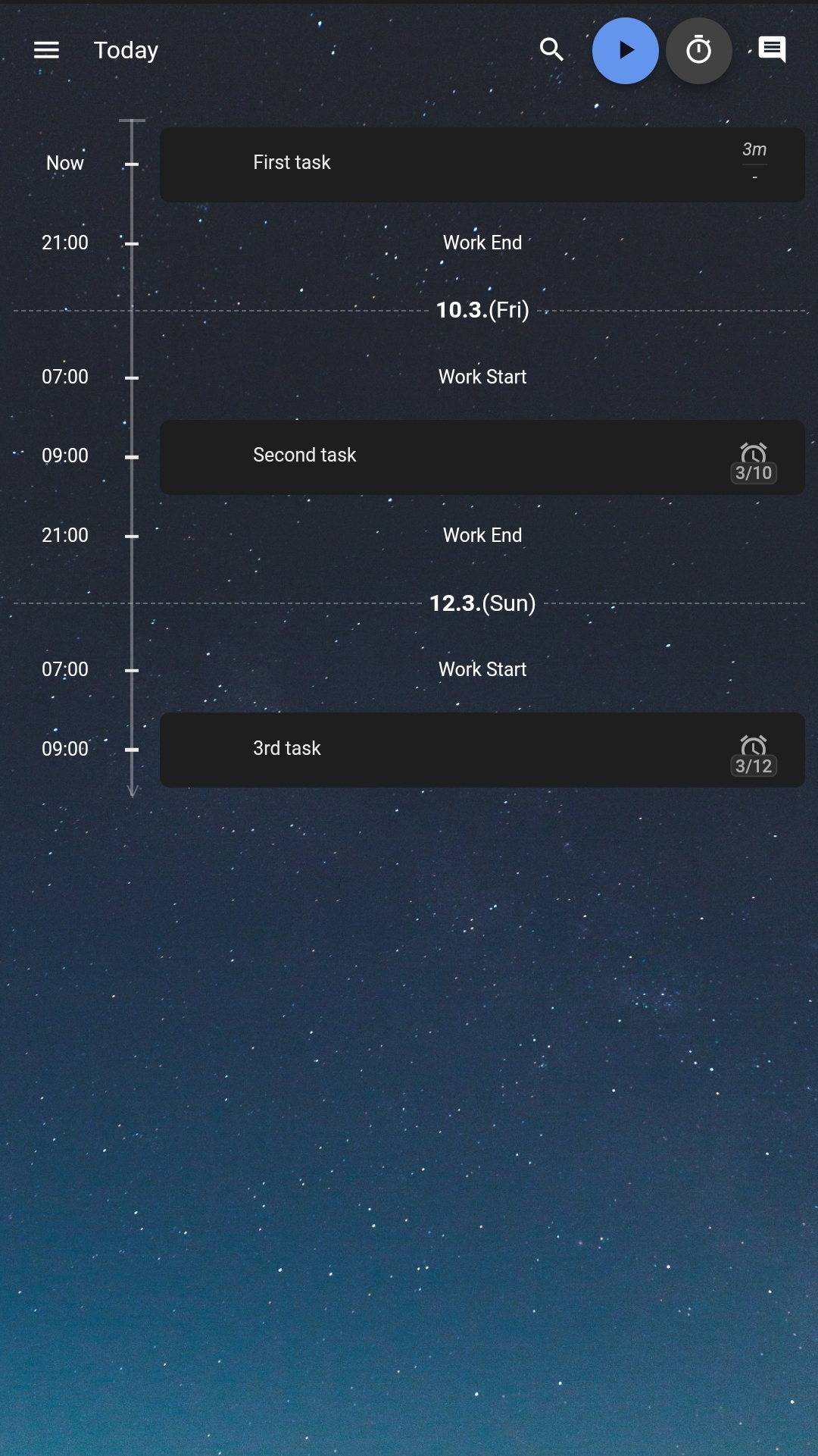
For me a good timeline view would use one line for each date and the full width of the screen. No need for accordion as tappng the line would open the item view anyway.
- The minimal info required is the date and the title (summary) truncated if necessary.
- If there are two or more items on a given day there is no need to repeat the day info but the title should be aligned under the first one (ie indented by the width of the date).
- If time is being used for DTSTART (I don't use it for journal items) then the time should display between the date and the title as a third column.
- If multiple collections are being displayed then a collection column would be needed after the date and before the time (or title if no time). I would suggest grouping within the day by collection, so that items from the same collection on the same day appeared together.
- To minimise use of screen real-estate the collection column could truncate the text of the collection name to two or three chars in the coloured label (this is important for those using eink screens where the colours of different labels may be very close in grey) (the same technique is often used for default user badges on websites)
- It could also be an option to hide the time column (but obviously still sort by time descending)
- In a timeline view the last item for the day would be at the top of the list to be consistent with the date order getting earlier down the list.
- If there are multiple items on a day without a time in DTSART then use whatever is convenient to order the items from the same collection on the same day (eg created date or alphabetical by title)
In summary four columns.
- Date - day name (3char), day num no leading zero, month name (3char) - group by year with year on a single frozen line at the top of screen before active filters. Ideally tap to pop up date selector and jump to date.
- Collection - coloured label with first 3 chars of collection name only). Ideally tap to filter by that collection (shortcut apply filter)
- Time - if set in DTSTART, blank if 00:00:00, optional hide whole column, optional HH:MM only or HH:MM:SS
- Title (summary) - truncated with ellipsis if necessary to fit remaining screen width. Tap to view full item
I like the compact view, but the timeline view is something different.
For me I see month view as something different again.
Display a whole calendar month (with selector to change month and year) as a grid of squares with dates.
In each date square display the collection label for each collection that has items on that date
If screen is small then truncate collection names to 3 chars
If no items from any collection the square remains empty
If two or more items from a given collection then display the label twice with a suffix -1 -2 etc on the name
Tap the labels to view the item.
In summary you only show that there is an item on that day from a collection - no need for any more info.
These two comments probably only relate to Journal entries. Tasks may need something more complex.
Since Notes don't have a DTSTART you could argue that a timeline or month view makes no sense for them
Additional views would be a very welcome feature. Very nice app BTW, keep up the good work.