Add Grafana-Style visual with 7-day usage metrics for namespace to kubeflow UI
Might help users better understand when they're under-utilizing their resources (so that they can scale down). I am thinking something like the cpu and memory graph.
CC @ca-scribner
So long as this can be fairly simple yet informative for the user I'm a huge fan. Something that clearly highlights things like "You paid for X CPU, but your utilization was actually just Y and that cost you an extra $Z", etc. Not sure how best to deliver this, but if there's a good clean way it would be great.
I was thinking these two graphs, one atop the other:
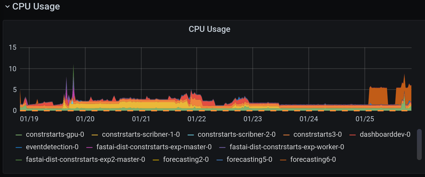
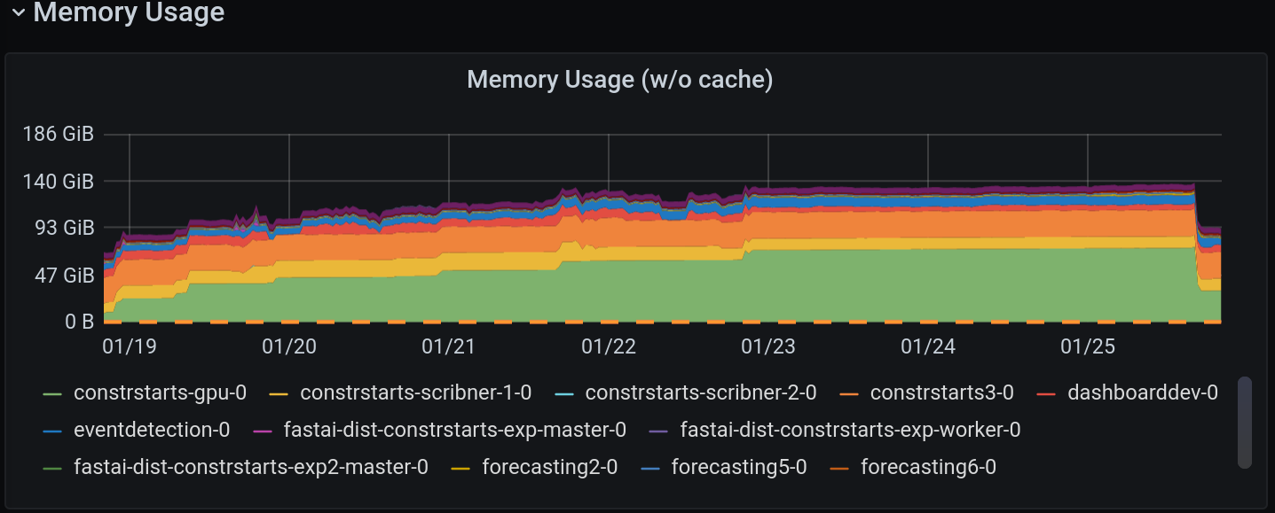
I basically wouldn't change anything except the actual aesthetics and maybe the resolution.
We could probably add the cost thing too, but with this at least they know "My machine has 5 CPUs. I have never used more than one CPU."
Kubecost has the "efficiency" numbers which could be useful. The challenge is defining where the bar should be, particularly for interactive workspaces where idle time will always be high.
Best thing is to have less compute in the workspace and to delegate to short-lived workloads (e.g. pipeline jobs), but that's relatively advanced for current maturity (both platform and user base). So timing may be important.
Combining with other ideas – like differing requests and limits for workspaces – might help here.