 SAP
SAP
Lib: Implement top navigation component
HOLD - WIP
Component name
Propose a new or variant name
fd-top-navigation
fd-top-navbar
Detailed description
Describe the request
A top navigation bar should be available to hold 3rd and 4th level navigation. It will be placed directly below the shellbar. Each nav item should support a child menu.
Use case
Describe when to use (and when not to use)
The top nav bar is most applicable for applications that have a limited number of nav items or those that need a maximum amount of screen space.
Visual style
Describe specific needs related to color, typography, iconography, borders, space, size, and other visual properties.
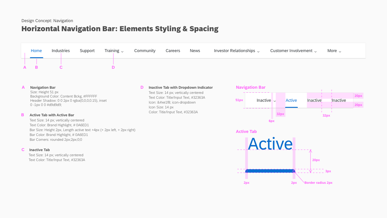
Use action color and action states to indicate selected items.
Describe how to arrange multiple instances and other alignment specifics.
May only use one instance per page.
How should this respond to common contexts, i.e., touch, RTL, small screens.
Must support RTL. The component will vary between small and medium screens (described below).
Describe interactive states, e.g., disabled, expanded, pressed.
Active and selected nav items will be marked with either bottom or side border.
Expected behavior
How should this handle events, outcomes, and transitions
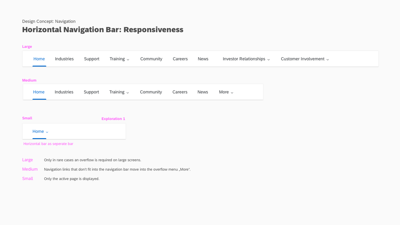
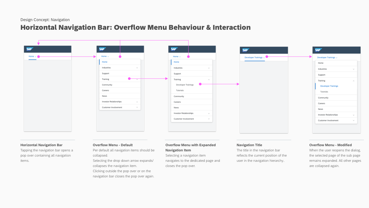
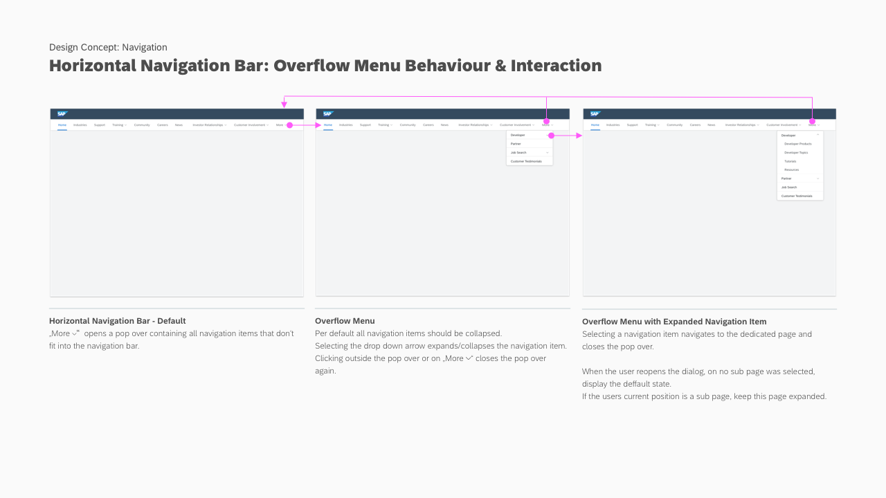
Small screen
- The user shall see the selected nav item.
- Clicking the nav bar will open a menu with the top-level nav items, the selected nav item should be included in the menu and marked as selected.
- Nav items with children will show a down arrow and expand the onclick.
- If the selected item is a child element, the menu should be expanded.
Medium and above
- The user shall see the max number of items that can be displayed based on the screen width, the selected item should be marked.
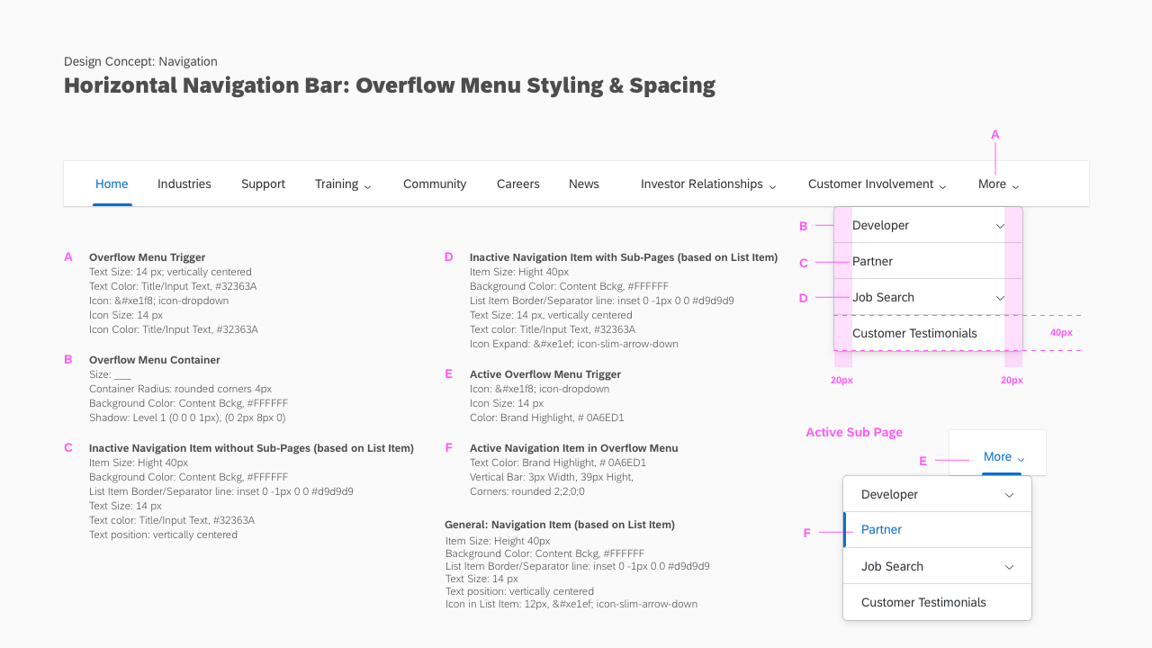
- Nav items with children will show a down arrow and open a menu onclick.
- Overflow nav items shall be available under menu labelled "More", open the menu onclick.
- If the selected item is a child element, the parent item and selected item should be will be marked. If the selected item
- If the selected item is in the overflow menu, the "More" item shall be marked as well as the item.
Additional information
There may be constituent components required to fully realize this component. For example, nav could be expanded to handle an addt'l level of navigation.