Delete button right next to View button - risky position
I would have a suggestion: maybe it's not a good idea to have the button to delete a dataset right next to the one to view it:
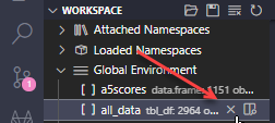
I constantly use the View button to the right and it might happen that I accidentally click on the delete one, which can be a pain if it's a result of a long code.
Just a suggestion to minimize human error:)
Describe alternatives you've considered Perhaps it could appear only if the variable is selected instead of just hovering? because having the View button appear when hovering is quite nice.
Thank you, I think this is a fair critique. I'd be interested to see what other extensions/programs do wrt button placement
This issue is stale because it has been open for 365 days with no activity.
This issue was closed because it has been inactive for 14 days since being marked as stale.