Adding a slight curvature to Graphs
Is your feature request related to a problem?
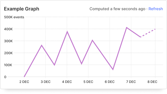
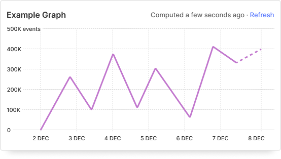
Our graph lines are very sharp and I feel that they aren't consistent to our friendly branding.
Describe the solution you'd like
Employ the use of a corner radius of 1. Example belows:
Describe alternatives you've considered
Not changing anything. I understand that the change potentially could feel pointless but it's the small details like these that together will influence the overall use of the app. aka push for quality even in the minor changes.
Thank you for your feature request – we love each and every one!
I think this is a cool change but we should also consider the "smoothing" feature that achieves a similar result but also impacts that actual values shown. It's feature flagged and I'm unsure how broadly it's released, but some default rounding here might make that feature less obvious when it's applied.
I think that's very much a case of unfortunate naming: The rolling aggregation reduces angle between subsequent data points, which makes them look less sharp than they are, hence smoothing.
I think Lottie's idea makes sense, as it then also forces us to explain better what the smoothing feature is (as you rightly point out, the smoothing is more about the data, not the visualisation. It appears to smooth things out though, hence the unfortunate-imo name 😅 )
This issue hasn't seen activity in two years! If you want to keep it open, post a comment or remove the stale label – otherwise this will be closed in two weeks.
This issue was closed due to lack of activity. Feel free to reopen if it's still relevant.