How would you suggest building this layout?
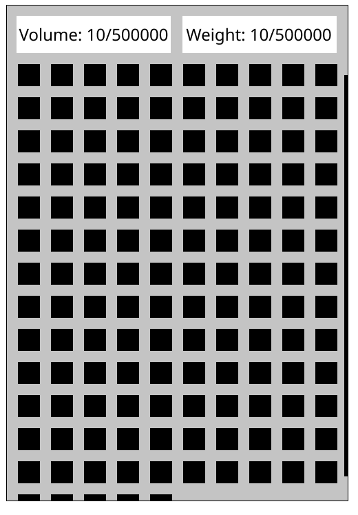
The rectangles under the text is just to show what size I want the text to be. Similary, the black rectangles are just placeholders, and the thing on the side is a scrollbar. I was looking at the Matrix widget, but it seems to make all of it's items expand to fill it, it dosen't have any way to leave margins between items. I'm also unsure if it supports scrolling? Would I need a ListSelector if I want to drag items between that and other widgets? I also could not figure out how to position the text and matrix, the stuff like Positionable::top_right_with_margins_on are very inconsistent, and then there's the align vs x/y vs top/bottom/mid stuff. I'm just quite confused how I'm supposed to lay stuff out, is there an example app somewhere that shows what an app layout would look like?