How to draw the line chart with gaps if the value is 0?
I have consumption values based on months. Like for current year 2021 the current month is Sep so in this case i have data till sep. But my X-Axis will be till December. So the question is how not to draw the lines for rest of the month. Please have a look at this example,
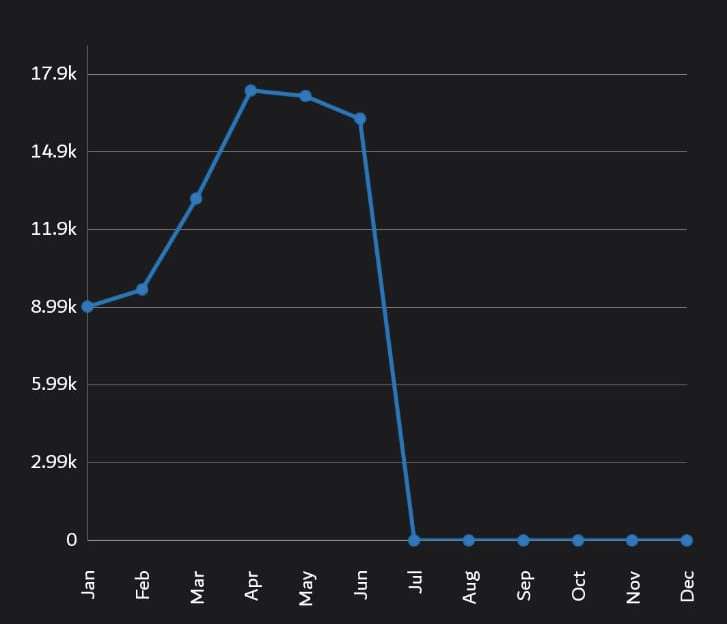
The easy way, just do not add entry to the dataset, if all the remaining entries are ZEROs. See the below chart, I added entries for the columns, but stopped for the remaining where ZEROs.
If i didn't add entry then the xaxis reduces to the last entry means if i have data till jun so the xaxis only display the labels till june. Anyways thanks for your response
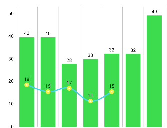
The only workaround that would come to my mind as of now, you use a combined chart with columns. Add all the columns entries till end of the period with ZERO values and hide the labels.
I hope this help.