[WIP] Demo training with few data
Before submitting
Please complete the following checklist when submitting a PR:
-
[ ] Ensure that your tutorial executes correctly, and conforms to the guidelines specified in the README.
-
[x] Add a thumbnail link to your tutorial in
beginner.rst, or if a QML implementation, inimplementations.rst. -
[x] All QML tutorials conform to PEP8 standards. To auto format files, simply
pip install black, and then runblack -l 100 path/to/file.py.
When all the above are checked, delete everything above the dashed line and fill in the pull request template.
Title: DEMO: Generalization in quantum machine learning from few training data
Summary: This is a demo of the paper "Generalization in quantum machine learning from few training data". We train a QCNN for classifying states in different phases.
Relevant references: https://arxiv.org/abs/2111.05292
Possible Drawbacks:
Related GitHub Issues:
Currently, I have the problem that the example is too simple (?):
I generate data from h = np.linspace(0,2,200) for the transverse field Ising model (h is the transverse field strength),
my criteria for the two phases is average magnetization below/above 0.5 (a bit arbitrary but sufficient for this example).
I draw 10 uniform random samples from those states as training data, and another 10 as validation data.
Now upon random initialization, I get either of those two scenarios:
Bad initialization, stuck optimization, overall zero accuracy
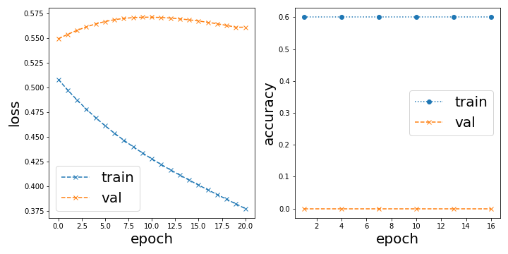
or Trivially good initialization, perfect accuracy from the start
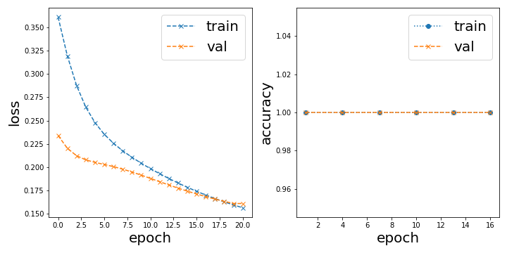
In the latter case, the classification result looks like this:
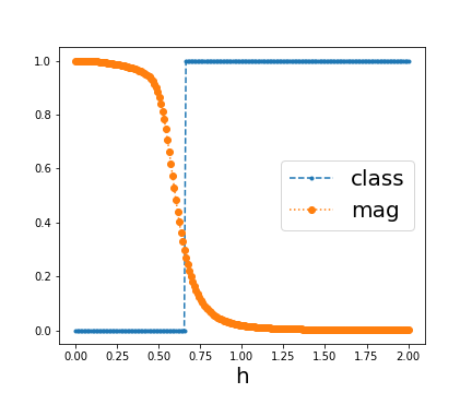
Overall, it is not surprising to me that this learning task is almost trivial, I demonstrated in 2106.07912 that this kind of classification can already be done with just one example from each phase. But what puzzles me is that with this convolutional model it either classifies it perfectly or not at all depending on the initialization.
The problem we have for this tutorial is now what do we want to demonstrate. It would have been nice to reproduce figure 2b in 2111.05292 and show a linear dependence between test and training accuracy, but since we trivially start with 100% accuracy to begin with I cannot show any such dependence.
On another note:
Since there are a lot of for-loops going through the 200 data points, it is really worth it incorporating dask. I dont know too much about it, but basically you can easily parallelize for loops by just doing dask.delayed(fn)(x) instead of fn(x) in a for loop and then later computing that delayed computation.
edit: I just realized it is not as easy as I thought. Updating here once I know more.
@Qottmann the problem might be the optimization -- it shouldn't be that sensitive to the initialization. Can you try using a smaller learning rate (0.01 or 0.001) and the Adam Optimizer?
Thank you for opening this pull request.
You can find the built site at this link.
Deployment Info:
- Pull Request ID:
489 - Deployment SHA:
b4cd93049ba287064f2e32d1d1b661b3316d91fe(TheDeployment SHArefers to the latest commit hash the docs were built from)
Note: It may take several minutes for updates to this pull request to be reflected on the deployed site.
I added an example image to visualize the difference between the true distribution and the samples one has access to. I recall somewhere that there is this matplotlib style that makes it look like a sketch but I cant find it. Do you know which one I mean? In case you know, this is the code the generate the example:
# construct "nice looking" distribution
x_fit = [-2, -1, 0, 1, 2]
y_fit = np.array([5, -3, 1, 0.5, 3])
y_fit -= np.min(y_fit)
coeffs = np.polyfit(x_fit, y_fit, 4)
x = np.linspace(-5, 5, 100)
y = np.poly1d(coeffs)(x) * np.exp(-0.3 * x**2)
y /= np.max(y)
subsample = np.random.randint(100, size=(10))

plt.plot(x, y, label="true distribution")
plt.plot(x[subsample], y[subsample], "x", markersize=10, label="sample access")
plt.legend(fontsize=14)
plt.xlabel("$\\theta$", fontsize=14)
plt.ylabel("$f(\\theta)$", fontsize=14)
plt.savefig("true_vs_sample.png", dpi=300)
I recall somewhere that there is this matplotlib style that makes it look like a sketch but I cant find it. Do you know which one I mean?
I think you can wrap the plot creating code under a with plt.xkcd(): statement to get something which looks like a sketch (https://matplotlib.org/stable/gallery/showcase/xkcd.html#sphx-glr-gallery-showcase-xkcd-py). Is this what you are looking for?
I used jax.vmap for vectorization and jax.jit for just-in-time compilation on the accuracy and cost functions and got a speedup of 3 orders of magnitude per evaluation. The total notebook now executes in 35 seconds or 15 seconds (jitted).
However, the results are nonsensical/constant at the moment, I probably put a global variable somewhere instead of an argument.
The changes are relatively small, just re-defining compute_out with jax.vmap and making sure load_data() and init_weights() is returning jax.numpy arrays instead of normal numpy arrays.
@josh146 Is there a way to import optax for this demo? I am following a comment of yours when optimizing with jax from an older forum post: https://discuss.pennylane.ai/t/jax-and-pennylane-optimizers/1752/4
I'm a bit at a loss with the issue upon importing jax in the CI actions. Locally everything works fine. I also tried updating to jax==3.1.14 in the requirements file, still failing.