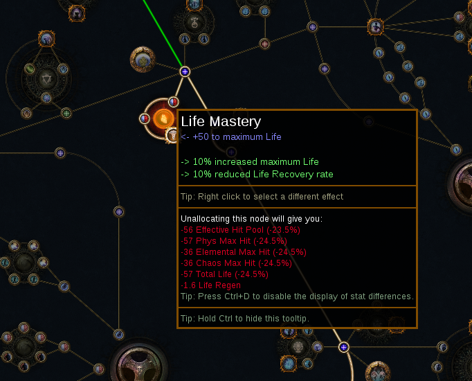
Indicator of different mastery node options in comparison mode
At the request of one of the users in the issues section fixes #4957 , I added a indicator about two other options in mastery, from now on different mastery will be dimmed (as in the picture below). In addition corrected the space between the title of the mastery and the main text when comparing (it is 16 everywhere, but for some reason wasn't here) and added a clearer description of the difference in selection (previously "<-" and "->", now separated with line and title that informs about changes.

example build to check changes: https://pastebin.com/BYYB2nfn
I think you've misunderstood the request made in #4957 -- they just want differing masteries on the passive tree to be a different colour (no tooltip changes).
edit: clarity
This is more consistent with how we handle similiar things but yes it does miss the point the issue wanted of inicating changes on masteries they want changes to be highlighted orange similar to how we do addition / removals of masteries currently
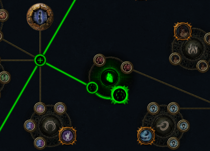
Mockup How they want modified to be highlighted.
Current Adding Mastery
Unfortunately I don't think highlighting any particular color is going to work, since masteries are all colors already. I think the dimmed mastery icon is fine, but I'm less sure about the tooltip change.