oeplatform

oeplatform copied to clipboard
 OpenEnergyPlatform
Feedback on implemented design
Bryan had some minor feedback for the implemented design. Please use this issue to add and discuss design requests.
Hi there,
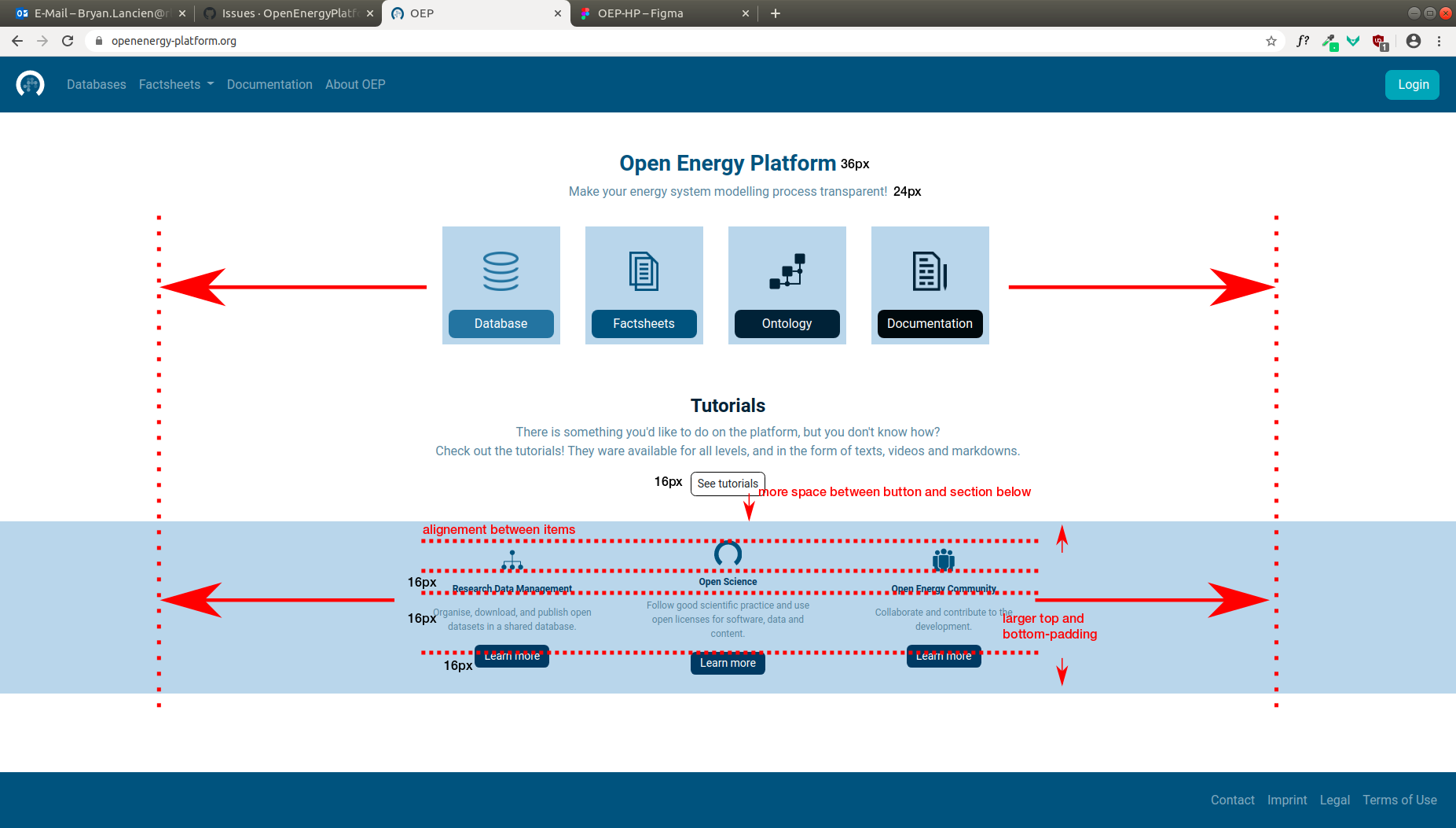
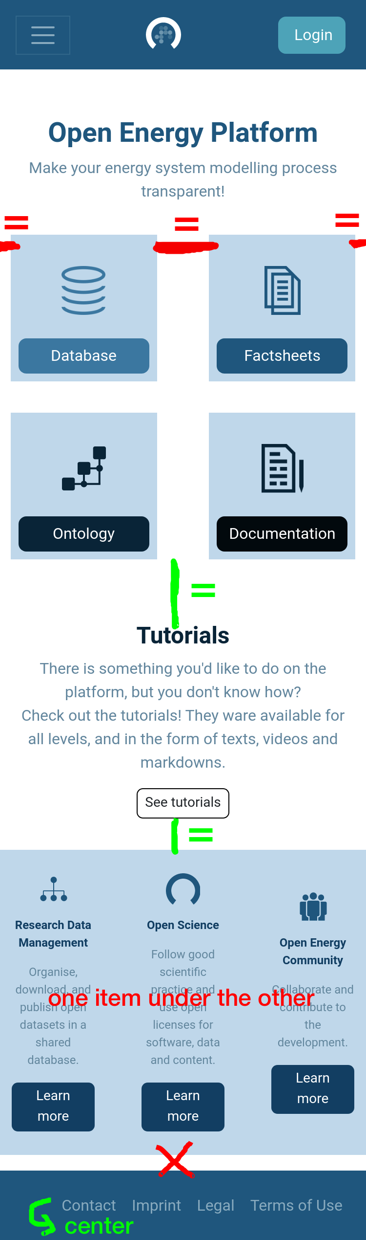
First, thank you for implementing the mockups I did a few months ago. There are a some things we could do to improve the visual aspect of the homepage though, as I find the overall design too small. Below two screenshots: one with a desktop view and the second one with a mobile view. I will mention a the points we could improve:
- Suggestions fot the upper section:
- desktop: above 1224px device width, set box width/height to 260px with 30px margin between each box (database, factsheets, ontology, documentation) -> total of 1130px width
- 100% width between 768 and 1224px device width (minus a margin of 30px between each box) -> the boxes should be responsive (between 180px and 240px width/height) and aligned in one row
- between 480 and 768px device width, set box width/height to 220px (there should be 2 rows of 2 items each)
- mobile: below 480px width, set box width/height to half of the screen width, minus 16px distance between each box and the left/right sides of the window (there should be 2 rows of 2 items each)
- buttons: 18px font-size
- Suggestions for the lower section:
- desktop: above 1224px device width -> keep items aligned like now. The 3 items together should take the same width as the upper section: 1130px
- 100% width between 768 and 1224px device width (minus a margin of 30px between each box) -> like the boxes, each item should be responsive
- between 480 and 768px device width, set each item width to 460px (items are in a column)
- mobile: below 480px width, set each item width to 100% screen width (items are in a column)
- items should be aligned: icons, headings, texts and buttons
- headings and buttons: 18px font-size
- text: 16px font-size
- increase top and bottom padding
- Suggestions for the layout in general:
- Below 1224px device width, keep padding on the sides of the page to 16px
- Remove white space at the bottom on mobile view
- Suggestions for the footer
- Below 768px device width, center elements
- Suggestions for the font
- Never use a font-size below 16px
- Reduce opacity of text anchors (nav and footer) to .7 instead of .5
- Suggestions for the HTML structure
- Set "Open Energy Platform" to
<h1> - Set "Tutorials", "Research Data Management", "Open Science" and "Open Energy Community" to
<h2>
- Suggestions for the tutorial sections
- Add space between button and section below (should be more or less the same height than between the heading and the upper section)
I hope this is all understandable!
@bmlancien is this still useful? Or do you want to bring up new ideas? Please close this issue if the second is the case.