No way to distinguish between a toggle and a chip
Chips that allow you to selected multiple options and toggles that only allow a single answer should have a way to distinguish between them to make it more clear. Currently the Yes/No buttons look the same as the Wrong Language/Not Appropriate/Contains PII/Hate Speech/Sexual Content. This makes the UX look less intuitive and also confusion at first glance about how many options you can select for "Select any that apply to the highlighted message:"
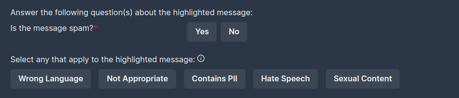
One way to solve this is the 'mark as spam' approach, when 'No' becomes the default choice, and you only need one button. But it makes the question less emphasized, I guess.
P. S. Of course, I'm not the first one to think about it: #1247