Autometa Logo
:art: Logo for Autometa :art:
Ideas, Inspirations and Suggestions:
- Mosaic of bacteria
- Something similar to the style of a Ishihara Test (color blind test)
- Container of DNA flying into it? (literal binning of DNA)
- Mail room of bacteria in each pidgeon hole
- Icons of different ecosystems with arrows pointing towards DNA/bin/something
- Automata theme?
The command line already spits out a lot of info lines but if you also want an ASCII art to print, can choose here: https://patorjk.com/software/taag/#p=testall&v=0&f=Graffiti&t=Autometa
A few design ideas - all are in Illustrator so can be chopped and changed around.
Option 1: Simple
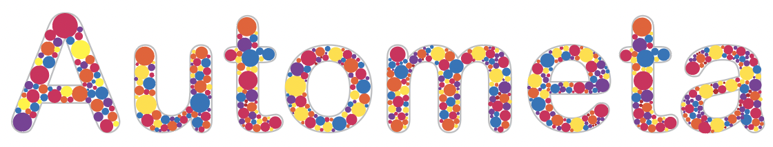
Option 2: Similar idea but more complex:
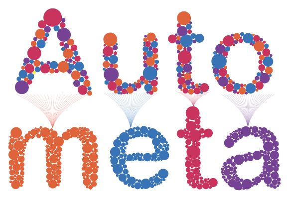
Option 3: A bit more artsy-fartsy
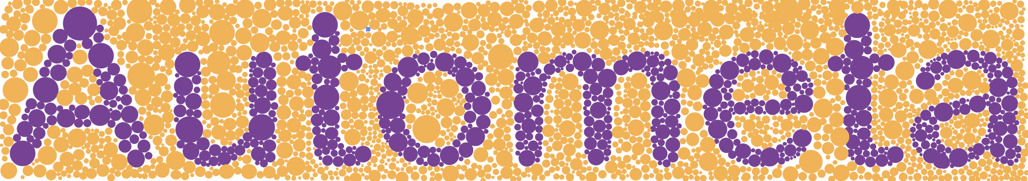
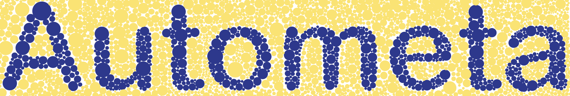
Option 4: Evan-hybrid eye-test-esque design
I really like option 1 and option 4 (with a more subtle palette). Option 3 reminded me of r/dontdeadopeninside 😆 So: 1 > 4 > 3 > 2 for me
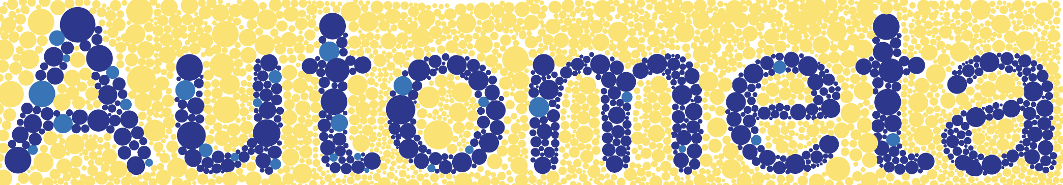
One thing we could think about doing is adding circles or dots with the wrong colors. So if the letter A in Autometa represents a bin, then it should not all be one color. In fact, we could use that to show how Autometa does a better job of binning by having more wrong colors in the first few letters and then fewer at the end.
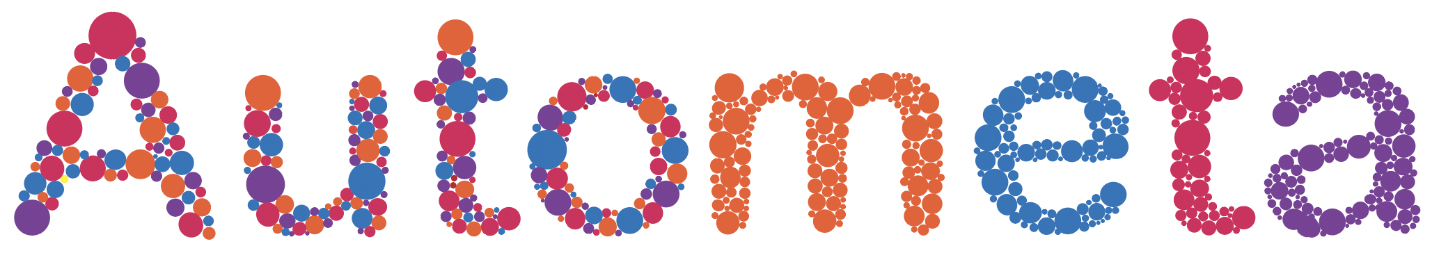
To begin, let's say we choose the colors from a random Seaborn palette as a starting point (obviously, this is just an example and can be changed later on to something from D3 etc.):

We decided what color each letter should be from that color palette and make a letter using those little circles. In the letter A we make say, 8 wrongly colored then, in u only 7 are wrong, and so on until the final one is just a plain a. Or have them all be one original color say Dark Grey and then use pastels for the progressively fewer "wrongly colored" dots...
Alternatively we take this same idea and use it on the circles to the left of 1 – one of the circles can have lots of incorrectly colored dots, and the second fewer, and the third, none at all.
Also, let's make sure that the letters are actually visible to people who are color blind. (I don't know if 4 is visible to them, just want to make sure they can see it).
I think I like 4 best, but would offer one suggestion - can we turn down the color hue for the non letter circles? I think that would make the logo look less blocky.
@jason-c-kwan The orange purple combination should be visible to those that are color-blind, but here's an alternative (yellow and blue) which should address both your comments.
Alternatively, we could just go grey-scale:

@chanana - Is this kinda what you had in mind? (Obviously, can change colors depending on what you guys like?)
Finally - to prevent Option3 from being read funny -perhaps this variation?
Finally - to prevent Option3 from being read funny -perhaps this variation?
OMG this is great! needs a bit of tweaking in terms of color maybe but the concept makes sense!
I think the last one without background is the best. You could probably also invert the colors or just make the white transparent for a dark background.