Tweaks to be done after converting all the pages to new design
Issues:
- [ ] Active a color
- [ ] Link gets hidden below header on blog and api page
- [ ] Contrainers and settings page mobile layout
- [ ] Tabs in mobile view when width is not sufficient
- [ ] Favicon is not crisp
- [ ] Typography tweaks
- [ ] Projects page - timestatus and button edgecases
- [ ] Projects page - new container button placement
- [ ] Projects page - add border(#dedede solid 1px) to card
- [ ] active menu item i.e., when the current page is in header menu (mobile view)
- [ ] space between header and first menu item in mobile/tab view
- [x] Blog page - clicking on link should expand that blog
- [ ] Blog page css uses css variables
- [x] ES6 to ES5
- [ ] Move container class from main
- [x] Buttons shadow get cropped on pages like blog-new
- [ ] Sticky header on iphone&mac - chrome and safari
- [ ] remove dotted outline of anchors visible on clicking in FX
- [ ] alert color, font-size(sm-screens) and background color
- [ ] decrease the size of pen icon on containers page
- [x] Check all pages in tab and mobile view. Some page's layout breaks on sm screen e.g., containers, settings page
- [ ] Change Delete ${containerName} to
Delete Containeron new-containers page.
Also, why do you want a border around project cards ? I think the box-shadow is enough.
@nt1m
@arshdkhn1 Why do you want to " Move container class from main" ?
checkout button && also for landing page I was thinking to use full(100vw) width for some section but since parent wrapper is .container I can't do that.
Also, why do you want a border around project cards ? I think the box-shadow is enough. On chrome and mobile the box-shadow is a bit less prominent.
After adding a border(#dedede99 solid 1px) -
I think edges get a bit sharp and they dont blend with background.
Edit: On mobile,
chrome
On chrome, I feel top part of box-shadow gets a bit merged with background. These results may vary on your screen, I am not sure about this.
@arshdkhn1 It is definitively a bug, however, I don't think moving the .container class away from main is the way to go however.
As for the border, the shadow is actually stronger on macOS, not sure why Linux renders it like this. Anyway, I really don't like the border. It looks unclean to me. I prefer it without a border. I would rather tweak the box-shadow to be slightly stronger than add a border.
@nt1m well the box-shadow issue can be managed like u did on project/container page? how do i get to have 100vw width for sections? I know adding .container everytime is redundant but I would love to hear other solutions?
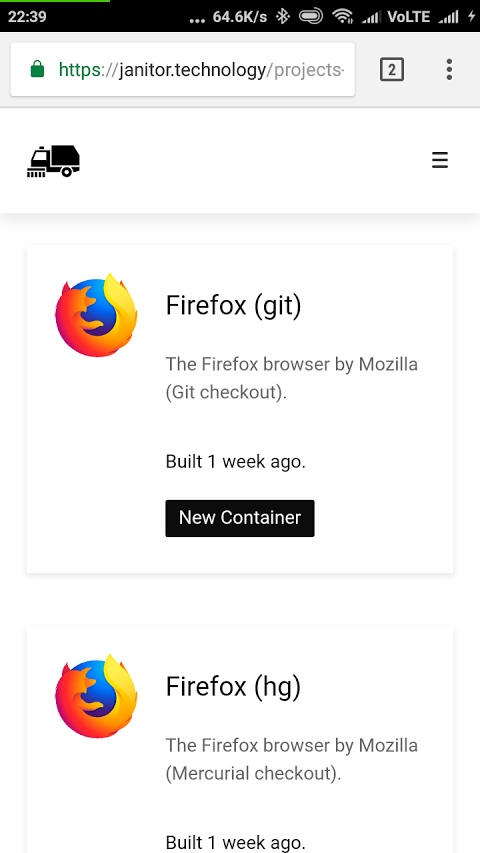
@arshdkhn1 I checked all the pages with Firefox's Responsive Design Tool, I think it looks great (so I marked the mobile device review in your checklist):
Landing page: 
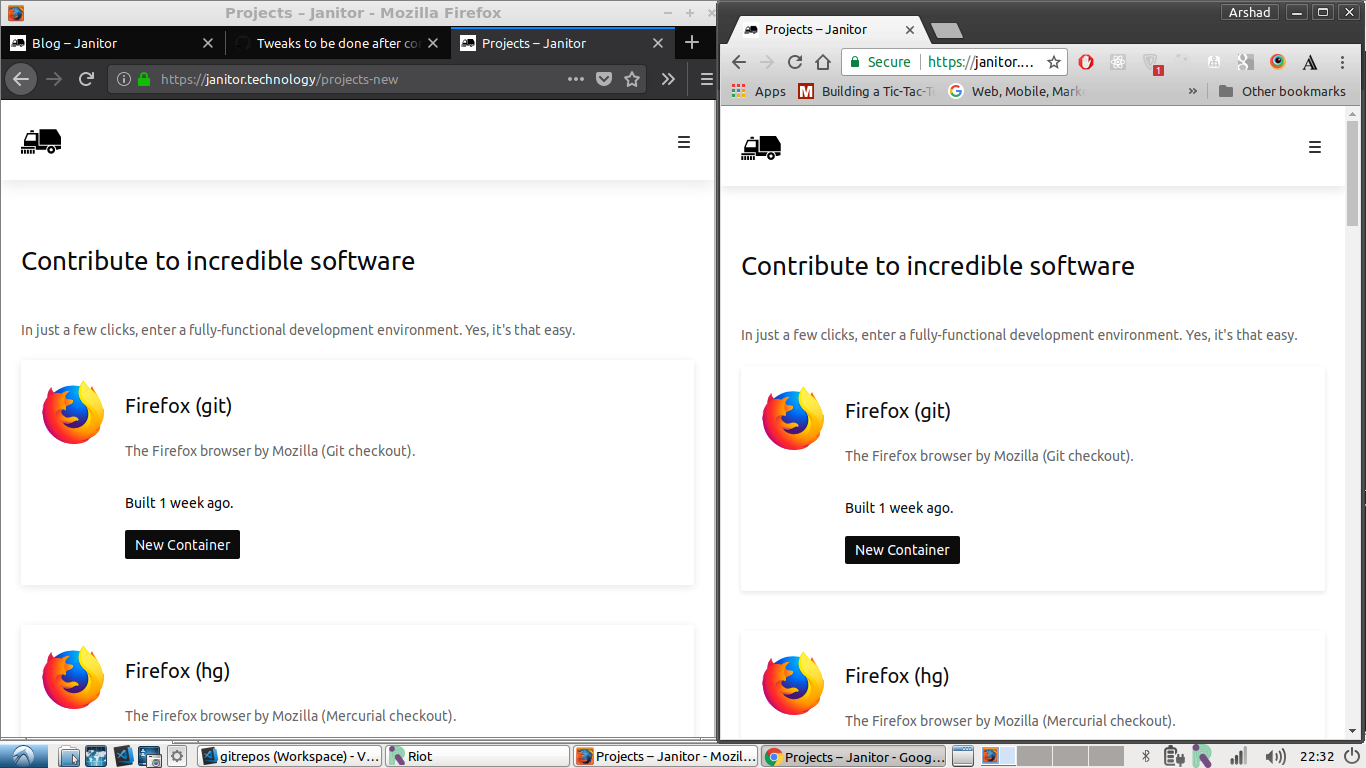
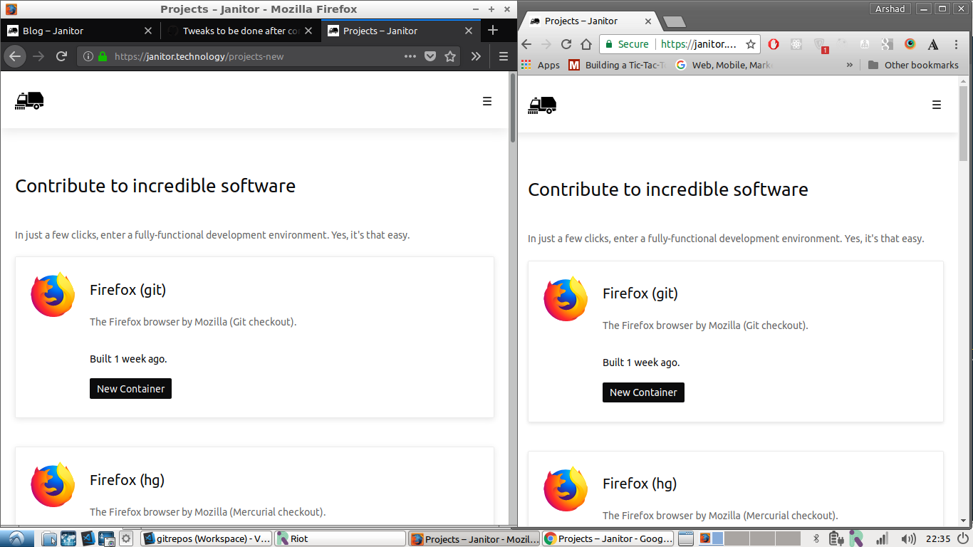
Projects page: 
Containers page (Info tab): 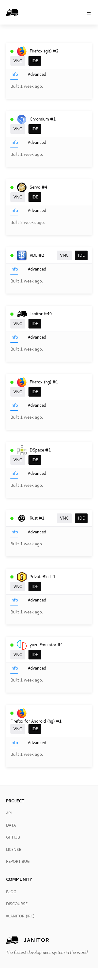
Containers page (Advanced tab): 
Settings page (Account tab): 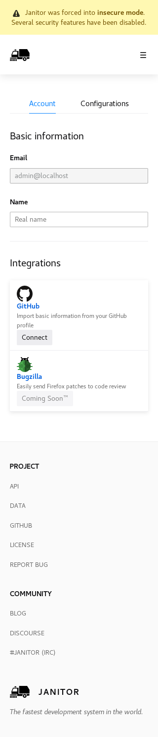
Settings page (Configurations tab): 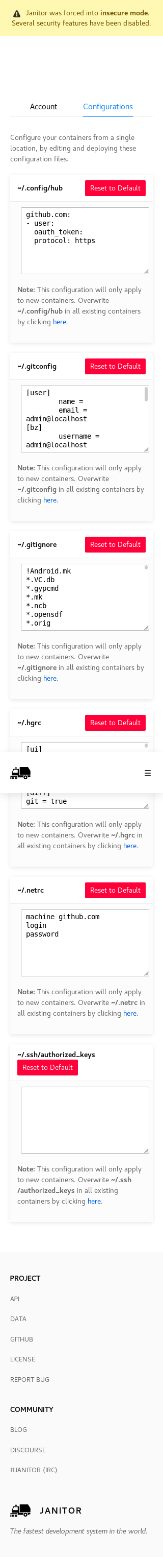
Best regards,
Coder206