Visualization for the Maturity Model pattern
Our Maturity Model pattern contains a lot of text, making it hard to imagine how the final self-assessment of a against that model might look like.
At a recent conference somebody was showing a similar self-assessment for a different purpose, and they used a radar-like visualization to show the results.
Update: Found the example that I saw in this conf talk. See slides 9 and 10 in here.
Can we generate a similar visualization for our Maturity Model pattern?
Inspiration:
- "radar chart" https://www.canva.com/graphs/radar-chart/
- I also found it as "spider chart", not sure if it is the exact same
One idea is something like this.
The maturity model uses 4 level-1 categories, each of them having some level-2 categories below them. Would be good to somehow show these level-2 categories grouped in a way that it is clear what belongs together.
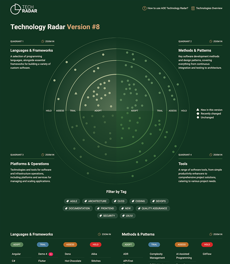
Another idea would be a radar similar to what is used here for the technology radar. https://github.com/AOEpeople/aoe_technology_radar
This could be an interesting start to build this in code: https://stackoverflow.com/questions/37236535/wrapping-text-on-circular-textpath
https://codepen.io/bumbeishvili/pen/EKJOmE
Somebody pointed me to the implementation of a tech radar by thoughtworks.
I did an experiment with how that radar might look like, using the questions/scale suggested in the maturity model pattern. Here the results. (you should be able to click on the individual bubbles yourself).
To fully customize the radar to the maturity model, one would have to change the labels as shown in the attached screenshot. Should not be that hard though. Here the source code.
Not sure if this would be useful for teams doing this self-assessment. But it does feel nice to have something that is "clickable" :slightly_smiling_face: Would be even nicer if one could drag and drop the bubbles on the radar to update the self-assessment.