Tooltip when mousing over a particular colour in a visualisation should only convey the legend relating to that colour.
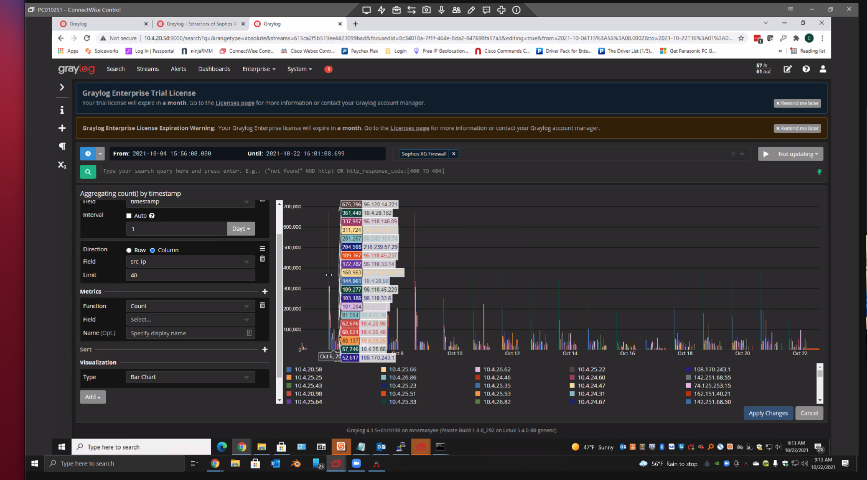
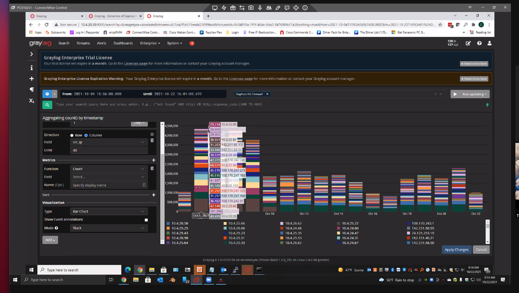
When creating a visualisation in Graylog, you can often have a large number of different keys in the legend. For example, 15 different colours relating to 15 different IP addresses.
Expected Behavior
When you mouse over a particular colour in the visualisation, you expect to see the tooltip label relating only to that colour. Eg. "Hey, what is that huge spike of brown at 03:00? I will mouse over the column to check which IP that is because I can't make out the colour. Ah yes, it's IP 192.168.0.16".
Clicking on it should then give the option to filter by that value.
Current Behavior
When you mouse over a particular colour in the visualisation, Graylog unhelpfully reiterates the entire legend into the tooltip label. This does not help you figure out which item from the legend you are mousing over. Eg. "Hey, what is that huge spike of brown at 03:00? I will mouse over the column to check which IP that is because I can't make out the colour. Cool, so it's either IP 192.168.0.16, 192.168.0.7, 192.168.0.11, 192.168.0.20, 192.168.0.111, 192.168.0.3, 192.168.0.167 192.168.0.1688 192.168.0.37, 192.168.0.255, 192.168.0.244, or 192.168.0.1, that really helped me".
To illustrate this, two irritating images:
Your Environment
Graylog 4.16
Hey @tellistone,
thanks for reporting this. Right now we are showing all data points for the position of the mouse on the x axis. What you are suggesting is to show only the data point which is on the exact x/y position of the pointer. This could result in a very fiddly user experience when we have two data points which are very close to each other (or identical). Also, we support comparing different values at this position this way. I do understand though that if there is a high number of values, that this can become overwhelming. Do you have an idea how to improve this while still considering all of the aforementioned aspects?
Do you have an idea how to improve this while still considering all of the aforementioned aspects?
If the data points are distinct, show only the data point moused over as suggested in this change.
In the event two or more data points are very close to each other, to the extent that mousing over a specific datapoint is deemed difficult, the label could instead show all of the datapoints that are in very close proximity to the cursor?
For inspiration: Grafana shows all values at the x axis, but highlights the mouse over one by making it bold. The small data table is also less noisy than ours because it does not color the text and its background. I like that approach.
Source: https://play.grafana.org/goto/SDBBIoYHg?orgId=1