[Feature Request] Configurable Rendering/Formatting of Links/Nodes in LinkMap
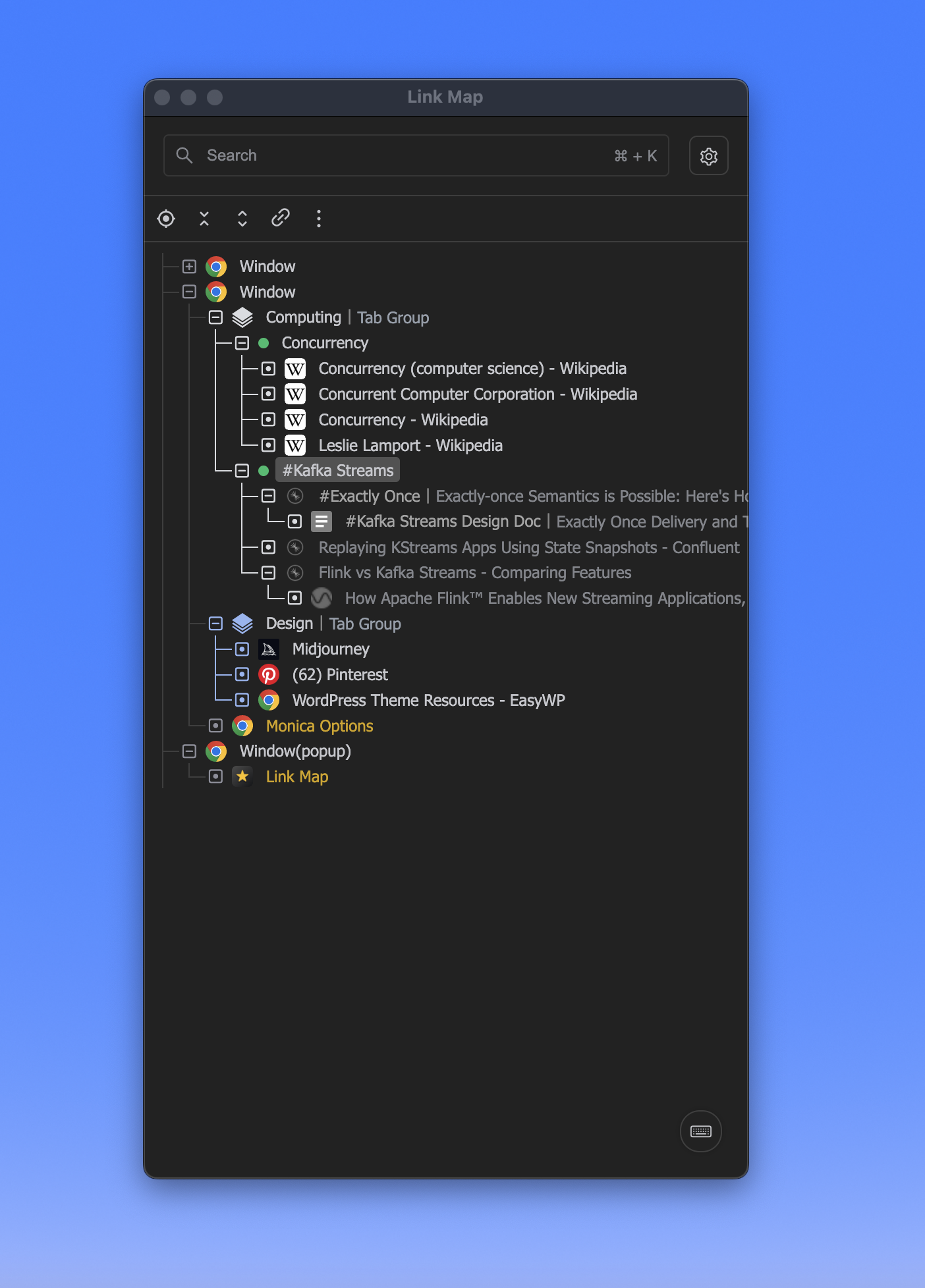
The current LinkMap rendering of the Node/URL list has a few drawbacks compared to TO's:
- the font type is not ideal from a clarity PoV (compared to e.g. TO's)
- the standard font is grey (which isn't helping visibility of the text grey on black, let alone grey on white [day view])
- the font size is a bit thin and small, while
- the spacing between lines is a bit too large
This leads to effectively fewer lines of URLs/Nodes compared to TO, while also less clear to read, because:
- the TO configurable active/open colour settings are also not there, and I'm struggling a bit to e.g. spot the active Window/Tab in the Node list and/or to spot the open URLs in the LM list
For comparison: See TO's:
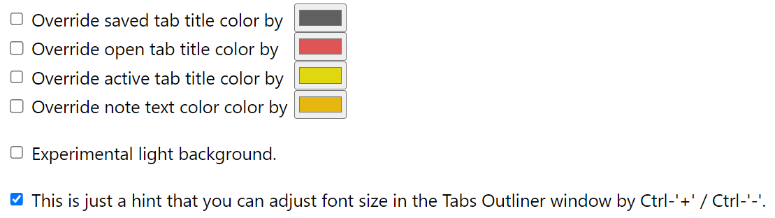
To have something similar wrt colour setting would be excellent, as it helps - next to a clearer font and more condensed rendering of lines in the LM List with less whitespace between the lines - to immediately spot the open/active Nodes/URLs in the tree.
For reference, see a LM screenshot, compared to a TO screenshot (I know you're familiar with it, but just for the comparison.. :-) ) Especially open and even more so: 'active' is very clearly visible. I noticed I'm using that option a lot (I have often >> windows with >> tabs open).
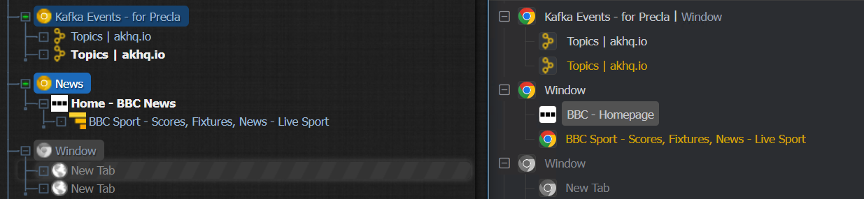 For clarity: this is when both TO and LM are zoomed in to 150% (to get a proper, readable Node/URL-view on a 4k screen.. )
PS Want to say again: you're doing an awesome job, your reaction is always very professional and positive on feedback given, which is great! Keep up the excellent work. Thanks!
Hi @staalman, I also think there are problems with Link Map's current color scheme and layout. During my development process, I would stare at the Link Map panel all day long, and it would get a little visually fatiguing after a while.
In the upcoming released version (v1.1.0, under reviewing by the Web Store), I have made some minor adjustments to the color scheme font and spacing, but it may still not be good enough.
About the light mode theme, I'm not satisfied with the color of font too and I will optimize the color theme.
In future versions, I will definitely open up the configuration of Link Map's color scheme and spacing, etc., so that you and other users can customize the configuration.
Any update on the fonts and icons issue, GarinZ?
I think Link-Maps readability can be further improved by not greying out the icons of non-active (running) tabs/windows, see the difference between the two. I also would like to see q quick solution by adopting the TO-font and font spacing as it is IMP much more readable and compact.