Improve grid line labels in farm designer
Expected Behavior
The grid line labels (100, 200, etc) should be legible at all zoom levels
Actual Behavior
At 0.75 zoom and farther out the labels are too small to easily read.
Suggested Solution
- [ ] Scale the labels inversely to zoom level so they always stay the same size to the user, despite zoom level
- [x] At zoom level 0.5 and farther out switch from labels every 100mm to every 200mm
- [x] At zoom level 0.2 and farther out only show labels every 500mm
- I think a good size for the text might be where the bounding box rendered on screen is 16 to 18px tall. This might take some tweaking to look good.
- There may be some legibility issues with the labels on the left if when they stretch into the darker brown or even gray areas, which may require tweaking. Ideas: adding a text-shadow, making the font bolder or darker in color.
It was already on my list! I'll work on this Il 7 feb 2020 23:09, Rory Aronson [email protected] ha scritto:@FabioDessi this improvement may be of interest to you :)
—You are receiving this because you were mentioned.Reply to this email directly, view it on GitHub, or unsubscribe.
Just saw your improvements to the sizing on the x-axis labels @FabioDessi, thank you! As I suspected, with the increase in font size, the current location of the labels could use improvement. What do you think about shifting the location of the x-axis labels to the right by 15px and up by 10px, and changing text-anchor to start?
At farther out zoom levels the location offset may need to be increased to maintain spacing between the numbers and the grid lines and bed border.
@FabioDessi thanks for the second PR 👍
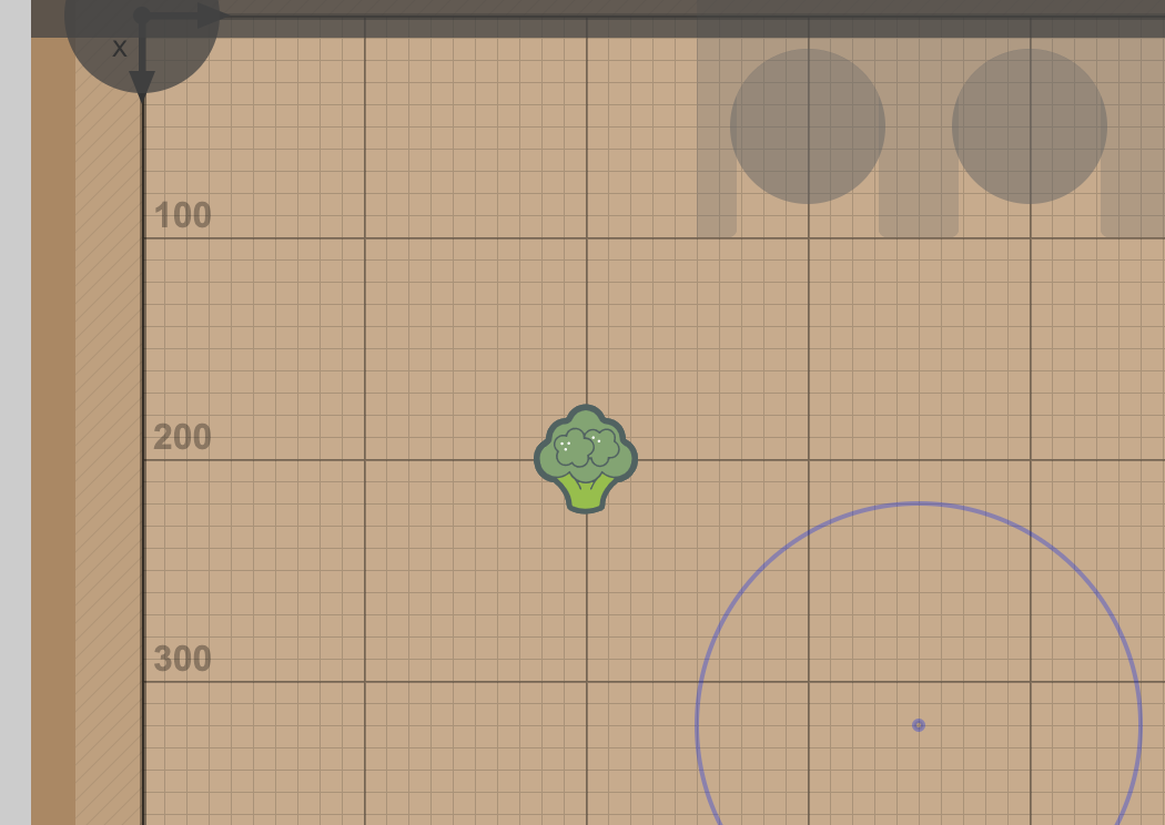
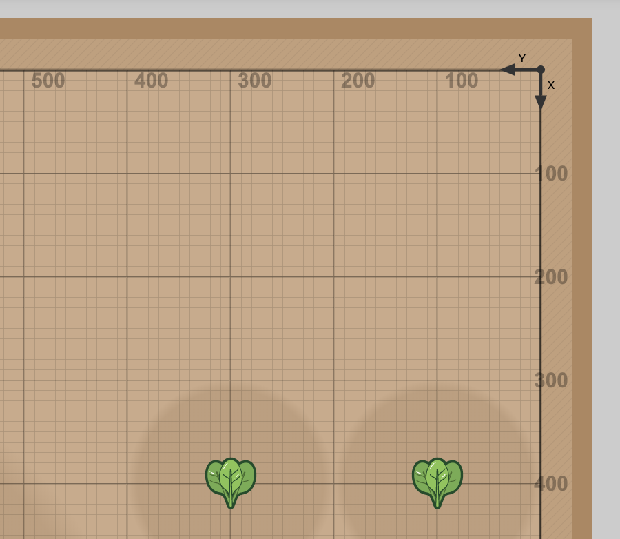
Here's my feedback so far: the labels look good with the default map rotation and origin location, but they shift around and feel out of place with different map settings.
Default map rotation and origin:
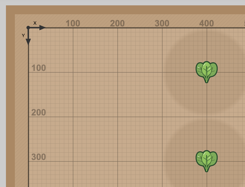
Rotated map and different origin:
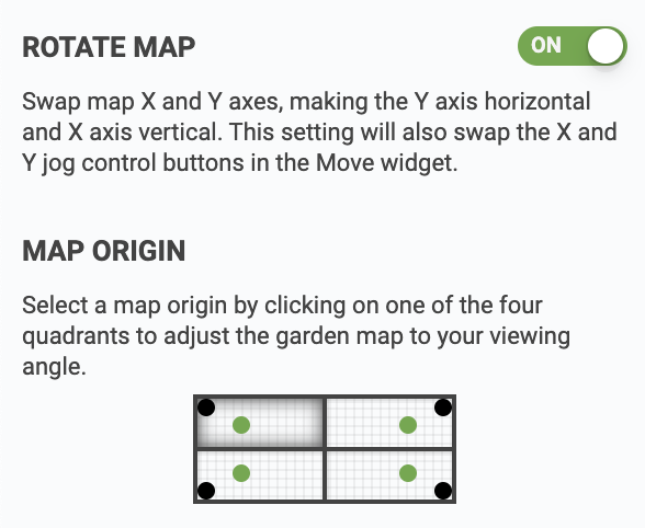
Here are the settings I'm referring to (found in the settings panel on the far designer page)
Could you send in another PR with adjusted label locations based on map rotation and origin settings?
Also, I'm thinking it would be nice to have labels on all four sides of the map, rather than just the x-min and y-min sides.
Let me know what you think!
@FabioDessi any updates on this? I'd like to get this improvement wrapped soon. Let us know if you aren't able to finish it up and we can take over. Thanks!