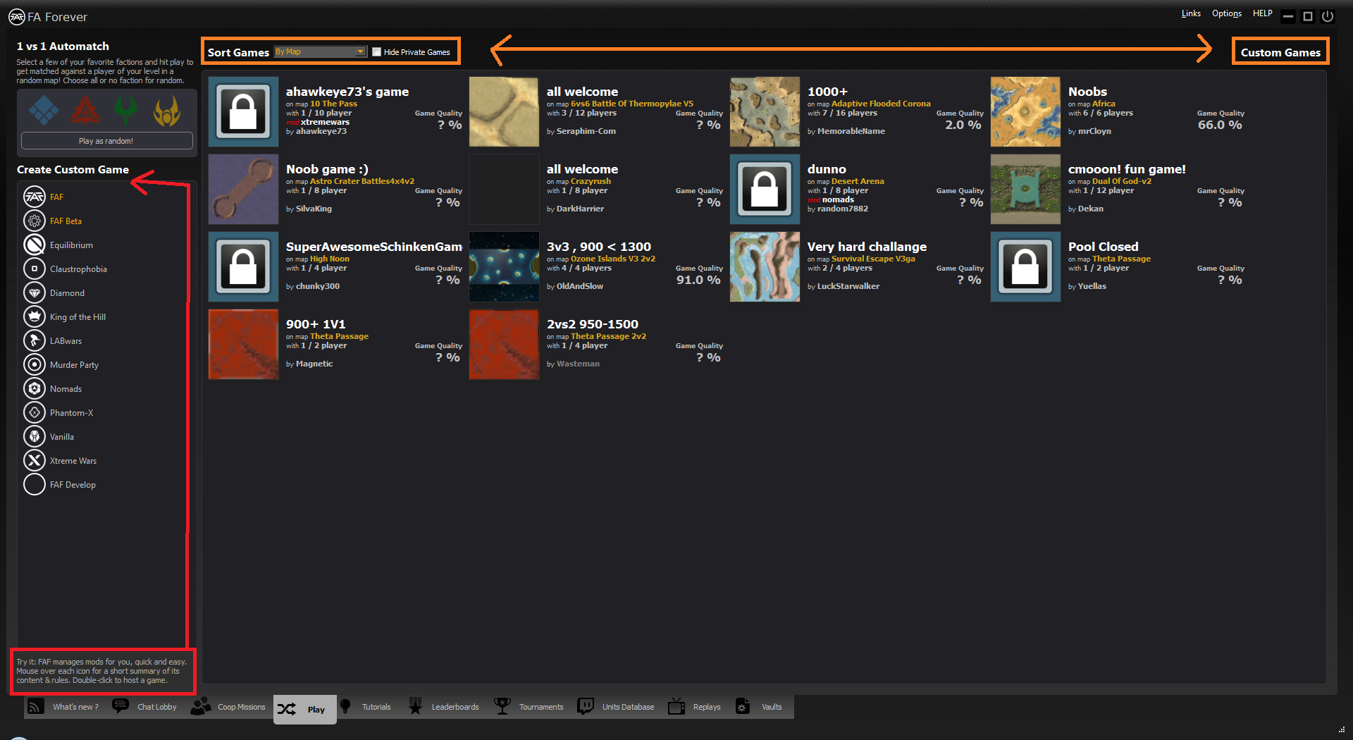
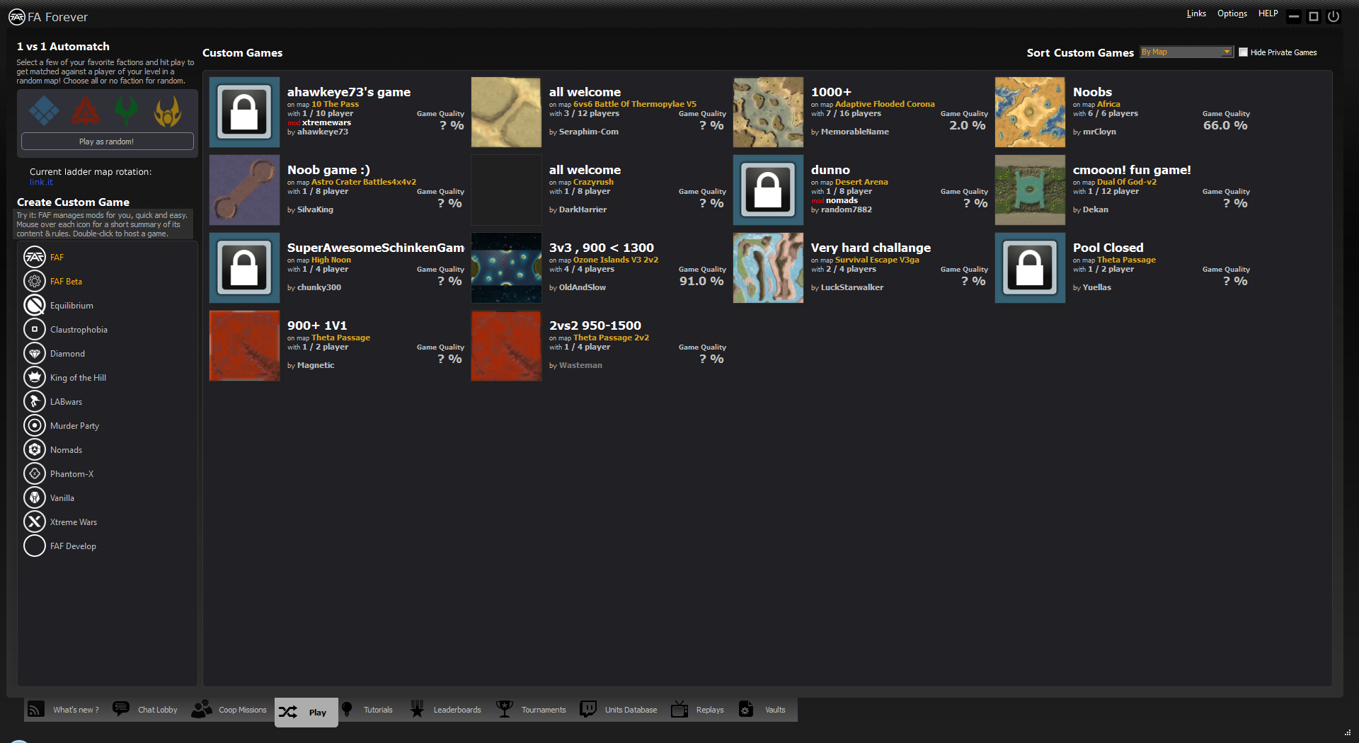
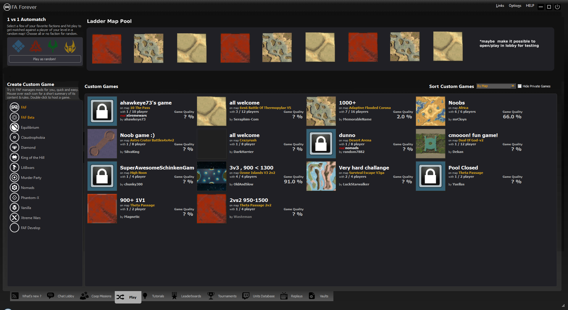
enhance clarity of play tab
Hello guys, i don't know what future plans exist for the client and its not really necessary, but the nice new "Single-Line Mod-Vault toolbar" made me think about enhancing the "Play" tab.
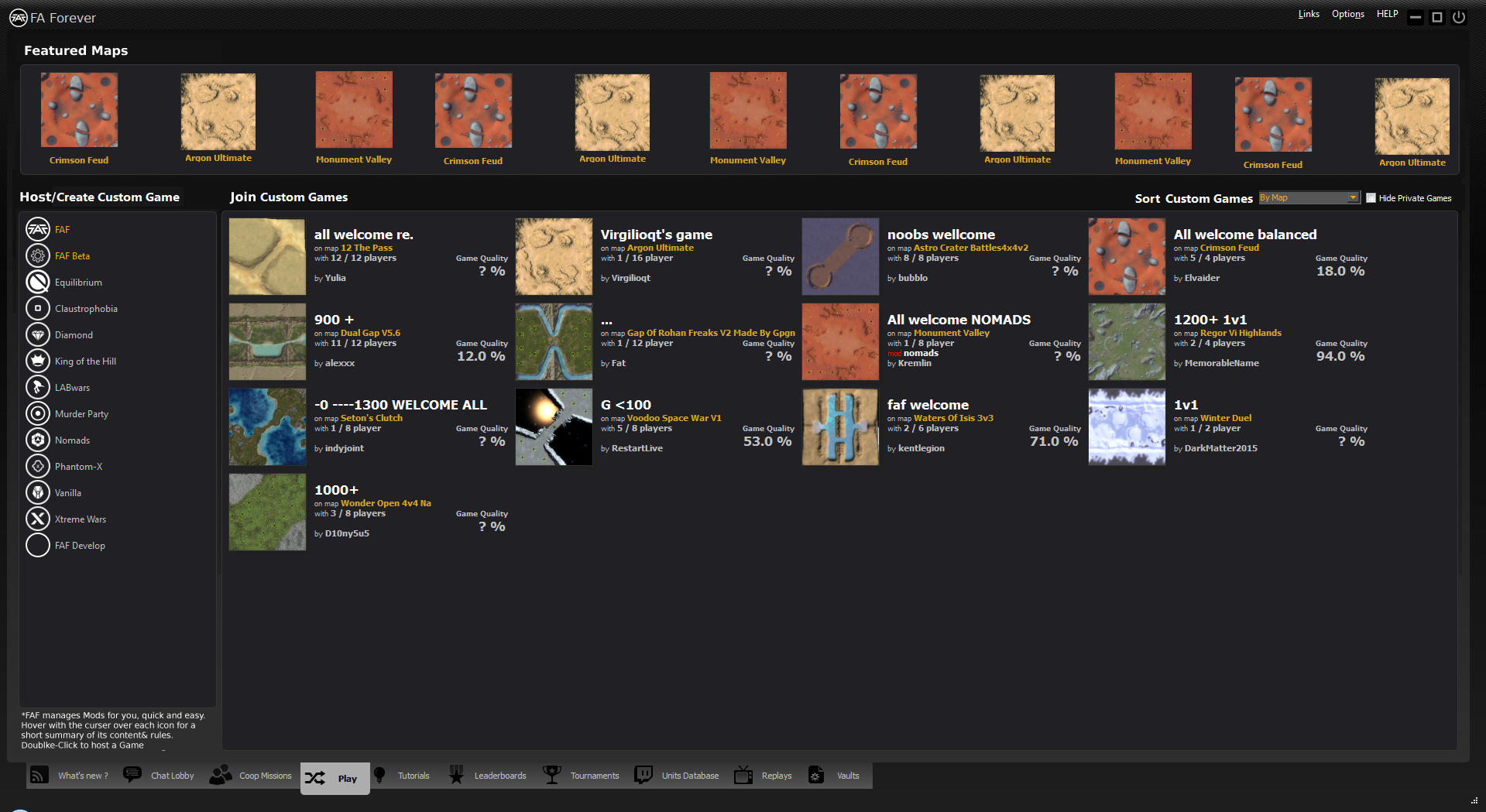
Currently the style is not consistent, plus especially new Fafies got no idea what the current ladder map rotation is, except they know where to look.
So here are my suggestions:
v1) Move some titles, descriptions and sorting (closer to options) + add link to ladder rotation
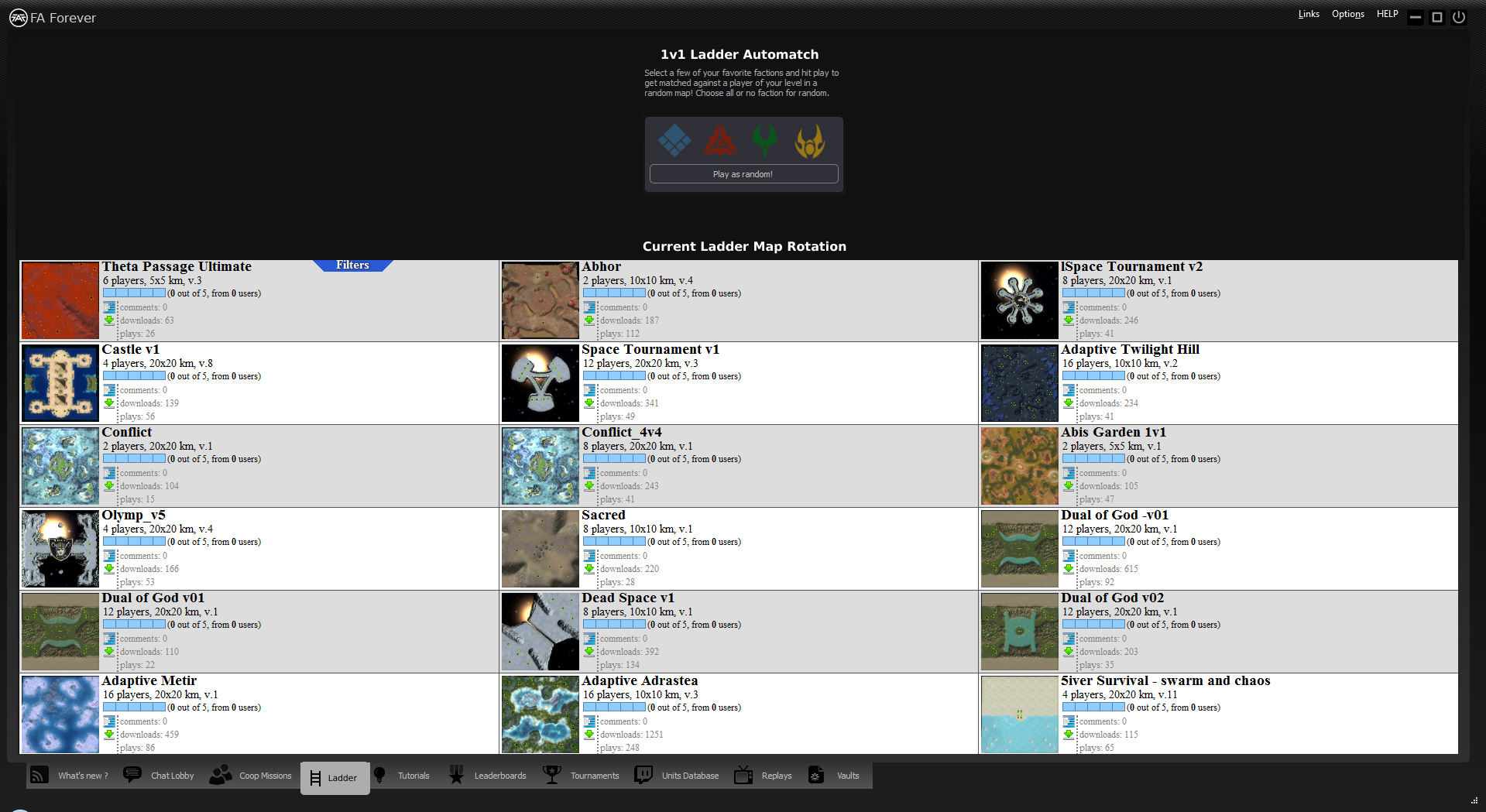
v2) Similar to v1, but shows the current ladder map pool (and maybe make it possible to host maps for testing in the lobby)
I hope you like the idea, since I'm unable to do myself. Maybe somebody of you finds it worth implementing or got somehow inspired.
regards
I don't mind swapping the 'custom games' title and the sorting. Not so much showing ladder maps, it'd take up too much space. IMO ladder should eventually get its own tab.
The biggest problem really is that there is no code in place to fetch current map rotation, and I believe we would need support for JSON api to make it work. It'll take a while, but we'll eventually get there.
it was suggested before, but having (similar to the "ladder map pool" you showed here) a list of most popular or (even better) featured maps on top of the list would be really great. clicking one of the icons would then lauch a lobby where this map is hosted (downloaded first in case its not already available).
Maybe this could help a bit against this omnipresence of gap/dual gap/thermo
Hey, nice that you like the idea. Here is a new version, where your comments are taken into account. Now Ladder and Play got separated Tabs.
1a)Simple Play Tab
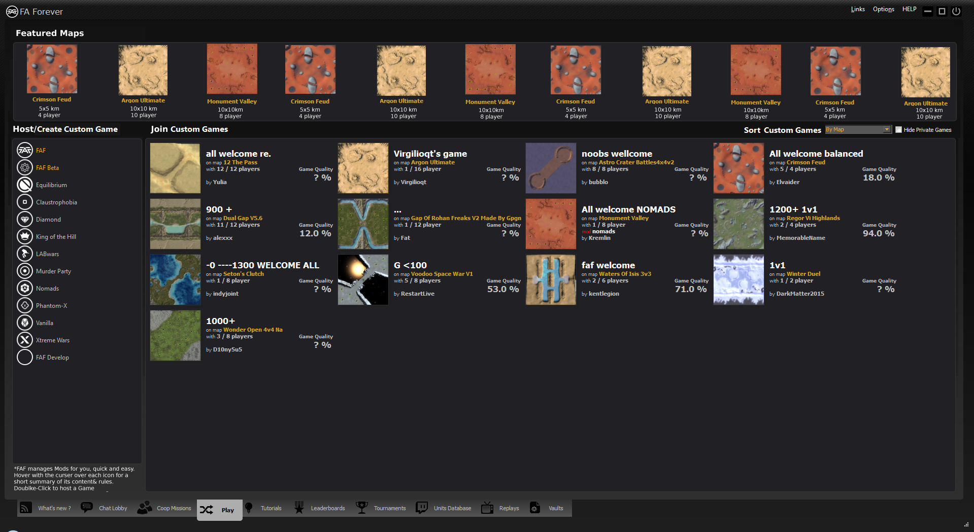
1b)Featured Maps Play Tab
2)Ladder Tab
maybe add size and player count to the featured map list as well i.e.
crimson feud 5x5
4 players
 b)km, player
I like the first changes. I'll make a PR, as soon as things starts moving again.