Support for Alternate Layouts using tabs instead of tables
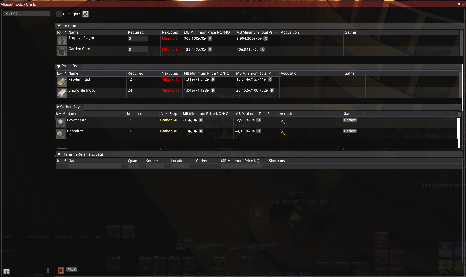
Is your feature request related to a problem? Please describe. The separators between crafts/precrafts/gatherables are somewhat hard to spot if you're scrolling fast, which can complicate navigation a bit.
Describe the solution you'd like A point of improvement could be adding support for separating the sections of crafts/precrafts/gatherables into different tabs for the sake of tidiness and convenience. You could also make it so that, when all items in gatherables/precrafts are collected and in the player's inventory, the tab name could change color or get highlighted to indicate at a glance that the player is ready to start crafting
I think a better solution would be to make each sub-group of the "To Craft" block their own block, and increase the spacing between blocks.
In other words:
- "To craft" would only contain the finished items
- "Precrafts" would be its own block, on the same "level" as "To Craft" and "Items in Retainers / Bags"
- Same with "Gather/Buy", etc
Here's a really badly done Paint mockup:
Combined with #125 I think this would be a better solution than tabs, personally.
I 100% agree with you about this, to keep everything in a single view, but I fear that without #125 , this would be a mess since the tables are currently very rigid and static in their positioning and size. To add to this, you could also make it so that the block headers get colored differently once you gather all the items in them (or autocollapse like in TC), just to tell at a simple glance that you're ready to move to the next tier.
Good job on the mockup, btw, Helped me to realize that this solution might actually be more appropriate than my initial suggestion.
Hmn, I like the idea of tabs from the original post (it's what caught my attention in the Discord), but I don't necessarily care for the block idea. I'm much more preferential to browser-like tabs along the top that I can click through. Even without #125 being implemented, there would inherently be more room for everything, regardless if the retainer block below is collapsed or not. And typically, (I know this is personal), I only look at what I need for the task I'm working on, be it gathering or working on pre-crafts. The rest is just information clutter. I grab pre-existing items from my retainers first, then check the times on the timed nodes, and run down the list of remaining gatherables that way. Tabs would make that easier to navigate and make the UI less busy.
I already work in separate sections and don't need, or want, all the information at the ready.
Ideally, I like both being offered. But if I had to choose?
Edit for more context: Even in TeamCraft, I collapse all available blocks, so I'm only looking at what I'm working on. Even then, I sometimes feel TeamCraft can feel pretty cramped. ¯\_(ツ)_/¯
Edited, again: for clarity.